



The art world in focus
Subscribe to our newsletter for news and insights on artists, galleries and exhibitions.

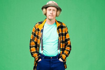
Grayson Perry, winner of the Turner Prize in 2003, is among Britain’s most distinctive contemporary artists, widely known for ceramics that lure with beauty and craftsmanship before revealing sharp, often disquieting observations of modern life. In recent years, however, he has turned to tapestry—an art form historically tied to aristocratic display—to stage expansive, intricately detailed portraits of contemporary Britain. Drawing on personal experience, social observation, and art history, Perry uses the medium to probe questions of class, identity, politics, sex, and belief.
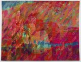
His tapestry Comfort Blanket (2014), a brightly coloured work modelled on a giant pound note, offers a pointed meditation on national identity. Centred on the image of a smiling Queen and inscribed with fragments of vernacular ‘Britishness’, the work takes its title from a friend’s description of Britain as a place of refuge after fleeing Hungary in 1956—casting the nation itself as both symbol and psychological construct.
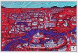
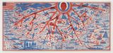
The work extends a significant strand of Perry’s practice, following The Walthamstow Tapestry (2009)—a monumental 15-metre panorama tracing a life shaped by consumer culture—and The Vanity of Small Differences (2012), a six-part series charting class mobility through the fictional figure of Tim Rakewell. Inspired in part by Hogarth and informed by Perry’s BAFTA-winning television series All in the Best Possible Taste, these works combine narrative ambition with acute social critique.
This interview was conducted over the phone between Perry and Anna Dickie on the evening Sydney’s Museum of Contemporary Art Australia announced a major survey of the artist’s work.
I had always liked tapestry because I was always interested in fabrics, quilts, and things like that. But I had never come across a way of doing it practically. I did try in the mid-nineties. I worked with an embroidery company, but they only created small embroideries, so I used to get someone to sew these bits into a large sewn patterned quilt, but it was a very time-consuming and unsatisfactory way of making a large fabric object.
But then I was working on a book at the time, and the print publisher guy one day came in and he knew this place that could convert my prints into a tapestry. When you make a tapestry it has to go through an awful lot of pre-preparation, but he put one of my prints through without much preparation, and it looked good. I kind of looked at it, and thought, ‘Oh it has potential.’ Then I drew up my first tapestry and I realised the scale it enabled me to work in. I was having a book launch at the time—and I thought let’s do something like a logo board, and so I did The Walthamstow Tapestry, which is 15 metres by 3 metres, and where we were going to do the book launch had a 20 metre wall, so we took advantage of it. From then on, I kept going. It is a technique that allows me to make small detailed works on a large scale—it works very well as a way of making a large object.
Contemporary art real estate is growing. Galleries are so big now and so imposing and whenever I get shown where I am going to exhibit, I always feel a bit intimidated by it because I make small things that take a long time to make. I am always at a disadvantage to people who make huge things, and have large workshops and do videos and so on. So my tapestries are a way of me dealing with a very crafted and detail-rich object that also can be of a fairly large scale. So it was the answer to my prayers in a way.
Every single item on the tapestry is a sort of logo. Every single item is named underneath by a brand. Brands are the modern myths and gods of our time. I thought about the tapestry and the large scale of them [tapestries], and thought of one of those religious fresco cycles, and I was also thinking about the most famous piece of textile art to British people, the Bayeux Tapestry, which tells the story of the invasion of Britain.
My tapestry tells the story of the invasion of marketing into our brain. You know, I didn’t really realise how it would work until I saw it up on the wall—I deliberately didn’t make any visual reference to the brands, I just sort of put the name there in a very nondescript text and the words themselves have this amazing effect. They create these sort-of ‘bombs of feeling’ that go off in your brain—they are so implanted, I suppose, as brands. As you scan the tapestry, you are taken through a sort of recent history in brands, and every one of them—for good or ill—has a sort of association. And it was a way of weaving literally and metaphorically a kind of emotion into the tapestry.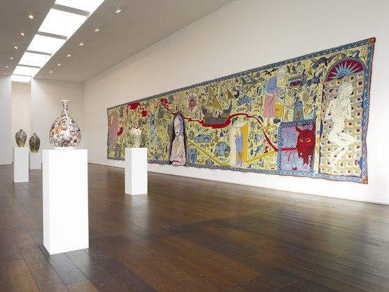
I called it The Walthamstow Tapestry because that is where my studio was at the time, in North East London, and I wanted to call it something after a place, to sort of echo the Bayeux Tapestry. William Morris was also brought up as a child in Walthamstow—just down the road from my studio—and of course he liked tapestry as well, and designed many tapestries, but his tapestries were hand-made. I liked the idea of doing something about brands in a medium that William Morris cherished as a type of bastion of down-to-earth craftsmanship. There is this sort of tension between the subject matter and the medium.
Yes, The Walthamstow Tapestry is the first piece of art that I have sold to a collection in China, and I understand the first piece of foreign art acquired by the China Academy of Art too, so I am delighted about this. At 15 metres long, it is a very significant work to have in the collection.
Yes, and I think that is a good thing. One thing I cannot bear and one expression that makes my heart sink is ‘global culture’. Because it is just a mush—it’s the way teenagers dress the same in São Paulo as they do in the Philippines, as they do in Scandinavia and I find it very dispiriting. I always encourage students never to be afraid of being who they are, when they are and where they are—of being specific and local. None of the great artists in the past worried about being ‘global’. Why should artists now? It’s bonkers. I like Chinese art because it is Chinese, not because it is a version of what I enjoy over in Britain.
I am one of those people always fascinated by what is in front of me. I am not one of those people who goes off to exotic locations to dance with nature. I am always interested in what is right in front of me, at my front door. And taste is one of those things that affects every decision we make everyday, but people aren’t exactly brought into awareness about it.
I have always been fascinated by class, and the main component of taste is class. Anyone who says there is no class system in society is lying because all societies have a status system of some sort or other. In Britain it is particularly pronounced and historically interesting, so it was a way of exploring a sort of nuanced status and unconsciousness. It is incredibly unconscious. When people say they like something, they never unpick the reason they might like something. People may think they are autonomous, but none of us is autonomous. We are completely conditioned by our upbringing and by our peers and by society and by advertising and so I was fascinated to unpick that.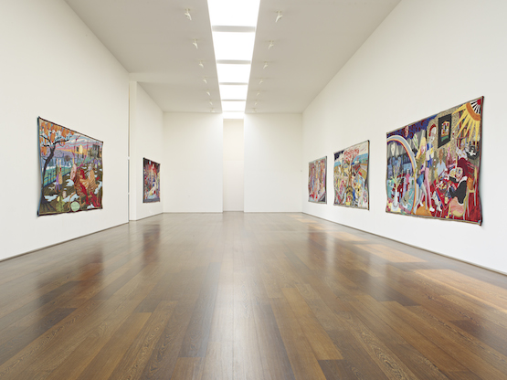
I have a very good handle on the British class system. I think there are some poignant things—with the working class in particular. The working class system in Britain was shaped by the heavy industries, particularly in the North, which now don’t exist on the whole—it means that they have a type of ghost society. It takes generations to change. The emotional structures are there, but the industries are not. They have found other ways to replicate rituals, and play roles related to heavy industry—like men going to the gym: so instead of casting steel girders, they pump iron. They tend to spend a lot of money on their clothes and their appearance and their car, as opposed to a middle class person who might put more money into their house and their food as a way of showing their status. Each class has a different way of dealing with material culture that they use to show their place in society.
Yes, any other sort isn’t readily as available.
Class in Britain is pretty much stalled in a way. There are no more white-collar jobs—there isn’t an expanding white-collar sector for people to expand into. If you are going up, there is no way to go—it’s already full.
I was already toying with the idea and it was sort of the perfect little story that went with it. I was thinking about drawing and trying to make a sort of quilt. My Grandmother got into the habit, during the war, of rescuing little scraps of wool and knitting them into little squares and sewing them into a blanket, and my other female relatives did the same thing. I saw the Queen as a grandmother figure, sort of knitting the blanket of the nation: collecting all the scraps that you could patch together to make the memory quilt or blanket of the nation. It also echoes a kind of giant bank note—a kind of token of Britishness.
You know we moan about Britain, but the reason people come here is because it is still a very safe place compared to a lot of places in the world—a very stable place. We shouldn’t moan about incremental changes to government because that is what keeps us stable. Revolution is inherently violent and chaotic.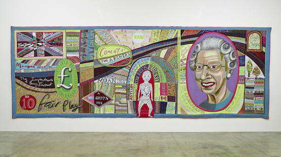
I get seduced when I am working on Photoshop by the little colour options. When I start a tapestry I always think, ‘Right this time, I am going to use muted tones, or even make it monochrome’—but then I get seduced. Also there is a kind of tendency in contemporary art [not to use a lot of colour] and the drive for ‘tasteful objects’. When you walk around an art fair, a lot of the work is monochrome because it looks good in a modern interior—it looks ‘serious’. It is part of the seriousness of male interiors. Colour has this sort of association with frivolity.
Yes. Well the thing is any big show of mine is going to be a survey show because I take so long to make work. I could only inhabit one room at the MCA, if I was to put my work from one year in there. So any big show is always going to involve a majority of works from the past. I am hoping it will be a good selection of work from right across my career involving all media: prints, sculpture, ceramics, tapestry and even a couple of video, film things that I did. —[O]









A respected voice in contemporary art discourse.
Focusing on ambitious storytelling and insightful art-world commentary. Ocula Magazine publishes in-depth interviews, critical essays and timely analysis on the artists, exhibitions and ideas driving the global art world.
Learn more about Ocula Magazine
Showcasing the best of the art world.
Ocula partners with galleries from around the world to highlight their artists, artworks and exhibitions. Gallery membership is by application and invitation, with each member vetted by an independent panel.
Learn more about Ocula Membership
Specialises in the sale of major artworks.
Led by a team with deep ties to the world’s leading auction houses, galleries and collectors. Ocula’s advisory team offers bespoke services to high-net-worth clients from around the world who are looking to acquire the best of contemporary and modern art.
Learn more about our team and services