Simon Denny on the Geo-Politics of Technology
Simon Denny. Photo: Paolo Monello.
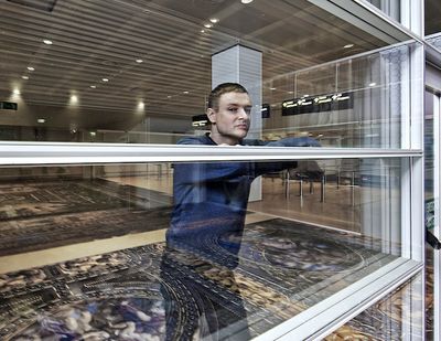
Simon Denny. Photo: Paolo Monello.
2015 was a stellar year for the Berlin-based artist Simon Denny. First, MoMA PS1 presented The Innovator's Dilemma (3 April–24 August 2015), Denny's first significant United States museum solo show.
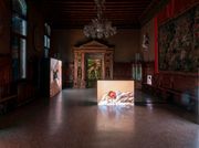
Then representing New Zealand at the 56th Venice Biennale, his project Secret Power attracted both art world accolades and mainstream media attention for exploring the design aesthetics of files famously leaked by the National Security Agency (NSA) whistle-blower Edward Snowden.
More recently, the artist opened an exhibition at the Serpentine Sackler Gallery, Products for Organising (25 November 2015–14 February 2016), which looks at the cultures of both global corporate organisations and hacktivist movements.
Ocula first caught up with Denny just as he was preparing for his Venice exhibition and this e-conversation between Denny and Kate Brettkelly-Chalmers follows on from those discussions.
KBCThe project Secret Power addressed the contemporary intersection of global geo-politics and communication technology through the lens of aesthetics, design and the visual iconography of tech culture. The term 'nesting' was rather insightfully used to describe the relationship of its many different parts: computer server racks that act as museum-style vitrines, Snowden files re-rendered as objects and visual compositions; the ceiling of the Marciana Library transposed onto the floor of the Marco Polo Airport transit terminal. I like 'nesting' because it is also used to describe the file structure of some database systems like Windows, for instance. But what descriptions have been most useful for you? Where do you begin when you discuss this work with other artists or curators?
SDIt's nice to read your summary. I usually begin by describing this project by identifying my own search to find an artistic context for the powerful imagery that the Edward Snowden documents introduced to the world. That is the core of the project for me. When I looked through the Snowden files I was strongly affected by the artwork that framed and shaped this information. I wanted to know what kind of author would be producing this work, to give more background to its production. Following some of the information-gathering tactics of journalists that I read, the figure of David Darchicourt, the self-proclaimed former creative director of the NSA came up through social media searches. Suddenly there was a placeholder for an artist's hand in the Snowden slides. His online portfolios on Behance and LinkedIn gave me some understanding of the context I was looking for. Here there were more illustrations and diagrams that helped flesh out the position of this image-maker who was, at one point, developing some of the world's most powerful imagery within secretive organisations.
The figure of Darchicourt made me think differently about other artwork as well, which became important when selecting and crafting the sculptures in the exhibition in dialogue with the pavilion venue, the Biblioteca Nazionale Marciana. I came to see the Marciana's beautiful masterpieces as a kind of 'intelligence imagery' from an older commercial empire. Fra Mauro's World Map, a richly detailed map pieced together by a monk from his conversations with merchants, sits beside many allegorical paintings, describing the value of knowledge, which cover the walls of the library. By making display units that re-rendered Darchicourts work in a monumental format in this rich Library, I was able to cast him as a master of contemporary intelligence image-making in dialogue with masters of the past. And I think that was the core viewer experience that cycled out into the other layers and stories within the project, across the borders at the airport and beyond.
Hackers and programmers with social motivations find each other on these forums. And the path from hacker to intelligence worker (and sometimes back again, like Snowden) is a well-documented one. The fuzzy membrane between these two, seemingly opposing, positions led me to the research process for the Serpentine exhibition, actually, I got really interested in examining how radical office/organisational culture shares similar values and origins with some hacking practices.
KBCSo you developed many of the graphics and aesthetic elements of the exhibition together with the designer David Bennewith, a frequent collaborator, and David Darchicourt, the NSA 'Creative Director'. Can you describe the very different process of working with these two Davids?
SDThe process of working with David Bennewith was something that was and is long-term—not confined to this exhibition. We have worked on publications together, but also whole projects, and he is one of a number of close conversation-partners I am in dialogue with ... So our discussions beginning around the 'national pavilion' aspect of the project eventually turned into co-developing the research, and this led to Bennewith reaching out on Twitter and finding Darchicourt's profiles. We then had this kind of revelatory moment looking through Darchicourt's portfolios and sort of threw ideas back and forth until the plan to offer him an original commission came up. Then Bennewith approached Darchicourt through his online profiles with the first of two commissions.
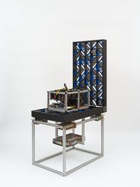
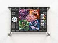
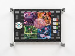
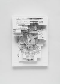
We worked carefully together on the brief: thinking about what would be the most interesting thing to have the 'hand of the NSA' draw in relation to a 'New Zealand' Pavilion. The question of what we were commissioning and how we were doing this—including the level of complicity we wanted Darchicourt to have in the process—formed the underlying logic that determined the stance of the entire pavilion. From that, I developed the two-part exhibition where half the show features interpretations of Darchicourt's work and half features anonymous work from the Snowden slides. Bennewith and I had many of the graphics redrawn and vectorised, and I interpreted some of the drawings in 3D models. I printed and designed custom panels for the server racks with the imagery printed on them, and arranged them into groups that suggested common themes and an identifiable aesthetic position.
KBCI have to admit that there is something a bit creepy about these server-rack vitrines. They seem to be observing a visual logic that has spun away from the user-friendly utility of, say, Apple into the wackier and potentially more dangerous world of 4chan. Would you agree?
SDI am a fan of Apple and of 4chan. I like both of those visual approaches to GUI [Graphical User Interface] or organising digital graphic/information. But the Snowden slides are much closer to 4chan. In the discussion we have in the exhibition catalogue between David Bennewith and Metahaven (a design duo that has worked closely with WikiLeaks) they talk about Darchicourt and the aesthetic of the Snowden slides being closer to Microsoft than Apple, and how that plays out in terms of a 'taste conversation'. But yeah, 4chan is about appropriation, message boards, quick, conversational use of images and memes. 4chan and the Snowden slides also share a tendency towards using gaming and fantasy imagery: wild monsters and cute LOLCats with a troll-like tone to them. This is what thrives on 4chan. It's heterogeneous, but there are certain visual themes that reoccur.
The fact that 4chan spurned Anonymous is also not irrelevant here, I think. Hackers and programmers with social motivations find each other on these forums. And the path from hacker to intelligence worker (and sometimes back again, like Snowden) is a well-documented one. The fuzzy membrane between these two, seemingly opposing, positions led me to the research process for the Serpentine exhibition, actually, I got really interested in examining how radical office/organisational culture shares similar values and origins with some hacking practices.
In the discussion we have in the exhibition catalogue between David Bennewith and Metahaven (a design duo that has worked closely with WikiLeaks) they talk about Darchicourt and the aesthetic of the Snowden slides being closer to Microsoft than Apple, and how that plays out in terms of a 'taste conversation'.
KBCThat is a really interesting link that I want to return to in a moment. But before that can we discuss some of the individual design details from the Venice exhibition? For instance, the 'Poison Nut' is a particularly strange and compelling graphic. It was a visual icon for a piece of NSA programming used to break through the security measures of specific surveillance targets. How did you come across it?
SDBy trawling through hundreds of the Snowden documents over the course of developing the Secret Power project—a one and a half-year period. Every time there was a Snowden archive release through various news agencies, I would print out and examine the visual conventions and language in each slide. Every now and again you would get a new original drawing or emblem that had been completely secret until that release. Those were the most exciting moments for me; the Mystic Wizard collage, the FOXACID drawing and the Treasuremap logo were all amazing discoveries.
The Poison Nut logo came quite late in the process. I think Der Spiegel released it in December 2014, when production was well underway for the sculptural works and we already had the Darchicourt commissions. I was very familiar with Darchicourt's hand at that point and as soon as I saw that logo I knew it was his work. Many of the Snowden slide images I was trying to contextualise in Secret Power were close to Darchicourt's style, but this was unmistakable. It could have been taken directly from his public portfolios that we were mining for the project.
After a special preview of the exhibition—before it opened to the public—Charlotte Higgins from The Guardian reached out to Darchicourt and brought up the Poison Nut and he admitted to designing it. In Higgins' interview, Darchicourt said that he was good at 'solving problems visually' and that he was one of two or three people in the organisation's design department who was skilled in drawing: 'My cartooning is something they found useful from time to time—it could be a good communication tool, helping express complex information in a very simple way'. That was amazing for me. We had found what we were searching for: a rationale for the design work we saw in the Snowden slides and a unique claim to authorship that hadn't been identified before or since. Somebody was saying, in effect, 'Yes, I made a part of these slides, they are real.' I think even John Key [Prime Minister of New Zealand, 2008-present], was still denying their authenticity at that point.
KBCYour current Serpentine exhibition Products for Organising is less focused on specific geo-political issues and more concerned with the aesthetics of contemporary tech movements. You look at both highly organised companies and corporations and the more loosely aggregated hacker communities. How did you come to address these different groups? What interests you in this juxtaposition?
SDYes, well it really followed on from things I learned through the Secret Power project. I saw this world of surveillance and resistance as a continuum rather than separate and opposed areas. I had a glimpse at the complexity of public-private sector partnerships and how governance has really gone beyond the usefulness of using these two categories to describe anything. I recognised how organisational systems and management practices actively produce and shape culture in a wider sense.
Ultimately, I am interested in reflecting a wide spectrum of different frameworks of media and knowledge. But that doesn't mean that someone doing what I do doesn't need to be informed. And the exchange I have had and do have with experts has helped me to understand more of the worlds and figures I reflect on in my work.
Popular management products like Sigma Six had management gurus like Patrick Lencioni who were maintaining and facilitating the work of the NSA. Gensler [the architecture and design firm] developed the iconic 'doughnut' building that the British GCHQ [the British Government Communication Headquarters] operates from as an architectural expression of their core values. Engineers inside the GCHQ were popularising distributed decision-making practices like 'Holacracy', which is most famously used in Amazon-owned Zappos. Values and practices close to hacking like radical openness, distribution of authority and extreme flexibility were migrating to some of the most powerful formalised organisations in the world.
So I thought visualising and exploring this pluralistic view of culture was what I wanted to do. I wanted to put hacktivists alongside hackathons to say: look, these practices and conventions are being leveraged for corporate innovation at the same time as they are being used for politically focused oppositional action. These 'products for organising' are really making a new world with new values based on a kind of radical liberalism and complex risk-taking.
KBCI'm always quite intrigued by how tech companies 'visualise' innovation and systems of producing novelty. It seems that part of the process of developing something new and transformative (in tech terms) also involves building a narrative or symbolic structure that perpetuates both its novelty and its value within the market. The iconography of the circle that you look at in this show seems particularly important for a number of companies as both an architectural structure and a visual symbol of process/progress. How did you come across this structure? And how do you think it functions in various digital economies?
SDYes, very much so. Stories are very important. This is as true in marketing and raising capital as it is in art exhibitions. A circle is a powerful form—and can symbolise different things to different organisations—but it's definitely somehow become a meme-like shape in tech. Dave Egger's novel The Circle framed this succinctly. Google's social network groups are called 'circles.' Facebook's new Gehry building has a huge feature wall in its entrance with the words 'full circle' made from circular objects. The management structure 'Holacracy' which is used in Zappos and within the GCHQ's organisational rhetoric describes teams as 'circles'. The Holacracy logo is a kind of concentric circular form and a circle is the shape of the GCHQ building and Apple's new headquarters.
An advantage of a circular building for organisations that embrace innovation in office spaces is this idea that collaboration and creativity is encouraged by chance encounters between different kinds of staff that all occupy the same endless open space. The theory is that if you are all in one continuous space where you pass co-workers all the time, you will share more knowledge. The kind of spontaneous, creative sharing needed for innovation is facilitated by this fluid space.
KBCLastly, can you talk about your work with journalists? You engaged the high-profile New Zealand journalist Nicky Hager as a consultant in the Venice project, and you continue to speak with other writers and researchers who are similarly interested in issue-based journalism. What do you get from journalism, and what do you think these journalists get from engaging with your work?
SDThat's a question I ask myself too. I am a fan of 'quality' journalism with integrity and commitment. I can see real value in the idea of the Fifth Estate and I am very glad the world has very intelligent people who dedicate their lives to this hard and often unrewarding work. But I am also a fan of more opinionated journalism and populist clickbait. I think all these forms frame things in different but valuable ways. Business Insider and FT Alphaville are clearly divergent in their world view. The Intercept also has completely different assumptions about value than these financial news platforms. But all these positions help me map a subject and learn more. Some media formats deeply reflect a self-consciousness of the market and marketing pop-psychology/infotainment. Others offer truly independent critical thinking about complex issues. I'm an autodidact like many artists and rely on journalism to understand the world.
Ultimately, I am interested in reflecting a wide spectrum of different frameworks of media and knowledge. But that doesn't mean that someone doing what I do doesn't need to be informed. And the exchange I have had and do have with experts has helped me to understand more of the worlds and figures I reflect on in my work. Regarding the journalists' own responses to my work, I know that both Nicky Hager and Ryan Gallagher have really enjoyed my approach, recognising that different mediums demand different affective framing and strategies. For the most part, I think our contact has been a worthwhile exchange from both sides. —[O]




![Modded Server Rack Display: Community Hack [Narrative by Matt Goerzen, suggested product title by Emily Segal] by Simon Denny contemporary artwork sculpture](https://files.ocula.com/anzax/f8/f854278a-e610-476f-93f3-a14133da2d4c_200_300.jpg)
