Seundja Rhee: A World Without Obstacle

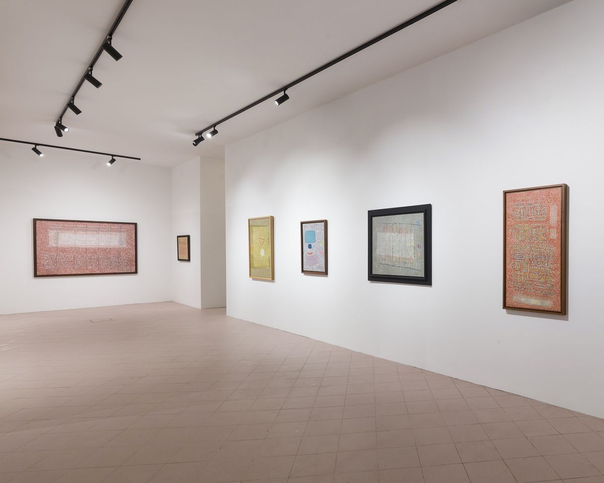
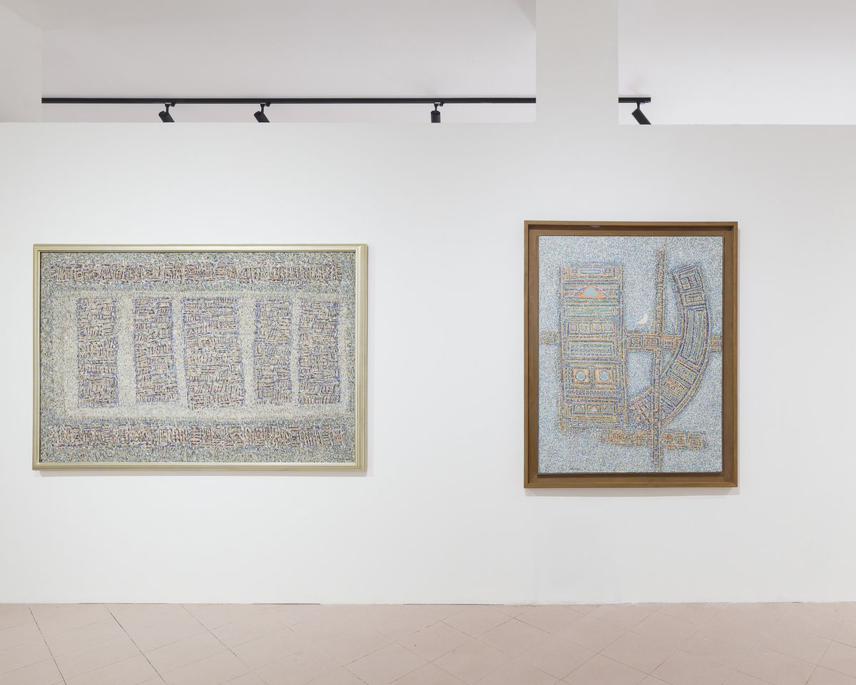
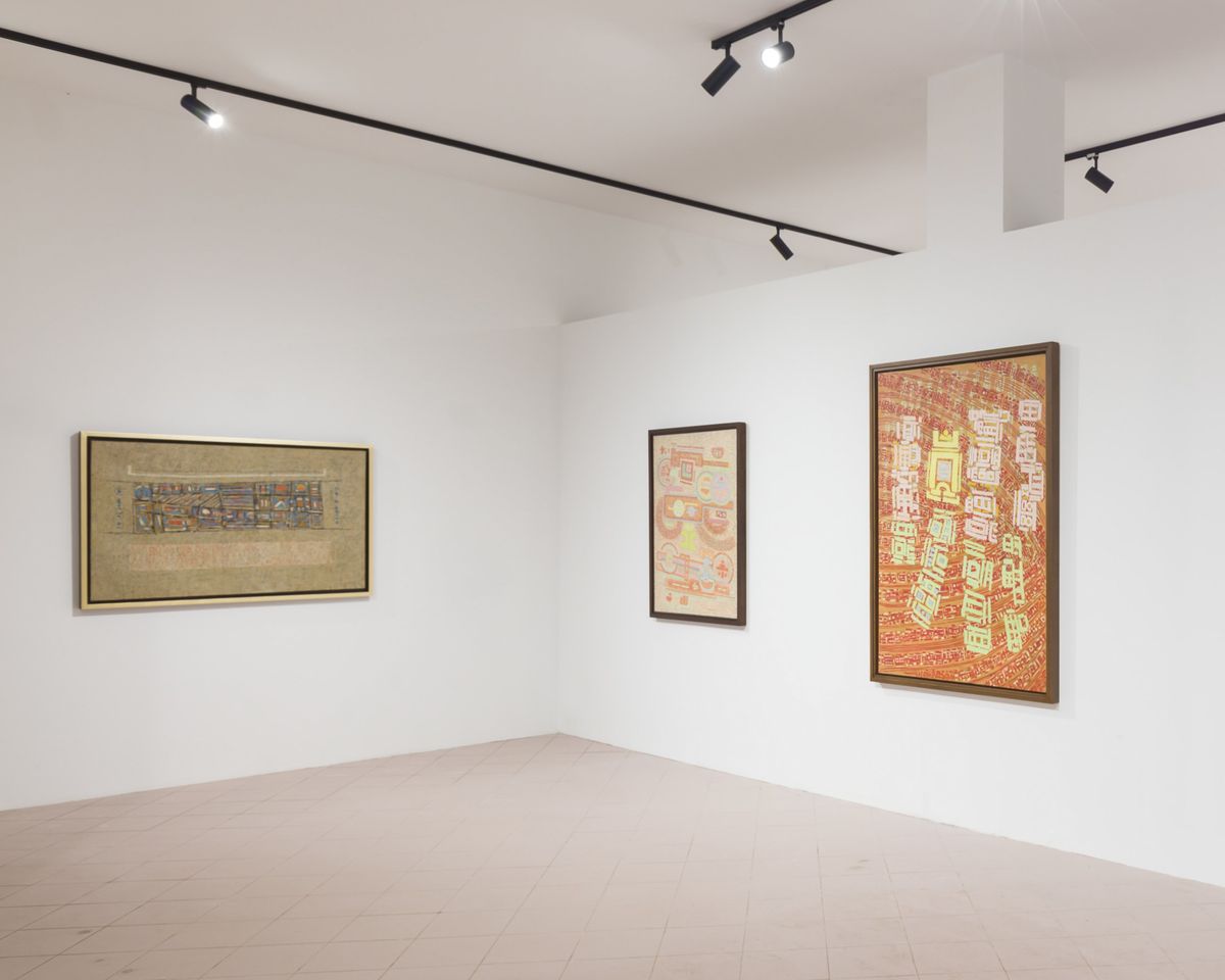
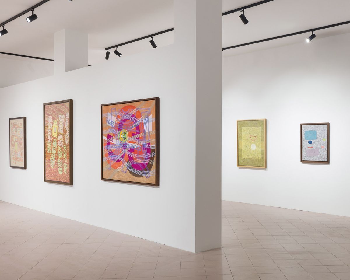
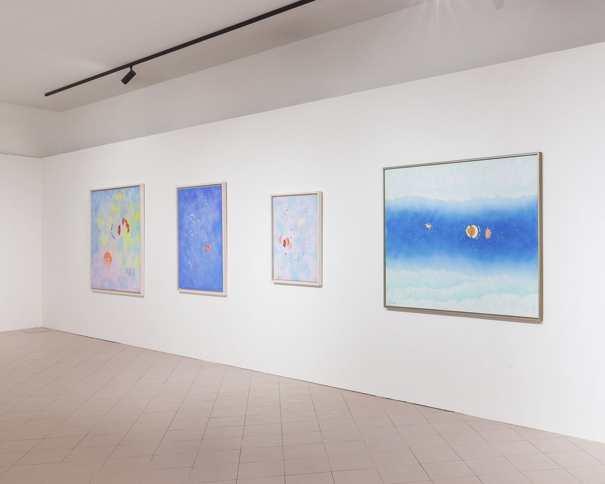
Exhibition view: Seundja Rhee, Towards the Antipodes, ArteNova, Venice (20 April–24 November 2024). Courtesy KoRICA (Korean Research Institute of Contemporary Art); the Seundja Rhee Foundation; and Gallery Hyundai. Photo: Mark Blower.
There is no artist quite like Seundja Rhee in modern and contemporary art history in Korea and beyond. Perhaps this is why Rhee's solo show, Towards the Antipodes, is a collateral event at the 60th Venice Biennale, presented by the Korean Research Institute of Contemporary Art.
Born in 1918, Rhee was a prolific artist who left behind more than 1,300 paintings, 12,000 prints, and 500 ceramic works following her passing in 2009, cementing her position as a pioneer in Korean abstract art. Yet her artistic career did not start until her mid-30s.

Rhee moved to Paris in 1951 to study costume design, after divorcing her husband and separating from her young sons. Two years later, she switched to fine art, enrolling at the Académie de la Grande Chaumière in 1953 on the encouragement of surreal abstractionist Henri Goetz, a professor at the Académie attended by artists such as Zao Wou-Ki and Ed Clark.
Early paintings focused on figure, landscape, and still life. But gradually, compositions began to shift to abstraction, with a trip to Amsterdam in 1956 triggering a series that converted the forms of the Dutch city's harbour into bold strokes of colour on canvas (Port d'Amsterdam, 1956).
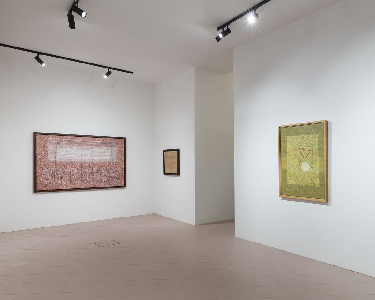
Exhibiting Rhee's work beyond her home countries of France and Korea for the first time since her passing, Towards the Antipodes (20 April–24 November 2024) focuses on her trajectory in painting post-1956.
Two oil-on-canvas works from 1959 form a starting point. They represent the period between 1957 and 1960 when Rhee began building coloured shapes and lines over dense layers of staccato marks that meld into a voluminous, almost sculptural plane.
In Perspective of Centuries, two red rectangles joined by a fine black filament line hover in a blizzard of grey strokes through which hints of blue and red peak. A Pearl of Sap arranges blue, yellow, and peach rectangles, circles, and curved lines over a greyscale ground. Far from hard-edge, each composition exudes an aura of static noise as if its surface was composed of vibrating sands.
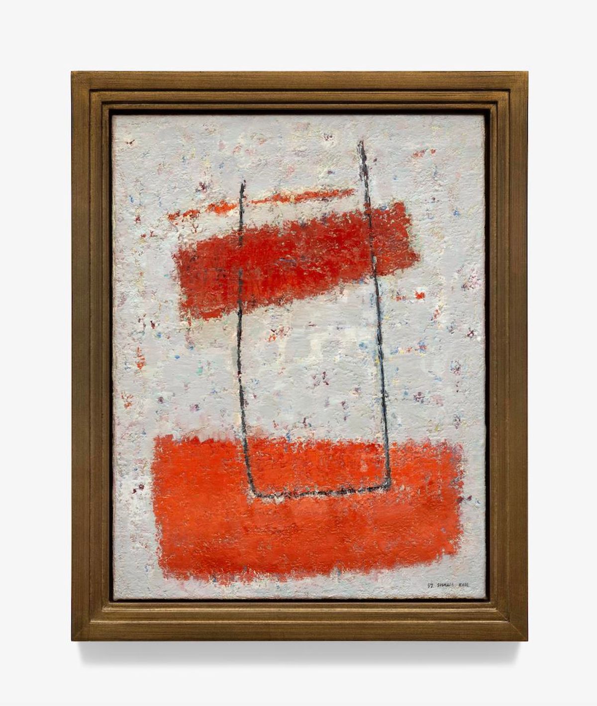
Earth No.1 and White Mirror (both 1960) depict a subtle development, with fields of colour on colour. In the former, uniformly spaced vertical lines form an orange rectangle over grey, with shorter white strokes producing a slimmer rectangle over it. Both shapes are covered by fine black lines shaped like a horizontal ladder.
In the latter, a horizontal rectangle cuts through an ochre-scale ground, with a large, pastel yellow block layered above it. Inside, black lines scratch out a square framing a red-lined triangle and white circle. In each case, images are built up with repetitive strokes that retain a sense of spontaneity and rhythm amid the order, as flashes of colour through the gaps hint at the layering that has occurred.
That pointillist quality, enacted not through a neat arrangement of dots so much as deliberate brushwork that builds volume through flatness, continues in the 'Woman and Earth' series (1961–1968). Here, short lines repeated like stitches or the weaves of a rush mat create rippling fields of contoured colour.
Looking at these works up close, it is clear that Seundja Rhee is a painter's painter...
The shapes Rhee played with in previous years evolve into signs. In the orange-toned canvas Sweet Sunrays (1963), a peach orb is positioned above two orange, rectangular forms over an earthen ground. In the blue-scale Ojak-kio (1965), a crescent moon rises over an interlocking rectangle, cross, and curve, whose internal volumes are defined by alternating lines of orange, blue, and yellow forming patterns within.
In these paintings, the curator of Towards the Antipodes, former National Museum of Modern and Contemporary Art, Korea (MMCA) director Bartomeu Mari, sees interpretations of tilled fields and cities.
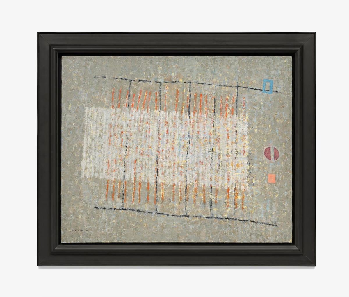
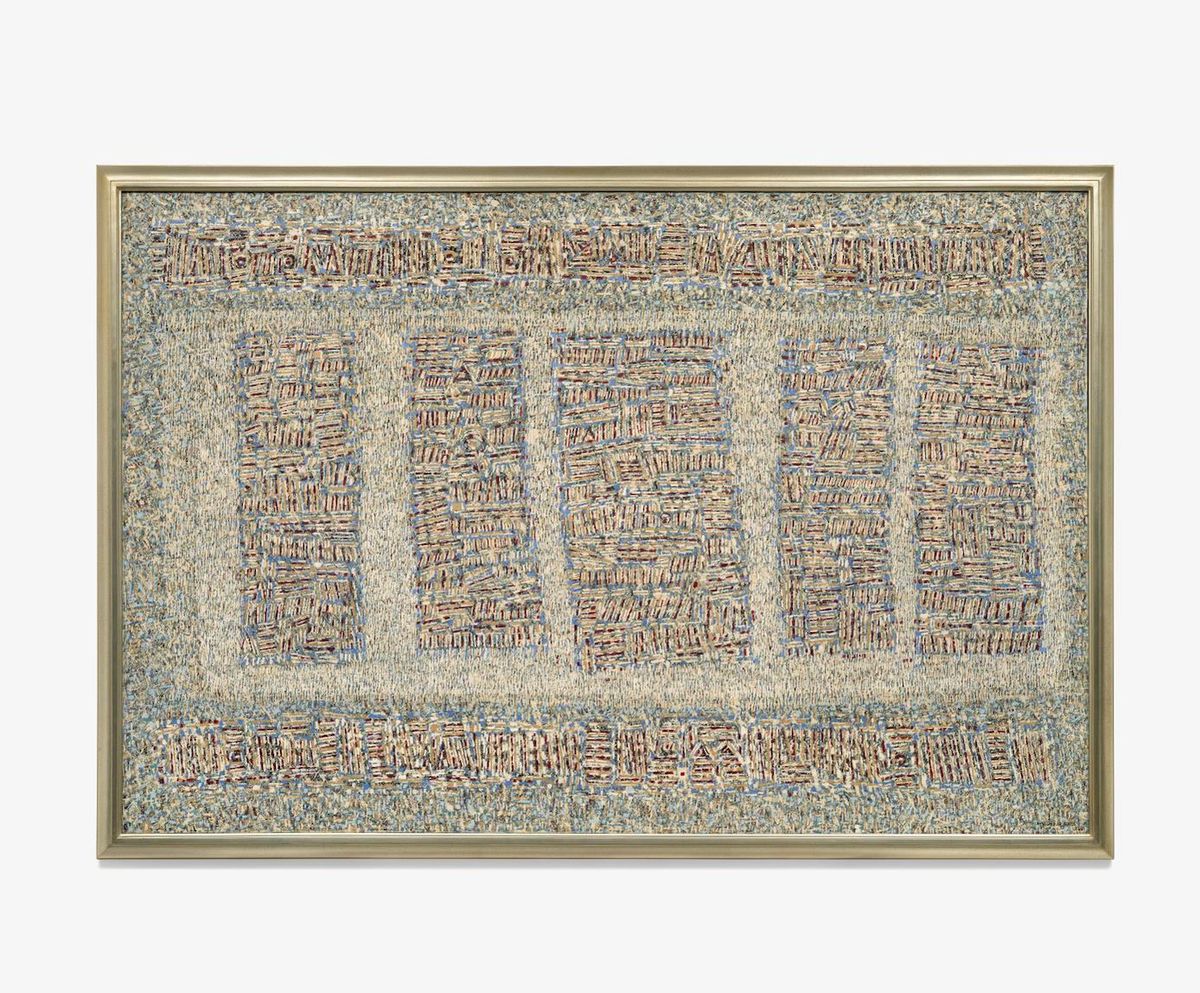
In Composition (1962), for instance, five vertical columns arranged over a rectangular plane framed top and bottom by a lintel-like bar, echo a bird's-eye view of an agricultural landscape, all defined by a cross-hatching of lines in shades of cornflower, burgundy, and straw.
Looking at these works up close, it is clear that Seundja Rhee is a painter's painter, with her canvases now forming something of a riddle for those engaging with her practice. As Mari notes, the artist's archive has yet to be fully studied, so it's hard to say how exactly she worked.
Yet this mystery only heightens the feeling that each of Rhee's paintings sought out representational forms that could transcend the divisions she experienced in her lifetime as a woman, a Korean, an immigrant, and an artist. 'These are not expressionist nor gestural works,' Mari says. 'They are highly conceptual and very rational. This is about thinking.'
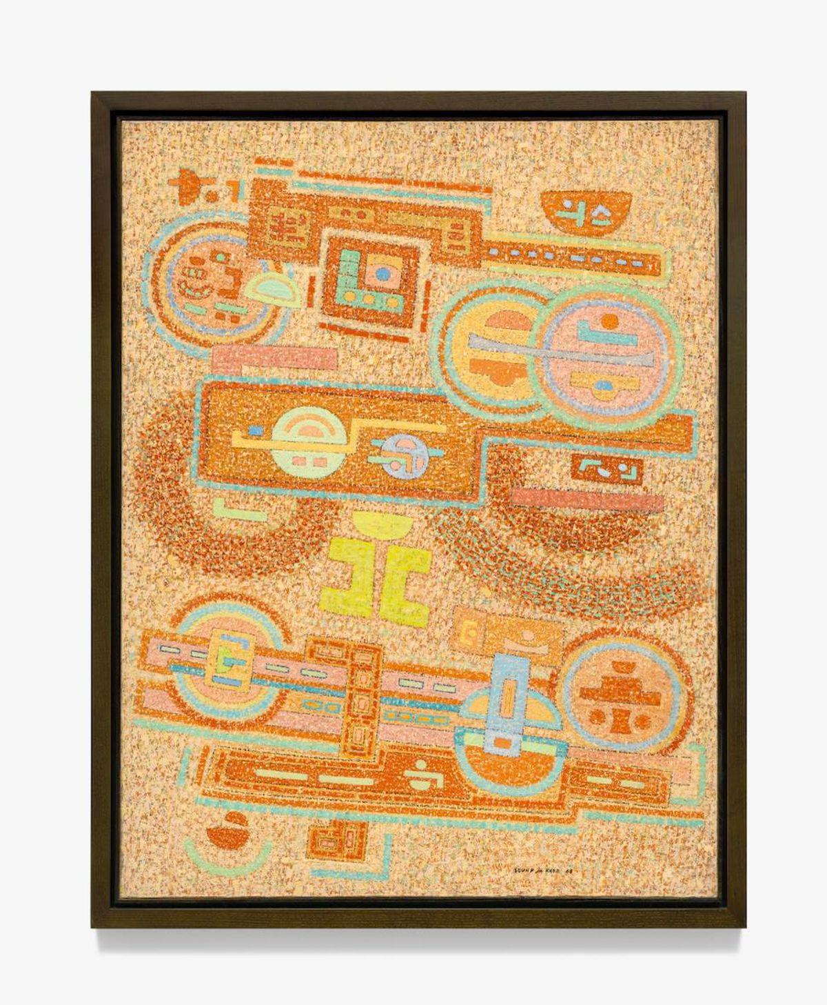
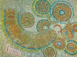
A World without Obstacle (1968) feels like a manifesto in that light. While retaining her signature, linear pointillism, the work sees more solid shapes emerge, with circles and rectangular lines invoking the floorplans of futurist space stations and homes in tangerine, teal, sky, and mint shades, with pops of yellow.
In an interview with Chosun Ilbo in 1970, Rhee describes using the circle consciously since 1958, as an all-encompassing symbol of eternal life and endless movement: 'The circle is a mass of life and a source of all things. Being comes from non-being.'
Indeed, the circle appears across Rhee's paintings as professor Jieun Rhee points out in the catalogue for a stunning 2018 survey at MMCA Seoul, commemorating the 100th year of Rhee's birth. In the striking acrylic-on-canvas 'City' series (1972–1974), not shown in Venice, half circles rendered in solid blocks of vibrant colour are conjoined by lines and shapes that inhabit the gaps between them.
A sense of balance infuses these compositions. Take City of May, 74 (1974), where two red semicircles float in a column joined by triangular conduits of a lighter tone. The same composition is repeated in blue in Yin and Yang, May, No. 1, 75 (1975), signalling Rhee's conceptual and philosophical concerns.
'The semicircle, which had appeared in the motif of a house or village in the works of Woman and Earth period, now looked like a single nucleus split in half,' professor Rhee observes. 'This form shows that the ideal configuration of Rhee's future city was derived from the organism of life. Rhee's future city objected to the grid of modernism from the start.' The same could be said of Rhee's approach to painting.
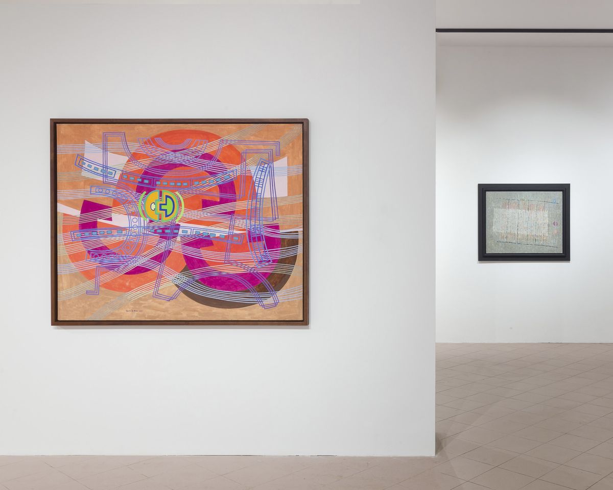
A small semi-circle, shaped like a geometric bolt, slots itself into its corresponding half at the centre of Superimposition Traffic (1971), which the artist created after visiting New York in 1969, around the time she shifted from oil to acrylic paint. Continuous strokes in shades of violet, blue, and green create waves that move across the frame, criss-crossing a central plane of large half-circles in red, orange, and green.
'I felt the pressure of the material abundance such as the large groups of mass and the density, the forest of skyscrapers reeling in the air,' Rhee said of New York. 'Standing at the top of the Empire State Building at midnight surrounded by the city lights from the overlapped skyscrapers led me to my new attempt, Superimposition.'1
In Midnight at Empire State Building (1969), Rhee interprets the experience as pure energy. Bright pastel lines of mint, rose, and canary invoke the top-down view of rooftops as pictographic characters, as swirls of russet and sanguine move in currents beneath them.
'When you look closely and start meditating about what is in the painting, you see signs that appear in all periods of Rhee's practice,' Mari points out. The conjoined circle sign in Superimposition Traffic, for example, became the floorplan of Rhee's studio in Tourrettes-sur-Loup in southeastern France, Mari says, where she settled in 1958.
It was in Tourrettes that Rhee expanded her 'Road to the Antipodes' series (1980–1994) to reflect views of the night sky. In My Cottage of Venus June (2000), swirls of white dots—which look like splashes, but have been meticulously painted on—appear like stars across an airbrushed dusk pink and blue nebula.
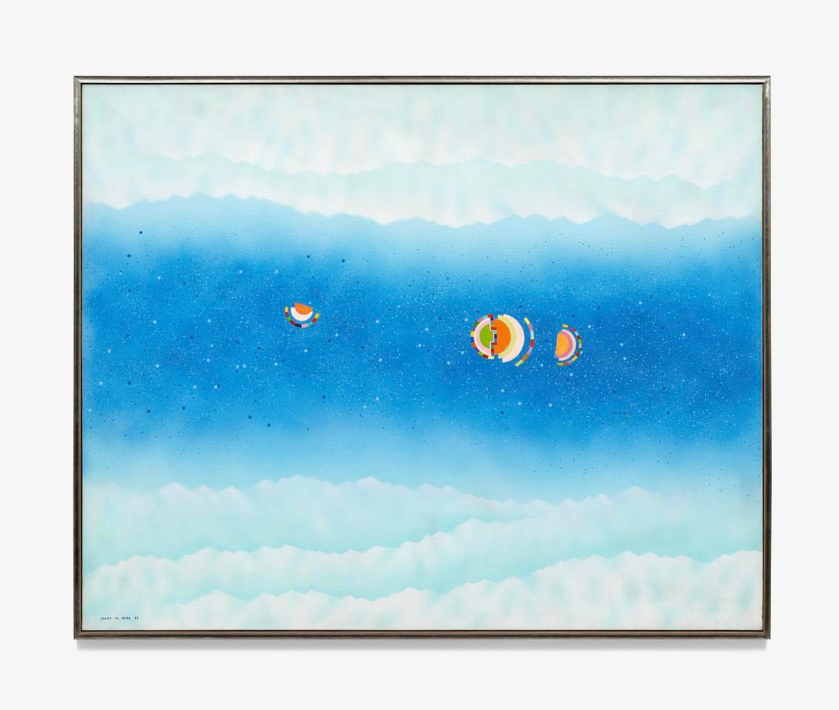
Inspired by aerial views she witnessed travelling between France and Korea in the 1980s, when the flight path followed a polar navigation route, 'Road to the Antipodes' marked a major shift, with airbrush creating jagged mountainscapes rising towards star-filled skies.
Familiar signs appear in block colours: Road to the Antipodes July No.2 (1981) includes three nucleus-like cells rendered with solid lines and block colours, that hover at the centre of a brilliant blue sky and white mountain range below.
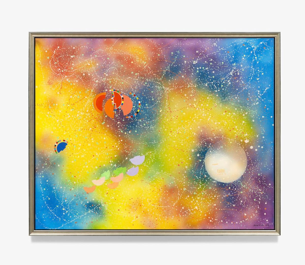
The final painting in Towards the Antipodes, A City of September (2008), is among Rhee's final works. Recalling the 'City' series, which played with concepts of organic rather than concrete structure, pastel-coloured semi-circles float among trails of white stars that move across a supernova of yellow and purple clouds churning over deep blue. Through a star's death, Rhee portrays life as a luminous cosmic circle. —[O]
1 'Seundja Rhee: Towards the Antipodes', Catalogue, Gallery Hyundai, 9 April 2024.