


Jude Rae on Thinking through Visual Experience
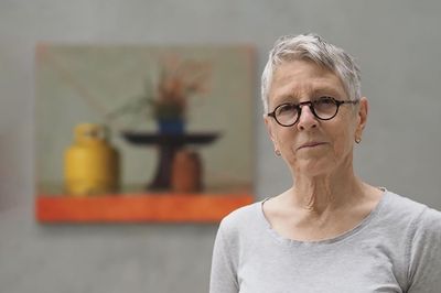
Jude Rae. Courtesy Maria Stoljar, Talking with Painters.


In 2013, the well-known Australian painter Jude Rae produced a suite of three interlinked video works. Someone once described them, she recalls, as a lesson in how to look at her paintings.
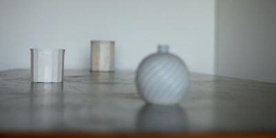
Like her canvases, these videos are composed with a shallow depth of field, objects arranged on a tabletop and brought in and out of focus. The camera’s soft oscillation produces a gentle instability, a way of slowing vision down. Rae has spoken of her interest in video as a medium that extends looking—stretching it into duration, encouraging a more contemplative attention.
Yet this brief foray aside, Rae has remained resolutely committed to painting over the past three decades, returning to its formal conditions as a means of probing how we see, and how vision itself might be thought through.
Having taught drawing for many years—most recently at the National Art School in Sydney—Rae is acutely attuned to the difficulty of translating three-dimensional experience into two dimensions. For her, however, drawing and painting exceed the tasks of description or mimicry. She characterises her approach as ‘thinking/feeling through visual experience rather than representing it’—a formulation that positions perception itself as both subject and method.


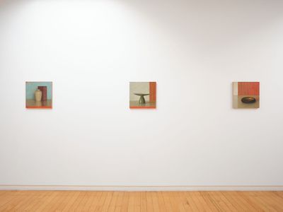
Rae’s exhibition 476-482 (24 August–30 September 2023) at Two Rooms in Tāmaki Makaurau Auckland is a coming home of sorts. Now based in Sydney, Rae spent close to a decade in Aotearoa New Zealand, where she directed South Island Art Projects (the precursor to The Physics Room) in Ōtautahi Christchurch. Under her stewardship, the initiative was described by art historian Christina Barton as ‘importantly radical’—an experimental, project-based space that sits, at first glance, at a remove from Rae’s identity as a representational painter, yet speaks to the conceptual undercurrents of her practice.
Rae has acknowledged the significance of this period, both in introducing her to figures such as Gordon Walters and Colin McCahon, and in affording her the space to develop an approach outside the pressures of the Australian art scene.
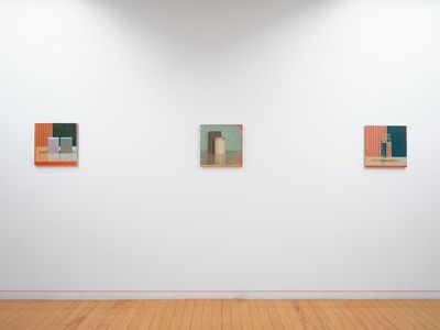
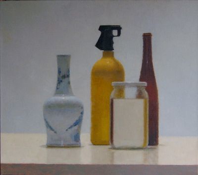
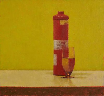
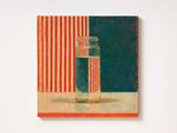
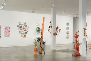
The show in Auckland features seven small, square oil paintings evenly positioned at eye height along one wall. Each depicts one or two objects placed on a table. While such arrangements inevitably recall the long arc of still-life painting—from Dutch vanitas onwards—Rae resists the symbolic and narrative frameworks historically attached to the genre. Rae is not interested in the symbolist or narrative associations that traditionally attach to still-life compositions. Since the late 1990s, she has titled her works numerically, sidestepping associative readings in favour of a more direct engagement with form and perception.
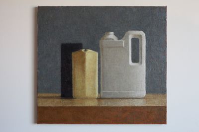
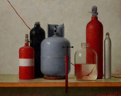
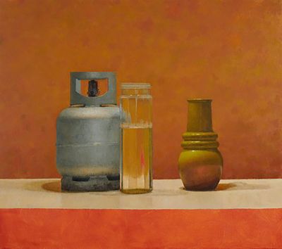
Rae’s practice occupies a charged threshold between abstraction and representation. The objects—a Bakelite bowl, cubes, a piece of Japanese cloth, a cream jar—are ordinary, often sourced from second-hand shops or the studio itself. Their appeal lies less in what they signify than in what they do: the formal challenges they pose, the way their contours and surfaces can be both described and abstracted.

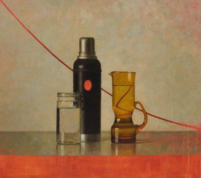
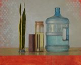
Each painting distils close observation into a calibrated interplay of geometry, line, and colour. In SL477 (2023), a glass preserving jar filled with water registers the subtle inversion produced by refraction, while a red-and-cream striped cloth introduces a rhythmic structure that both anchors and complicates the composition.
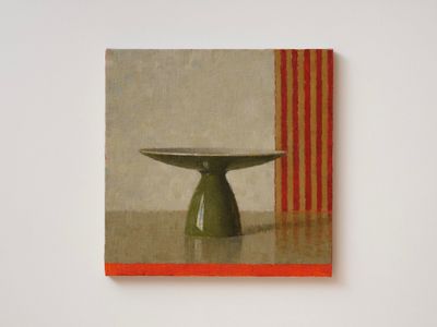
Yet the works never fully relinquish their attachment to the world. They remain tethered to what is before Rae in the studio—light, atmosphere, and spatial relations—held in a delicate balance between depiction and dissolution. In SL478, the linear folds of cloth carry a faint hum of gold, as if evening light were glancing off the interior of a Bakelite bowl.
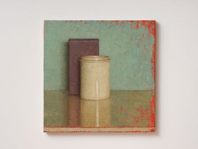
Throughout, Rae stages a quiet tension between the illusion of three-dimensional space and the material fact of the painted surface. In SL481 (2023), a purple oblong box and a creamy cylindrical jar are carefully modelled through layered applications of paint, their volumes articulated by a single light source. Yet the turquoise ground thins to reveal flashes of red underpainting, while the unframed edges expose raw canvas, primer, and drips—reminders of the work’s construction.
When we spoke at the opening of the exhibition, Rae returned to this duality, at one point pinching her thumb and forefinger together as she reflected on the peculiar condition of human consciousness: the experience of being, simultaneously, object and subject. Her paintings, in their restraint, invite a similar attentiveness—subtle propositions that ask viewers to reconsider how they inhabit, and perceive, the world.
AD: Your father was a painter and you learned to paint in a very traditional style from the age of 12. Could you speak about his influence?
JR: That’s right. I grew up watching my father paint and began formal education in drawing and painting in my early teens. My father didn’t exhibit his work very much; while it was important to him for people to see his work, I think he found the idea of exhibiting difficult.
Some artists are very sensitive to judgement, and back then certain aspects of the art world environment in Australia were not particularly friendly to representational painting. He was creating a kind of representational painting at a time when it seemed to be becoming irrelevant in contemporary art circles.
AD: You talk of representational painting becoming unfashionable during your father’s time, but the art world has recently really embraced representational painting. How do you feel about that?
JR: [Laughs] I say, welcome back!
AD: Despite your father being a painter, and you learning to paint very early, you didn’t initially pursue a career as an artist. Why?
JR: I wasn’t sure what to do with myself in my early twenties, and a career in painting seemed unlikely if not impossible. Instead, I studied for an arts degree at Sydney University. I enrolled in English language and literature—I loved poetry.
I was in a fairly messy emotional state and lost confidence, discontinuing my English Literature studies twice consecutively, which prevented me from re-enrolling in that department. Seeing the university counsellor was not so normal back then and never occurred to me. And that history led me by default to painting. I am glad it worked out like that.
AD: You did eventually complete a degree in Fine Arts (History) at the University of Sydney. Do you think that coming to painting initially via other disciplines impacted you?
JR: Yes, I think it made me more analytical. But what really influenced me was my husband and I moving to live in New Zealand.
AD: In what way did the move to New Zealand influence you?
JR: New Zealand gave me distance and helped me get some perspective on my roots.
Despite a brief revival of interest in representational painting in the mid-1980s, painting in general was becoming increasingly unfashionable when I was starting out in Sydney. Nevertheless, and perhaps naively, I could not believe that the sensitivity my father brought to figurative and representational painting would not be valued in the contemporary art environment.
Coming to New Zealand presented me with a different approach to Modernism, one more related to the English approach. I was aware of English painters like Ben Nicholson, his father William Nicholson, and Paul Nash. Something about the way Nash constructs his paintings and uses underlayers really impressed me. There’s a directness to his work, no fuss. I don’t think you would recognise his influence in my work, but his work had an impact.
In New Zealand, there was also an approach to geometric abstraction that I felt more in tune with for some reason. Painters like Walters and McCahon really resonated with me.
AD: How do you define your work’s relationship with abstraction?
JR: I am interested in negotiating the relationship between the traditions of representational painting and Abstraction in my work, but I don’t really believe the distinction holds because all painting is ‘abstract’. And as Morandi is supposed to have said ‘there is nothing more abstract than reality.’
“I have always been very sensitive to the emotional effects of light, not just in painting.”
The older I get, the less I trust my eyes and the more I think I understand this remark. Morandi’s paintings are refined meditations on the tension between two established traditions in Western art—representation and Abstraction. He employs every trick in the book to play off the tensions between painting as illusion and object. False attachment, perspectival distortion, and painterly materiality sit in wonderful balance with acute observation, formal balance, and tone/colour relationships. He is the ultimate painter’s painter.

AD: French philosopher Maurice Merleau-Ponty’s writing also influenced your practice. Why did his work appeal to you?
JR: Yes, his writing was a big influence and continues to be a reference point for me. I don’t pretend to understand the complexities of his philosophical tomes but essays such as ‘Cézanne’s Doubt’ [1945] and transcripts of lectures broadcast on public radio are quite accessible.
It is significant that the work of artists influenced his thinking. At one point, he refers to Albrecht Dürer‘s famous drawing of hands at prayer in the collection of the Albertina [Museum] to illustrate the mysterious fact that we are subject and object both—we are immersed in the world, and yet this connectedness often eludes us.
The challenge to Descartes’ dualism suggests that the Cartesian split—that I am here and separate from objects and the rest of the world—is a useful but essentially false dichotomy. Merleau-Ponty was interested in how the work of certain artists helped him think about how we inhabit the world.
While I was at Sydney University, I enrolled in a first-year philosophy course, which included a unit on the history and philosophy of science. At some point, I encountered the phrase ‘the theory laden-ness of observation’, which seemed to hit me between the eyes.
Anyone who has attempted to draw knows that one of the problems with say, something like foreshortening, is that you see what you expect to see. A simple example of this is legs. Everyone knows that legs are long, but the angle of observation can compress the shapes we see. We struggle with foreshortening because we draw what we know rather than what we see. In this sense, learning classical objective drawing can be thought of as a template for critical thinking because it pushes us to reflect on our assumptions.
AD: That reminds me of an article I read recently on this neurological state of synaesthesia, a rare condition that causes the senses to intertwine, so you hear music but see shapes, or hear a name and see colour.
JR: Synaesthesia is interesting for what it might teach us about our relationship to ‘normal’ vision, which can be very perfunctory and instrumental. I think most artists approach vision as much more complex than normally assumed and involving elements of other senses.
It’s important to me that people see my work first-hand because it engages tactile elements and aspects that relate to depth of perception, which can’t necessarily be seen on screen, and which articulate certain ambiguities. I think of these characteristics as small flags that complicate how someone might digest them.
Most of the time, we use our vision simply to navigate the world. Painting can slow this process in ways that anyone can apprehend if they take the time. It is important to me that people who don’t know a lot about art still feel a pull towards my paintings.
AD: In a profile for Art Collector magazine, Justin Paton described your work as follows: ‘Though the works don’t trade in obvious political content, doubt is where their currency lies. They remind us not to rush into judgment but to hold fire and open our eyes.’
JR: [Laughs]. Oh, he’s very good. I remember reading that and thinking, ‘You angel’. I think that he is referring to the doubt, the ambiguity that is generated in viewers.
I am not as interested in the psychological responses that my work might evoke as I am in this ambiguity. I am also interested in generating something that holds the attention. If there is strength in my work, then perhaps it is this.
AD: You sometimes refer to your paintings as object paintings, rather than still lifes. Why?
JR: Art cannot escape its history—it is there whether we like it or not. Painting carries an enormous historical weight, and I am very aware of the genres and traditions. I am not as interested in the aspects of symbolism associated with the genre of still life as I am in the formal strengths of the genre, and its association with the beginnings of Modernism and Abstraction.
AD: You have worked in other mediums, such as video in 2013. Could you tell us about these works?
JR: Well, I am not a video artist, but I have an enduring interest in certain approaches to video art, as distinct from cinema. In 2013, I made a series of three linked videos that I recall someone saw and described as ‘lessons in how to look at my paintings’.
The approach is very simple. The reference point is still life and the camera is stationary. A very narrow depth of field travels across a table top and a series of objects come slowly in and out of focus. I wanted it to feel both dreamlike and concrete.
AD: Maybe the person who commented on them was referring to the idea of contemplation.
JR: Yes, maybe that’s what I like best about ‘duration’ in video—it slows you down.
AD: Can you discuss your use of colour?
JR: The colours in these recent paintings are stronger perhaps. I have also used some different backdrops. In some of the paintings, I used a striped piece of Japanese cloth that provided opportunities for me to develop certain formal solutions.
Refractions and reflections also offer up the opportunities I am often looking for—say, for instance, a vertical to counter the strong horizontal of the table top. I enjoy finding formal solutions while working within the limitations of the studio.
Our relationship to colour fascinates me. I remember my mother saying that colours intensified for her as she got older but maybe you just notice such things more as you age. The relationship between colour and tone is endlessly interesting. I have always been very sensitive to the emotional effects of light, and not just in painting.
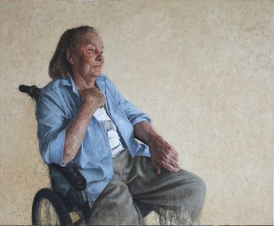
AD: Your portrait of your mother [Portrait of the Artist’s Mother - Val at 93 (2018)], is very beautiful.
JR: Thank you—I think that it might be my best portrait so far. In her last couple of years, she developed a mild form of dementia that caused her to gradually recede, and I found it was easier to paint her as a result.
In the painting I wanted the background to appear slightly luminous, as though she was moving into a place of light. Although she was a lapsed Catholic, she never really stopped being Catholic.
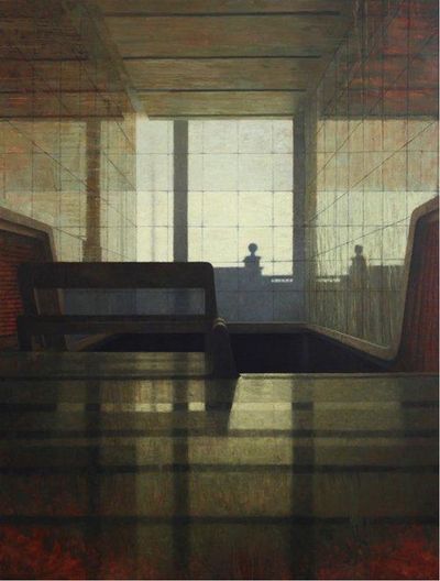
AD: You discussed light briefly before and reflection and refraction, which made me think of some of your large interior works.
JR: The studio and painting interiors are important to me—they are finite spaces. I love being outdoors, for instance, walking in cities or in the bush, but ultimately, I like to come back and be in an enclosed space.
In ‘The Shock of the New’ [BBC documentary series], Robert Hughes rather archly describes Henri Matisse as ‘the painter of the great indoors’. I need a feeling of quiet in the studio, perhaps a sense of control—of light, of distractions—in order to immerse myself in painting and a quieting of the senses.
AD: What do you do when you struggle with a painting?
JR: When I had a garden in Canberra, I used to go out and pull weeds. I am a lot calmer now, and I don’t have a garden anymore. Sometimes, I just turn the canvas around, so the painting faces the wall and I leave it alone for a while.
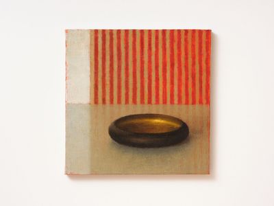
I really fought with SL476. It depicts an object that I haven’t painted before, a Bakelite bowl with a scuffed faux gold interior given to me by someone a long time ago. The proportions are subtle and difficult, but I enjoy that struggle. It’s partially why I stuck with painting gas bottles for so long—those subtle curves.
“To some extent, my paintings are realistic but they are also inventions.”
When a painting isn’t quite working, it’s like having a stone in your shoe. But I know a painting is almost finished when it has become more interesting than the object I am appearing to paint.
AD: What most challenges you when painting?
JR: It’s knowing I need to get somewhere with the painting, but not knowing where until I get there—and sometimes I don’t. If a painting isn’t working, it’s unpleasant but often you just can’t leave it alone, so you keep on banging away at it.
For me, representation in painting is more a question of finding a sense of presence and equivalence, rather than chasing verisimilitude.
People sometimes mistakenly assume that a certain quietness in my work suggests that I am a calm sort of person. Although it can be rewarding, it is not calming trying to get a painting to where I want it to be. Matisse once described the process of making a painting as being like a drunk kicking a door down. It’s eloquent, isn’t it?
I’ve come to realise that there is a strong imaginative element to realist painting. My paintings might look realistic, but they are also inventions. Writer Hilary Mantel talked about the relationship between truth and imagination in her 2017 BBC Reith Lectures. She described truth as ‘an unruly beast’.
I used to think that because I was a realist painter, I didn’t have much imagination. But it’s an imaginative act just to get something on the canvas. —[O]


A respected voice in contemporary art discourse.
Focusing on ambitious storytelling and insightful art-world commentary. Ocula Magazine publishes in-depth interviews, critical essays and timely analysis on the artists, exhibitions and ideas driving the global art world.
Learn more about Ocula Magazine
Showcasing the best of the art world.
Ocula partners with galleries from around the world to highlight their artists, artworks and exhibitions. Gallery membership is by application and invitation, with each member vetted by an independent panel.
Learn more about Ocula Membership
Specialises in the sale of major artworks.
Led by a team with deep ties to the world’s leading auction houses, galleries and collectors. Ocula’s advisory team offers bespoke services to high-net-worth clients from around the world who are looking to acquire the best of contemporary and modern art.
Learn more about our team and services