


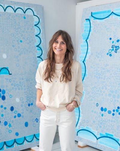
In the Studio with Amy Feldman
The American painter invites Ocula into her New York studio ahead of her first solo exhibition in Austria with Galerie Eva Presenhuber. Save to My Ocula
Blue holds a vast depth of possibilities: it is linked to contemplation, spirituality, and imagination. American painter Amy Feldman, who is known for her focus on grey, turns her attention to the colour that has captivated so many artists before her in her solo exhibition, Good Fortune (16 January–8 March 2025), at Galerie Eva Presenhuber in Vienna.
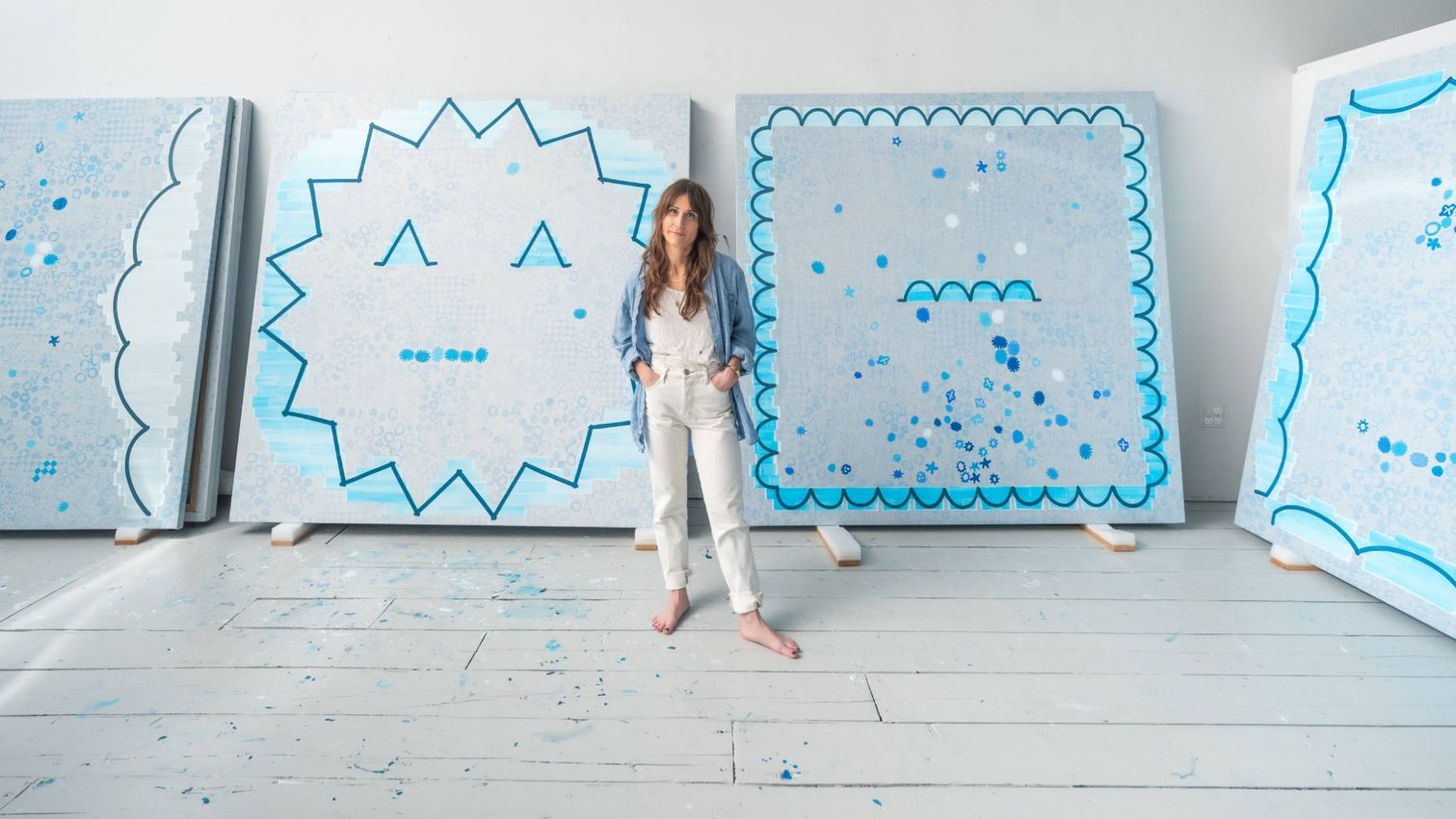
Ocula visited Feldman’s Brooklyn studio to discuss her shift to blue and her distinctive process involving potato stamps and spontaneous doodles. This back-to-basics approach to form and mark-making not only parodies her life as a mother but also serves as a vehicle for a sincere and complex investigation into the language of painting.
You’ve spent a long time exploring underappreciated grey hues. What prompted your turn to blue?
I’ve spent 15 years mining grey—its subtlety and ambiguous potential. Blue, an ally to grey, relates to the sea and sky, the vast and sublime. It’s a New Year colour, conjuring the divine, holding grace and dignity in the face of what’s to come.
I often mix cerulean, cobalt, and Prussian hues with red and yellow to make greys. I indulge in the clarity of freshly squeezed pure colour, in the seconds before my brush swirls the pigments together. I wanted my new works to pivot and pair grey with more acute colour, and reflect on the human desire to make sense of the unknown. The grey paintings invite the viewer to exist in an in-between space, while the blue works offer a way to order it.
Using blue and blue light in my paintings felt natural and aligned with my monochromatic works. The contradiction of natural blue light (from the sun) and artificial blue light (from screens and electronic devices) relates to dissonance between painted and printed marks in my work, and how they operate together.
My studio is in Red Hook is a small seaside community. I have a large window facing the water and big, square skylights. During the day, blue light fills the studio and the skylights cast shadows on the paintings, walls, and floorboards. The skylights frame this shifting blue throughout the day, capturing moments that are meaningful or of no matter. I watch the sunset over the Erie Basin each night, aware of this shifting blue, but hadn’t thought about it in the context of grey until I began making an exhibition for Vienna, which will open at the start of the new year.
Could you highlight one or two works in the show where these blues shifted the meaning or mood?
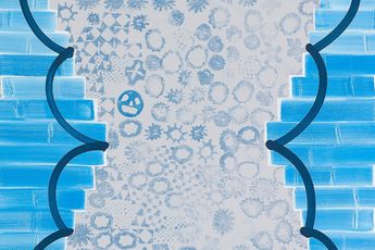
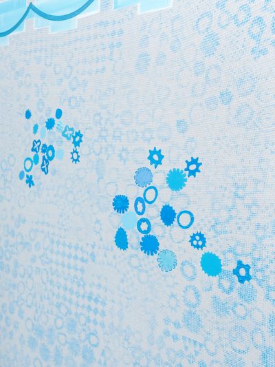
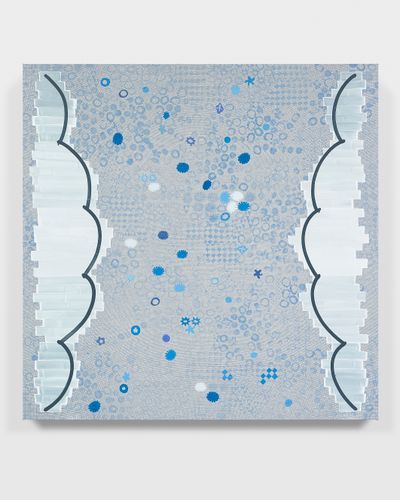
The cerulean stripes along the edges of Celestial Screen and Wonder Margin (both 2024) build a container for the image inside the frame. The images are built by painting over forms I printed into the ground, using various shades of blue.
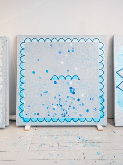
In Wonder Margin, the blues relay the feeling of a snow globe, a shake of time, or my imagining of Vienna in winter. Teeth-like shapes divide the composition, creating a horizon within the abstraction—where sky meets sea, dividing the world above from below.
Small blue forms within the borders of Celestial Screen are painted with care. Each has a unique quality, whether ultra-flat, glowing, or textured. The random patterns in the ground are ordered by what I choose to paint, and together, the shapes form a face. The image is both obvious and obtuse, reflecting the human desire to find the familiar in the sky. The weave of the canvas resembles a screen, like a television in the heavens.
In Good Fortune (2024), translucent blue stripes are painted over a star shape. A similar star, made with a potato stamp, is repeated in the patterned ground, while the larger form appears to represent the stars’ final variation. The blue brick stripe feels rigid but airy, its seductiveness rooted in its colour. I love that contradiction of order and entropy coexisting within the painting. The star form is bold, but it could almost collapse should one brick fall and dissolve into the atmosphere.
I understand your paintings start from small doodles. Are these a conscious process?
For me, doodling is a low-risk way to generate ideas and find forms. It’s conscious but involves letting go. I struggle with making ‘finished’ drawings, so I just create variations and lose myself in the lines. Some doodles become paintings, while others exist on their own. I also make more structured drawings with notes and measurements to plan the paintings—these are also a really important part of my process.
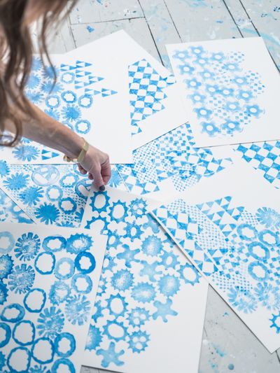
Your hand-carved potato stamps are a fascinating part of your process, especially when they rot and change over time. How do you work with that unpredictability?
I use potato stamps for their organic nature and as a rudimentary form of printmaking. The process is time-sensitive—once cut, the potato begins to shrivel and rot, limiting the window for successful printing. This fleeting quality mirrors how I approach marks on canvas: once made, they are final.
The potato’s gradual transformation means each print is slightly different, creating variation within repetition. After a few hours, the edges wither and the impressions shift, appearing very different to when I started stamping. I find this unpredictability beautiful—it becomes a mediation on time.
I read that in your studio are paintings by your husband, Zach Bruder, and collaborations with your daughter. How do they influence your work, and how do you support each other’s practices?
Our family is full of love and generosity. Our four-year-old daughter is in my studio everyday, so it’s no wonder that I’ve recently used fingermarks and potato prints to compose paintings. Her uninhibited approach to painting and drawing is pure and inspiring—watching her work and discover her own hands has been one of our greatest joys. We both have our own unique way of organising things, a trait which likely shows in my compositions, and our home is filled with mini still lifes and shrines we create together.
I fell in love with Zach and his work, and our life feels like a collaborative creation. He’s profound in his thinking and fearless with a brush—the images he paints continue to seduce me. I’m often enlightened by an off-the-cuff word or phrase, or a photograph he’s taken of something that caught his eye—both circumstantial and full of meaning.
Your work titles—like Magic Matter, Sky Secret, and Celestial Screen—are concise yet vivid. Where do they come from?
Titles typically have two parts, creating a rhythm that doubles with the forms, like the rhythm of a heartbeat (da-Dum). They act as a pulse and cue for humour. This stems from my early exposure to Shakespeare. Growing up in Newburgh, New York, I found community in a local Shakespearean theatre group led by the celebrated actor Samuel E. Wright. There, I learned the importance of presence, observation, and subtlety of gesture. All my paintings hold a tension with the edges while commanding the centre stage, focusing like a spotlight.
What do you do for fun besides painting?
Yoga and long walks with a purpose.
The artist Josh Smith told us that his biggest revelation about Vienna was how delicious the water tastes (’like something very expensive’). What are you looking forward to with exhibiting in and visiting Vienna?
I look forward to the art, architecture, people, and the little discoveries I can bring back to the studio. While researching for Vienna I learned about Bleigiessen, a New Year’s Eve tradition of using molten lead to predict the fortune of the year ahead. The shape of the lead, which hardens when poured into water, is deciphered. I’m fascinated by this process of transformation and its relationship to abstract painting. I never miss a chance to have my fortune read and look forward to learning more about this tradition. —[O]
Selected Artworks
Main image: Amy Feldman in the studio. Courtesy Ocula. Photo: Charles Roussel.


A respected voice in contemporary art discourse.
Focusing on ambitious storytelling and insightful art-world commentary. Ocula Magazine publishes in-depth interviews, critical essays and timely analysis on the artists, exhibitions and ideas driving the global art world.
Learn more about Ocula Magazine
Showcasing the best of the art world.
Ocula partners with galleries from around the world to highlight their artists, artworks and exhibitions. Gallery membership is by application and invitation, with each member vetted by an independent panel.
Learn more about Ocula Membership
Specialises in the sale of major artworks.
Led by a team with deep ties to the world’s leading auction houses, galleries and collectors. Ocula’s advisory team offers bespoke services to high-net-worth clients from around the world who are looking to acquire the best of contemporary and modern art.
Learn more about our team and services