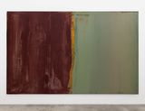
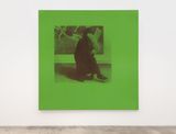
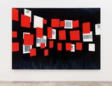
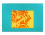
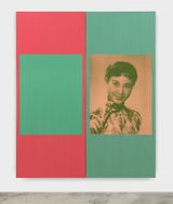
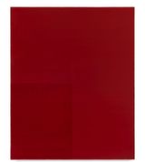
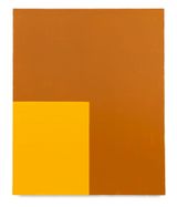
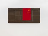
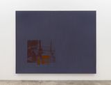
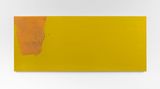
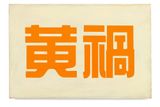
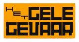
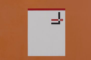
Across David Diao’s sprawling, allusive body of work, colour is a constant—wielded in service of his paintings’ conceptual rigour and as the source of their visceral appeal. This focused survey is the first to centre on the artist’s elegantly brazen way with colour, charting the range of perceptual, semantic, and symbolic uses to which it has been put over fifty years.
The earliest work on view dates to the 1970s and typifies the era’s process-based abstraction, distilling the material properties of colour through a visible economy of means. Foundational paintings such as 1971–A were made using discarded cardboard tubes, found near Diao’s Soho studio when the neighbourhood still housed a thriving textile industry. Running an electrical conduit through their centres (to use as a handle), Diao converted the tubes into ad hoc squeegees, which spread the paint in even, near-mechanical swathes that he calls ‘lightweight extensions of my reach.’ By outsourcing compositional decisions to this makeshift tool—which dictated the width of the canvas, the span of each hue, and the paint’s skittering application—Diao distanced both his hand and his taste, leaving colour as ‘the only subjective element remaining’ to signal the artist’s presence behind the picture.
In the wake of post-painterly experiments such as these, Diao cycled through various hard-edged styles, unsatisfied with a purely formal approach but unsure of what came next. Following an extended hiatus from art, he reemerged with works like Glissement (1984)—paintings that motivate abstraction through explicit reference to the history of modernism. The work appropriates Kazimir Malevich’s iconic 1915 photograph of his Suprematist installation at the famed 0, 10 exhibition—an image that, as Diao notes, ‘appears in every textbook on abstract art.’ Skewed red squares representing Malevich’s twenty-one canvases seem to float atop Diao’s own, backed by a separate layer of geometries that depict the same works in grayscale from an altered perspective. The painting’s title—French for ‘slippage’—alludes to the method behind the work: Diao projected the Malevich photograph and traced the works’ outlines, then shifted the projector off-register to trace them again, creating a spatial ambiguity that gestures toward conflicts that animated modernism at its birth. For Diao, that historical tether to the outside world was a breakthrough. ‘Since 1985, if not earlier, I have sought to question that abstract painting has noreferent other than itself,’ he has said. ‘Almost all my work has a backstory.’
Works from the 1990s thus thicken colour with layers of reference, exploring the extra-aesthetic meanings of what Fred Moten would call ‘social chromatism.’ Diao’s Yellow Peril series are lemony monochromes that treat colour’s racial implications, titled after a slur for the nebulous threat that Asian immigrants were said to pose. The paintings skewer that noxious stereotype by dwelling further on cliché, translating the titular phrase into six languages in a font closely tied to their respective national identities. Colour operates as a visual shorthand for the state most succinctly in the form of a flag, and another suite of recent paintings adopts that distinctive tricolour format. Yet Diao’s contrasting solids correspond to no known region or polity, disrupting the flag’s rallying function through his rogue use of off-key colour.
That injection of colour as a jolt or a lure extends to Diao’s paintings with silkscreened imagery, through which the artist inserts himself into a modernist lineage from which he was otherwise barred. Lying 1 (2000), for instance, depicts Diao lounging in front of an expansive painting—his own artwork in the original photograph swapped out for a Jackson Pollock drip, its staid black-and-white palette redone in searing hues atop a turquoise ground. Fields of bright acrylic recur in Diao’s paintings dedicated to Gerrit Rietveld, whose storied De Stijl designs are literally deconstructed across planes of vibrant colour, meticulously laid on with a palette knife and burnished to an even glow. An ongoing series titled Polish Constructivism continues in this vein, reworking a 1929 composition by avant-gardist Władysław Strzemiński—elevating a lesser-known strain of abstraction to question the canon, who it admits and who is excluded. Diao’s aquas and purples signal his distance from the austere high modernism his work channels, transforming that (often spartan) art historical legacy into something both contemporary and personal.
Over five decades, David Diao’s paintings have dismantled the tenets of modernism from within, exploring the shadow side of its reductive geometries as a source of untapped potential. “Since 1985, if not earlier, I have sought to question that abstract painting has no referent other than itself,” he has said. “Almost all my work has a backstory.” Those accounts stem from a rigorous approach that resists Conceptual art’s veneer of detached neutrality, relying instead on deeply personal investments in art history and his own place within it.


A respected voice in contemporary art discourse.
Focusing on ambitious storytelling and insightful art-world commentary. Ocula Magazine publishes in-depth interviews, critical essays and timely analysis on the artists, exhibitions and ideas driving the global art world.
Learn more about Ocula Magazine
Showcasing the best of the art world.
Ocula partners with galleries from around the world to highlight their artists, artworks and exhibitions. Gallery membership is by application and invitation, with each member vetted by an independent panel.
Learn more about Ocula Membership
Specialises in the sale of major artworks.
Led by a team with deep ties to the world’s leading auction houses, galleries and collectors. Ocula’s advisory team offers bespoke services to high-net-worth clients from around the world who are looking to acquire the best of contemporary and modern art.
Learn more about our team and services