


David Noonan in Conversation
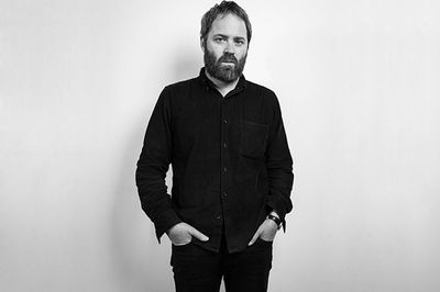
David Noonan. Photo: Mark Blower, London.


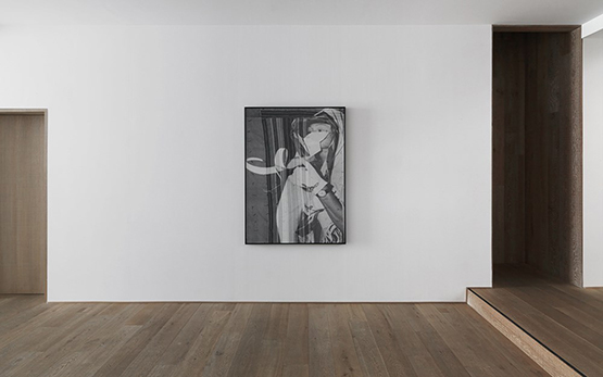
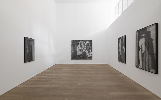
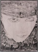
A recent solo exhibition at Xavier Hufkens in Brussels in 2015 brought together a suite of large-scale, screen-printed linen collages by the Australian-born, London-based artist David Noonan, whose practice moves fluently between film, sculpture, collage and print. As in his earlier sculptural and film works, the collages shown at Hufkens stage carefully calibrated encounters between abstract and figurative imagery, sourced from a personal archive of black-and-white and sepia photographs, archival documents, magazines, films, and his own photographs of vintage textiles.
Through a deliberately laborious process, Noonan repeatedly screen-prints selected images onto linen, then cuts, rips, stitches and glues these fragments into new compositions that feel at once resolutely figurative and strangely unmoored from any stable time or place. A sense of narrative hovers at the edges of these pictures, yet the scenarios they present—masked figures, performers, owls and stage-like interiors—remain elusive, as if glimpsed in a dream or half-remembered performance. Noonan is careful not to assign a fixed meaning to individual works; instead, he speaks of wanting his images to operate cumulatively, to generate an atmosphere that draws the viewer into a mood rather than a single, decipherable story.

Speaking with Noonan in London during Frieze week, it becomes clear that this atmospheric charge is inseparable from the artist’s ongoing interrogation of process and form. For the Xavier Hufkens exhibition, he introduced a subtle but consequential technical shift: staining the raw linen with a thin wash of warm grey pigment before printing, which expanded his tonal range while preserving the fabric’s unprimed, “natural” presence. The resulting cooler, photocopy-like palette works in concert with the linens he favours—rough, sometimes folded or patched, and often left with raw edges, visible seams and loose threads—so that the surface appears ruptured and restless. This almost trompe l’oeil tension between printed image and tactile textile support produces works that feel at once archival and futuristic, theatrical and ghostly.
In the following interview, Noonan reflects on the formative impact of his early multidisciplinary training; the evolution of his practice from painting and bleach works to collage and screen print; recent technical developments in his handling of linen and tone; and the way his masked, often androgynous figures negotiate the shifting ground between figuration and abstraction.
“There is often a sense of blurring of identity or sexuality, and an allusion to the idea of the human form as something that can be malleable, that can undergo transformation and change.”
AD: If we start right at the beginning. Was there a piece of art or something else—a particular incident, artwork, or person, for example—which represents a defining moment in you deciding to be an artist?
DN: As long as I can remember I wanted to make art, and to study it. The earliest opportunity I could do that was when I was seventeen, I was able to enrol in a pre-tertiary art course, a kind of two-year preparation course for university.
I remember that year very clearly, my world as I knew it dramatically changed—it felt like a lot of things fell into place. It was such a shift from the horrible, oppressive high schools I had attended.
We were taught a lot of subjects: drawing, photography, ceramics, painting, graphic design, craft, and art history. It was intense; it covered all the disciplines. I was overwhelmed by the breadth of it all, everything was treated equally, there did not seem to be a hierarchy of disciplines.
AD: That interaction with a number of disciplines reflects your practice in many ways. You are probably best known for your collage work, but you work using various mediums, including film and sculpture.
DN: Definitely, the early introduction to a lot of disciplines was really useful for me.
AD: After the pre-tertiary course, you then went to university and studied painting?
DN: After that course, I went to India for three months and lived in an ashram. I painted sets for productions of the Mahabharata and the Ramayana, and when I returned I started a three-year Bachelor of Fine Arts. I majored in painting.
AD: So you majored in painting, but you are best known for your collages. When and how did you start exploring collage?
DN: It was around 2003. I had just spent a year in New York at PS1, and when I returned to Melbourne I didn’t have a studio, so I started collecting books from charity shops and second hand bookshops, and with this found material I started making quite small paper collages.
This was a way for me to make non-studio based work, but also a way of working with found images. It was at this time that I started building an archive of images that interested me, but were not necessarily used in the collages. A lot of it I didn’t know what to do with until years later.
I was also still painting, and around this time I began making bleach paintings.
“There is something very sculptural or object like about figures...”
AD: Tell me about the process of making the bleach paintings?
DN: It was a bit like a photographic process. By applying different dilutions of bleach to dyed black cotton I found I could get quite a large tonal range. It was painting in negative really, taking the pigment away rather than applying it. I used the process to create monochrome pictures of different scenarios, which I pieced together from photographs I had taken of various situations I had staged.
So in some ways the pictures were made with a collage process: bringing different images together to make an invented scene, for instance a figure from one image placed in an interior from another source, etc. So it didn’t feel like such a great leap to take this process away from the bleach technique into screen-printing.
I moved to London in 2005, and did a show of the bleach paintings at HOTEL, the pictures had been made in Melbourne. Once the show was over, and I had found a studio and kind of acclimatised to London, I felt like I had come to the natural end of that body of work and the bleach process.
It was a little like when I moved back to Melbourne after New York; I had this compulsion to collect images, to build up a new archive in a new city, and sort of start something new, something relevant to where I now was. I remember I did a lot of trawling through charity stores and antiquarian bookshops, which was a way for me to discover London and also collect quite different material than I had been able to find in Australia.
AD: Can you please tell me about one of your first pieces using screen print that led towards the style you have become known for, of super-imposing prints?
DN:


It was for a show at Foxy Production in New York. I made these quite small (compared to what I’m doing now), double exposure images (where two images are superimposed). Thinking about it, they have a similar palette to the works in my current show at Xavier Hufkens; they were screen printed on a kind of grey ground, which is what I have been doing in my most recent work. After this show I started printing on wooden panels, and then unprimed materials like jute and linen. The scale changed quite a bit too.
AD: Tell me about the work you have created for Xavier Hufkens’ current exhibition? I understand the palette you mention has a lot to do with discovering a new technique of working with the base material?
DN: As I mentioned most of my work is screen-printed onto unprimed natural textiles, usually the unprimed side of painter’s linen. I then cut and tear the printed images into sections, and collage them into the final pieces.
With the Xavier Hufkens show, I wanted to use a much cooler palette than I had used since the early works we talked about before, almost the same kind of tonal aesthetic of a photocopy. I could not find natural linen that allowed me to do this, so I worked on a process of screen-printing using a very thin flood coat on natural linen that was more like dying the linen rather than heavily priming it. This allowed me to control the colour of the linen, while still allowing it to behave and look like a natural material.
AD: Tearing the linen and leaving the edges raw very much brings the surface of your works alive.
DN:


Yes, the surface of the picture is important to me. When I first started using silkscreen printing I made quite straight prints onto flat surfaces, like primed linen or wood, but I found the flatness of the surface unsatisfying.
I loved the flatness of Warhol’s pictures as this was so intrinsic to his overall aesthetic, but I wanted to find a way of making my pieces have a surface more like a painting than a flat print. I am making unique pieces with a process designed to make [use of] multiple images.
I used this aspect of the process to my advantage by making many prints of the same image that I can tear and cut up to assemble into one piece, this way I can layer the surface through collage, and also make larger works by piecing together the image in sections.
AD: So what is the first step in making a work?
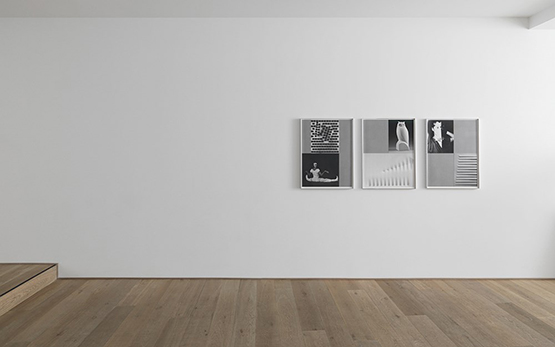
DN: I start with ideas and preliminary notations. I often lay out images on tables around the studio or pin images on the walls. With the Hufkens show, something that I noticed halfway through making the work was that I seemed to subconsciously, or perhaps just formally, concentrate on singular, individual figures (apart from one piece where there is this type of conversation happening between two performers).
There is something very sculptural or object like about the figures, and of course the images of the owls were from actual Art Deco sculptures. Spatially, all of the pictures seem to have quite a shallow depth to them as well.
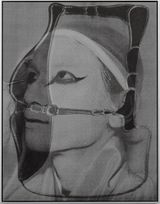
AD: Masks feature a lot in your work. I was reminded of Claude Cahun and her use of masks. What is it about the idea of the ‘mask’ that so attracts you to use it in your work?
DN: It’s something which I’ve always found interesting. Masks are like make-up or costumes, which are all about notions of transformation or disguise. I think that is one of the reasons I have been drawn towards images of theatre, or people in preparation for performance.
There is often a sense of blurring of identity or sexuality, and an allusion to the idea of the human form as something that can be malleable, that can undergo transformation and change.
Masks can also be used to abstract the face or body. In the Hufkens show, there is a group of pictures that have people wearing geometric and quite wild paper masks. The masks abstract the figures, and then the overlay of the geometric textile image abstracts them further; it’s like the elements that make up the picture—the figures, the masks and the textiles—are being folded into one another.
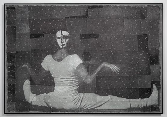
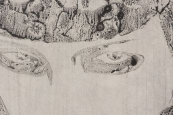
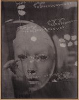
AD: The mask appears in one particular image in the Hufkens exhibition that I would like to discuss; it’s the image of the dancer sitting in the splits, but with her back to the audience and a mask on backwards. It is striking image, but also a disconcerting image.
DN: It is a disconcerting image, but to me it’s actually more disorienting, the body is literally being confused or abstracted by the mask being worn the wrong way around. The body appears less human and more doll-like. The pose of the figure, with her legs flat along the floor and her arms held out, makes me think of a marionette puppet that has been allowed to rest on the floor or stage.
I find the mask itself really captivating and beautiful, it is almost Picasso-like in that it depicts a face seen from the front and side simultaneously with a large single black tear on the cheek of the face.
The mask is the focal point of the picture. The overlay, or superimposed image is of a folk art quilt that was made up of many, many pairs of jeans, taken apart and sewn together and then sewn all over with little tufts of thread, which make a pattern that covers the whole quilt.
It reminds me of Memphis design patterns from the early 1980s. The quilt overlay literally breaks up the figure through the patchwork, which is collaged together in the same fashion as the original textile. The tufts of thread have a trompe l’oeil effect of looking like they are actually sewn into the picture.
AD: Where would you want to go next?
DN: I think there are definitely things happening in this body of work that I want to push, certainly the palette shift in the work feels significant for me, and using steel tray frames as opposed to wooden ones shifts the materiality of the pictures ... It’s a little early to say, I am not really sure. I just know that things are changing and moving ... A project that I am working on at the moment is an artist book with common-editions. A lot of the new ideas in the work will be processed in the making of this publication. It will be published next Spring. —[O]
Main image: David Noonan. Photo: Mark Blower, London.


A respected voice in contemporary art discourse.
Focusing on ambitious storytelling and insightful art-world commentary. Ocula Magazine publishes in-depth interviews, critical essays and timely analysis on the artists, exhibitions and ideas driving the global art world.
Learn more about Ocula Magazine
Showcasing the best of the art world.
Ocula partners with galleries from around the world to highlight their artists, artworks and exhibitions. Gallery membership is by application and invitation, with each member vetted by an independent panel.
Learn more about Ocula Membership
Specialises in the sale of major artworks.
Led by a team with deep ties to the world’s leading auction houses, galleries and collectors. Ocula’s advisory team offers bespoke services to high-net-worth clients from around the world who are looking to acquire the best of contemporary and modern art.
Learn more about our team and services