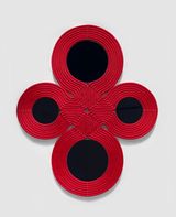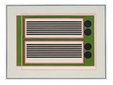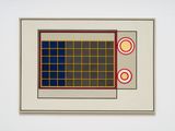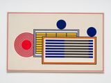

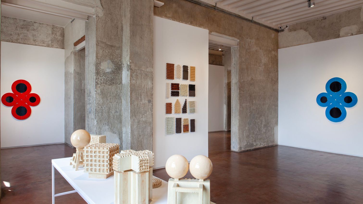
Most works of art provoke a feeling of doubleness in the viewer. There’s a legible image or idea, and then a mood, something sensual and affective, which is more difficult to articulate. An image might engage the mind and imagination, transporting a viewer to the past, or to an otherworldly realm. The colours or composition of that same image might send a shiver down a viewer’s spine, or make them swoon with delight. These are simultaneous experiences, and while some works might emphasise one mode over another, any successful work will conjure a dynamic dance between the two. Lubna Chowdhary’s recent Markers, Polytypes and Verso Recto works offer the viewer an intense experience of doubleness. If their geometric forms recall the pages of a sacred text or evoke a journey to a modernist utopia, their lush, layered glazes entrance the senses.
Any artwork is a blend of the legible and the corporeal: that was one of my first thoughts when I read Chowdhary’s title, Double Consciousness. But ‘double consciousness’ is also a theory, outlined by W.E.B. Du Bois, in which he seeks to articulate ‘the sense of always looking at oneself through the eyes of others’. While Du Bois developed his theory to describe his own experience as an African-American, it’s adaptable to different circumstances. Chowdhary was born in East Africa, raised and educated in the North of the UK, and draws upon her South Asian heritage in her work. She makes ceramics, a medium that was overlooked by the dominant discourses of contemporary art when she began her career. As an artist with a hybrid identity, she has faced the restrictive perspectives of others, and a persistent sense of doubleness. These are all useful considerations when looking at Chowdhary’s recent body of work, but I’d like to suggest that doubleness can also act as a metaphor for hybridity in a broader sense, and as a force for liberation.
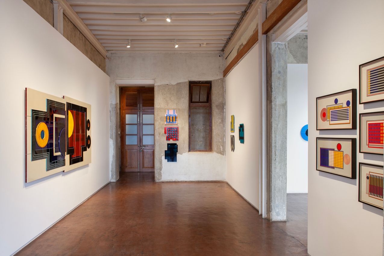
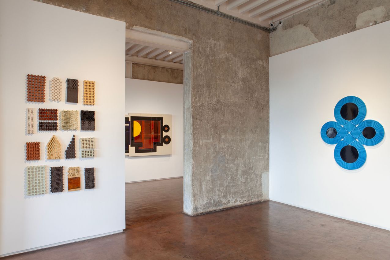
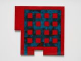
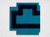
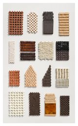
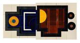
The grid in Marker 109 recalls the heavy bars of a medieval prison, an association offset by the seductive colours that make the work more of an object of contemplation than a depiction of a dungeon. Marker 103 looks like a fragment of a map, while Marker 104 or Marker 111 both evoke snippets of architecture. With all of these Markers, there is a strong sense of doubleness: we feel a simultaneous desire to read or understand the geometric forms while getting lost in the luscious surfaces. The sensation of looking at the layered glazes – the subtle translucencies and juxtapositions of colour – may be the dominant experience for most viewers. The Markers are thus abstract paintings, exulting in the earthy delights of their medium. The strong, parallel and intersecting bars might also bring to mind fragments of walls or buildings, or the playful minimalism of Blinky Palermo. For the artist, however, the geometric forms of the Markers allude to Kufic calligraphy – and thus to the history of writing, sacred texts, and the kinaesthetic motion of reading. Modernism traded in purity, proposing an endgame for painting, but Chowdhary finds a way to both celebrate and extend its legacy with the medium-specific delights offered by ceramics, and a nod to a non-European tradition.
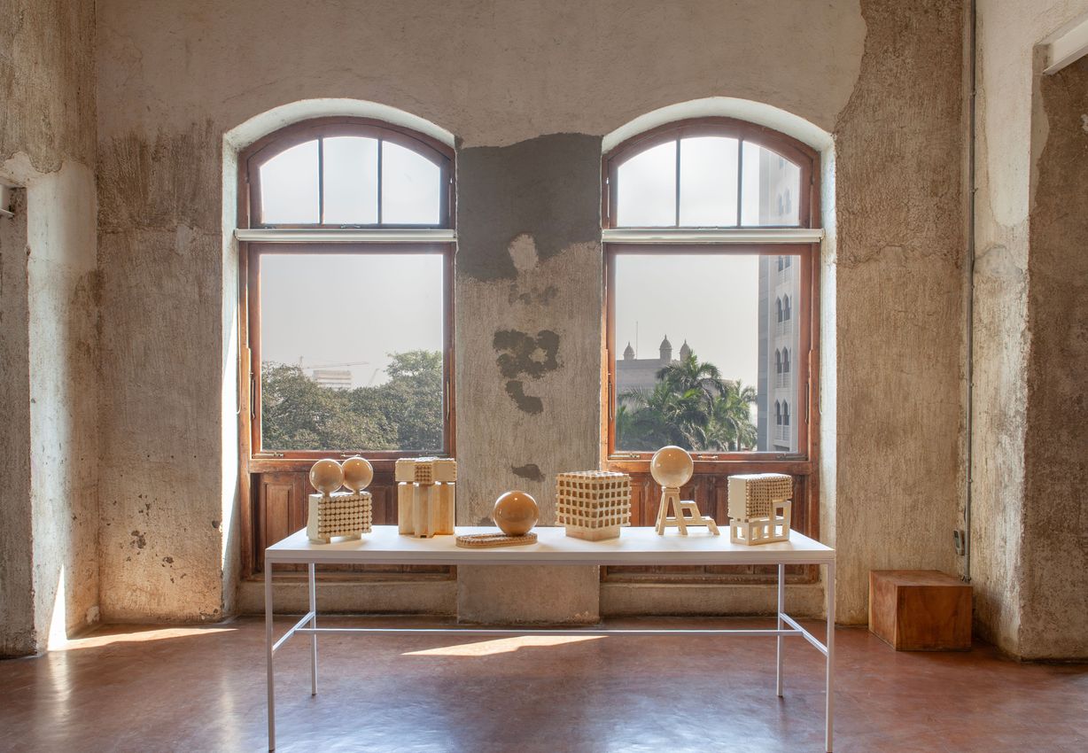
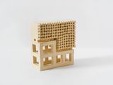
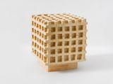
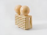
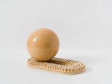
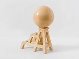
Chowdhary’s Polytypes resemble scientific or architectural models: small, polymorphic structures that appear to incarnate ideas better expressed as three-dimensional forms than in words. A work such as Polytype 5 echoes the form of cerebral, modular sculptures by Sol LeWitt, yet with a warmth and scale that makes it tactile, appealing to the body, if not the skin, or even the palm of the hand. Polytype 2 expands on that structure, with two L-shaped forms stacked vertically, the top form replete with small, tubular extrusions that form an almost organic texture, like the tentacles of a sea anemone. What is it? A model for a building, a cooling system, a device to absorb thought? I prefer to see it as an open-ended proposal, an object of contemplation, a scholar’s rock for an era of postmodern hybridity. Chowdhary introduces spherical forms in Polytypes 7 and 8. Polytype 7’s sphere is nestled amidst an oval track of tentacles, as if it might roll from one side to the other. Polytype 8 introduces a note of precariousness, if not humour, with the sphere sitting atop a kind of step-ladder, a plump ball about to fall away. If the grid-like works play on the modernist, anti-narrative structure of the grid, the sphere introduces an element of potential energy, even potential narrative. Agnes Martin considered her horizontal lines an invitation for the viewer to imagine looking over a desert horizon. Similarly, we can’t look at one of Chowdhary’s Polytypes without a feeling of being somewhere, a place we might one day visit. As models of virtual space, characterised by latitude, texture and rhythm, they become microcosms of consciousness, appealing simultaneously to our imagination and our sense of touch.
The titles Verso Recto 1 and 2 invert the conventional Western order of a book, changing the sequence to right to left, the reading order of many Asian languages, including Urdu and Arabic, and Chinese and Japanese. The scale of the multi-tiled works transforms them from folios into large abstractions, though labelling these works ‘abstract’ is a limiting, or unsatisfactory characterisation. If the alternating touches of cool and warm glazes and the mesmerising depth of the surfaces make the Verso Recto works unapologetically sensual, stand back and a different register emerges. These are open-ended picture planes in which we might see ideas and images start to take shape. Verso Recto 2 looks like an astrological chart, or ancient calendar, with a harvest moon rising amid some midnight blues on the left, a sun warming a field of ripe grain on the right panel. Verso Recto 1 brings to mind a map or a system, evoking one of Francis Picabia’s ‘machine’ paintings, such as Voila La Femme (1915). Chowdhary brings a spirit of playful subversion to the tradition of modernist purity in both these large, multi-panel ceramics and her small-scale Folio series. Whichever direction we read, or from whatever perspective, a folio is always an image of doubleness, inviting the viewer to play across its spaces.
If Verso Recto 1 and 2 are invitations to get lost in their lush surfaces, they are also calls to consider all the ways in which perspectives, systems, maps and artworks alter the way we apprehend the world, and ourselves. Abstraction has always flirted with the guilty pleasure of wanting to have a mimetic relationship to some ineffable idea. This Kandinsky is about music, this af Klint about a spiritual realm, this Rothko about doom. By drawing from her cultural heritage, as well as revelling in the unique characteristics of the ceramic medium, Chowdhary introduces ideas of complexity and contradiction into a tradition that has been all too occupied with transcendence, self-expression or purity. Chowdhary’s work creates instead a space for reflection. John Ashbery’s poem ‘Wet Casements’ begins with a speaker wondering how it would feel to experience ‘the look of others through / Their own eyes’. Frustrated by the impossibility of the task, he decides to build a bridge upon which ‘people may dance for the feeling / Of dancing on a bridge’. This is not a task only for the intellect. He builds a bridge where mind and body meet. He then sees his ‘complete face’ not through the eyes of others, nor even his own eyes, but in the stones of the bridge, polished to a reflective surface by all the dancers. Chowdhary offers the same service: she builds a bridge, a place where everyone can dance. It’s a platform from which the artist might catch a glimpse of her own hybrid identity, and where the viewer can reflect upon that tender, ineluctable doubleness that makes us human.
Courtesy Jhaveri Contemporary, Mumbai. Text: Craig Burnett, 2025.
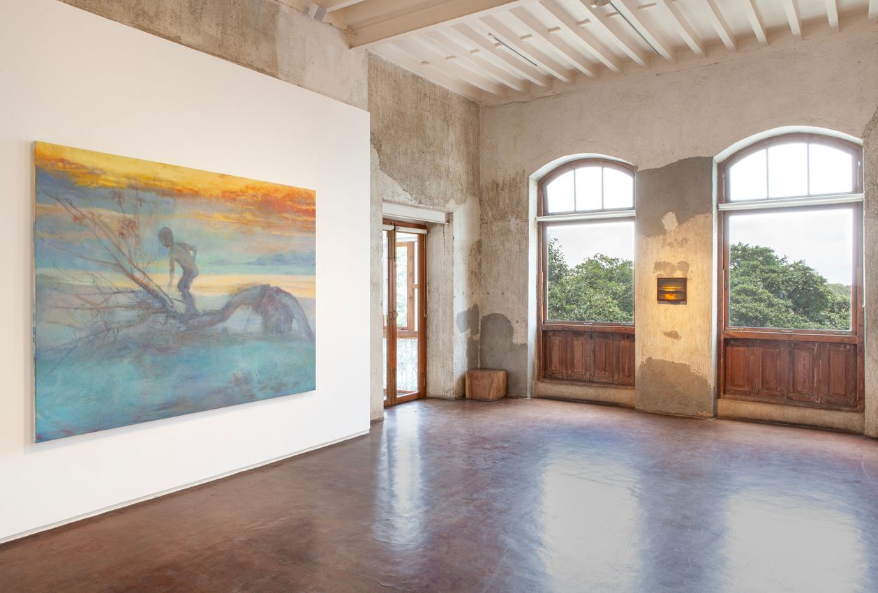


Lubna Chowdhary subverts the traditional context and utility of her chosen medium—clay—to address a longstanding preoccupation with urbanisation and material culture in her art. Shaped tiles, sculptural objects, and spatial installations in ceramic constitute a distinctive oeuvre that bridges the disciplines of architecture, craft, design, sculpture, and painting.

Jhaveri Contemporary was formed in 2010 by sisters Amrita and Priya with an eye towards representing artists, across generations and nationalities, whose work is informed by South Asian connections and traditions. The gallery’s dedication to original scholarship, engendered through its carefully crafted shows, is one of the many ways it distinguishes itself. Entwined with this philosophy is another guiding principle: showcasing the heterogeneous practices of long-celebrated luminaries as well as emerging talents, often in generously interrogative conversations. With a focus on mining lesser-known art histories, Jhaveri Contemporary facilitates dialogue between artists, curators and historians to add to the wider field of art. Estates served by the gallery include Mrinalini Mukherjee and Anwar Jalal Shemza.

A respected voice in contemporary art discourse.
Focusing on ambitious storytelling and insightful art-world commentary. Ocula Magazine publishes in-depth interviews, critical essays and timely analysis on the artists, exhibitions and ideas driving the global art world.
Learn more about Ocula Magazine
Showcasing the best of the art world.
Ocula partners with galleries from around the world to highlight their artists, artworks and exhibitions. Gallery membership is by application and invitation, with each member vetted by an independent panel.
Learn more about Ocula Membership
Specialises in the sale of major artworks.
Led by a team with deep ties to the world’s leading auction houses, galleries and collectors. Ocula’s advisory team offers bespoke services to high-net-worth clients from around the world who are looking to acquire the best of contemporary and modern art.
Learn more about our team and services