

The art world in focus
Subscribe to our newsletter for news and insights on artists, galleries and exhibitions.
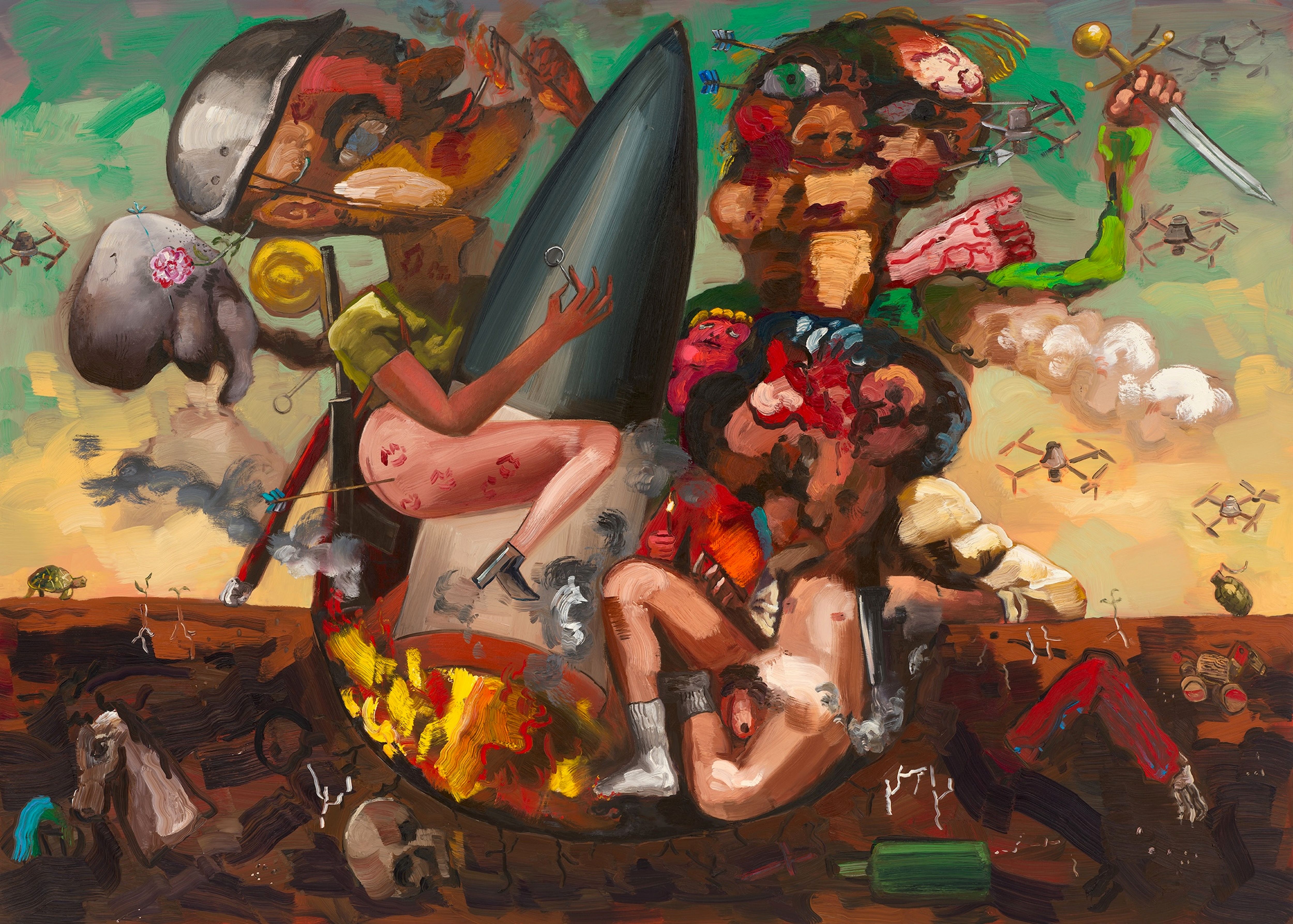
Three figures cluster around a flaming missile, set within a desert landscape at sunset. One straddles the rocket, posterior exposed, lipstick kisses adorning their bare thighs, and an arrow emerging absurdly from one buttock. Another holds a sword aloft as further arrows emerge from their face, cheeks lavished with rouge and lips sweetened with deep red lipstick. In the hazy sky drones circle the group, as two defiantly strike matches to light their cigarettes, and a tortoise makes a solitary procession across the horizon. This is Dana Schutz’s The Department (2026), in which her carnivalesque dark humour and eye for sardonic detail are made clear.
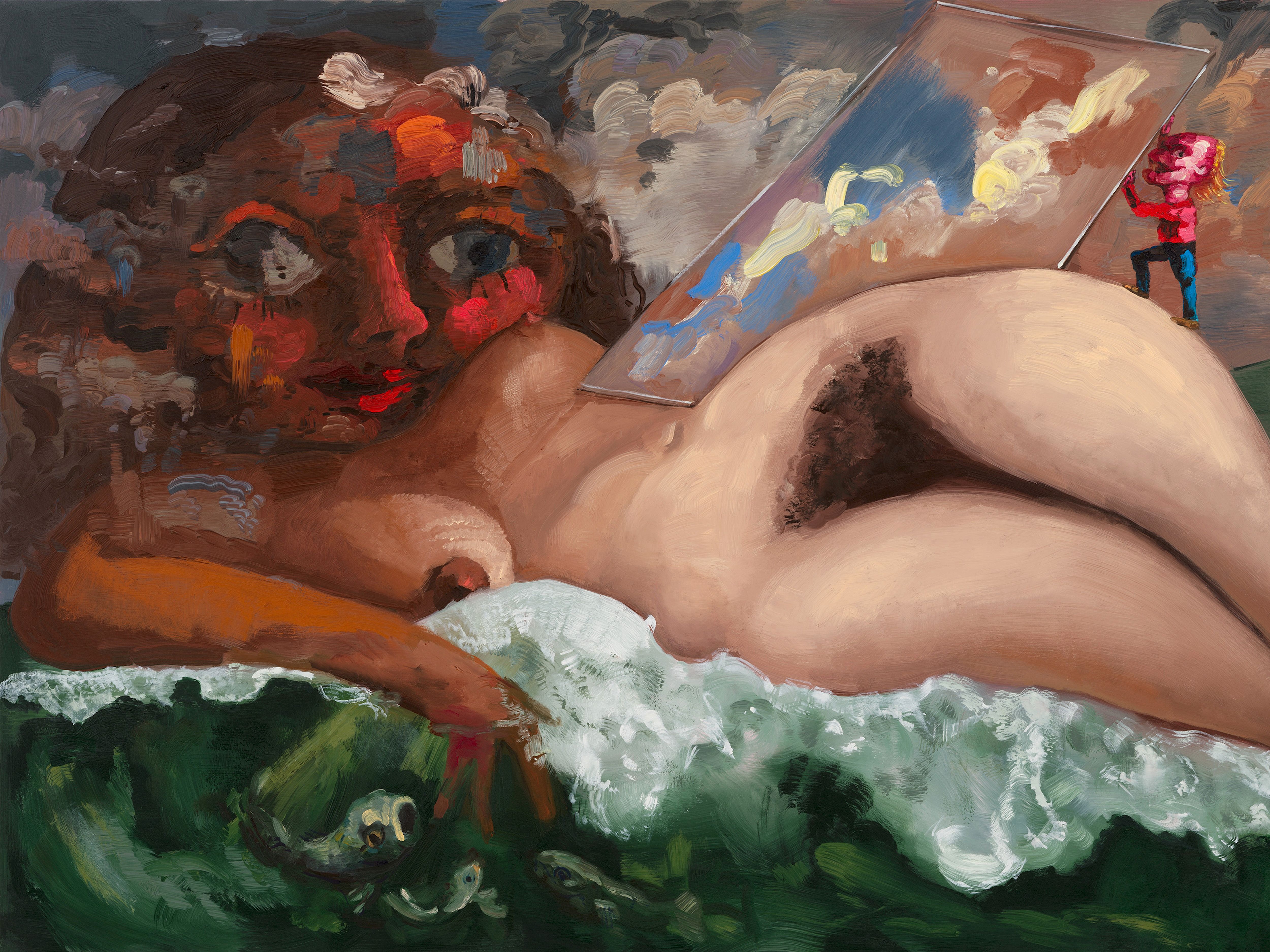
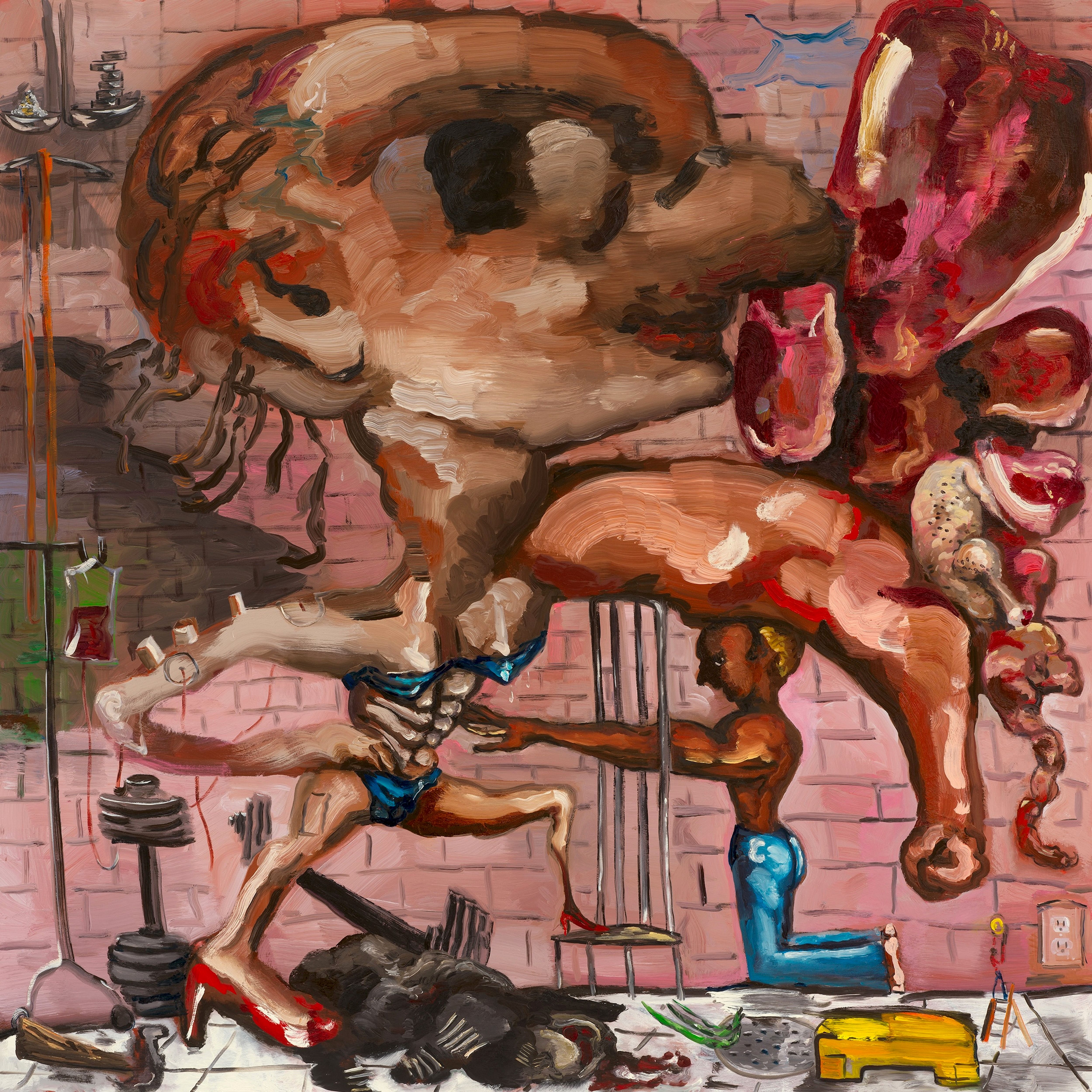
The painting lends its name to Schutz’s latest exhibition at Contemporary Fine Arts (CFA) in Berlin, which includes a selection of works recently shown in Trouble and Appearance, the American artist’s major solo show, which took place at the Pinakothek der Moderne in Munich earlier this year. There is a pomposity to the exhibition’s title that Schutz plays up to through the petty humiliations, aspirations and delusions that she assigns to the various protagonists of her paintings. In The Health (2026), a female body builder in a shimmering bikini and red high-heels invites a smaller, shirtless man to admire her abdominal muscles as her head inflates to vast proportions. Another power-play is staged as the nude female protagonist of The Beauty (2026) is approached by a far smaller man, who holds a mirror up to her preening face.
A group of revellers gather at a feast beneath an apple tree in The Ceremony (2026). A table is adorned with a bunch of green grapes, hunks of raw meat, prawns, and delicate glasses of wine. “Food that’s on the edge of pleasant. I was using it as a stand-in for something that is organised and good in society, but then at odds with whatever is happening in the scene,” Schutz explains. The inclusion of a tablecloth amid the scene further emphasises the artist’s desire to undermine expectations. “It’s meant to be a civilised situation,” she says. “There is a decorum that is being sullied, destroyed, messed up.”
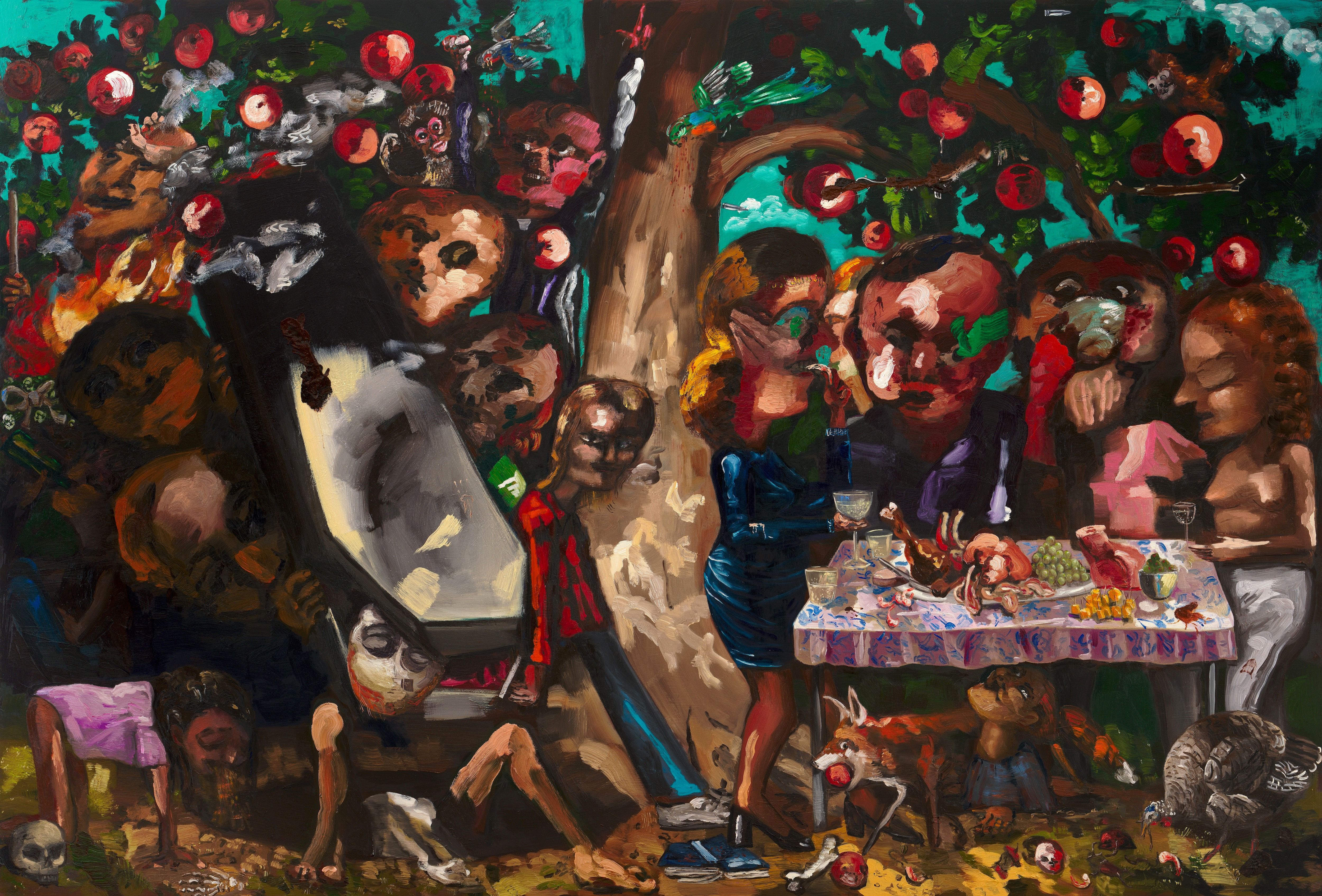
Schutz’s paintings and drawings are often vast, stretching over two metres in height or width, with the surface of the canvas thick with the layers of oil paint. As a teenager in Michigan, she began to make paintings in her parents’ basement without any formal training. “I would paint on drywall, cardboard and things from the ceiling,” she remembers. At times during these early years, she would forget to correctly clean her brushes and instead use her hands to apply paint directly to whichever surface she was working on. “What I love about paintings is that they’re different than images online. They’re in a room, they’re in space and they have a surface,” she says. “Because on the internet it is an image which has no sense of scale.”
In Schutz’s recent exhibitions, she has revealed some of the hands-on processes behind her paintings, by choosing to exhibit sketches and preliminary drawings for the first time. “I never really considered them as art or anything that would leave my studio,” she says.
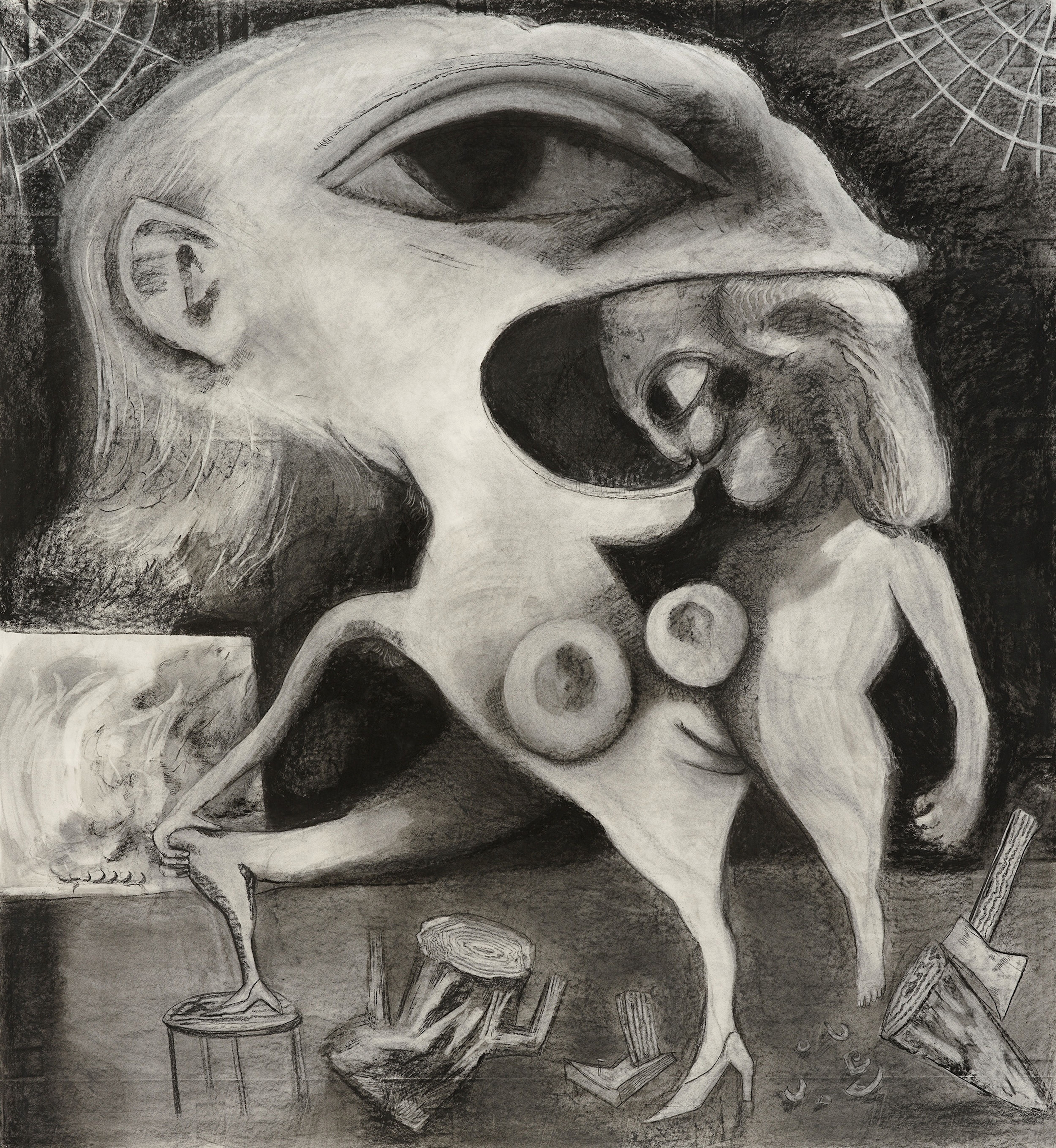
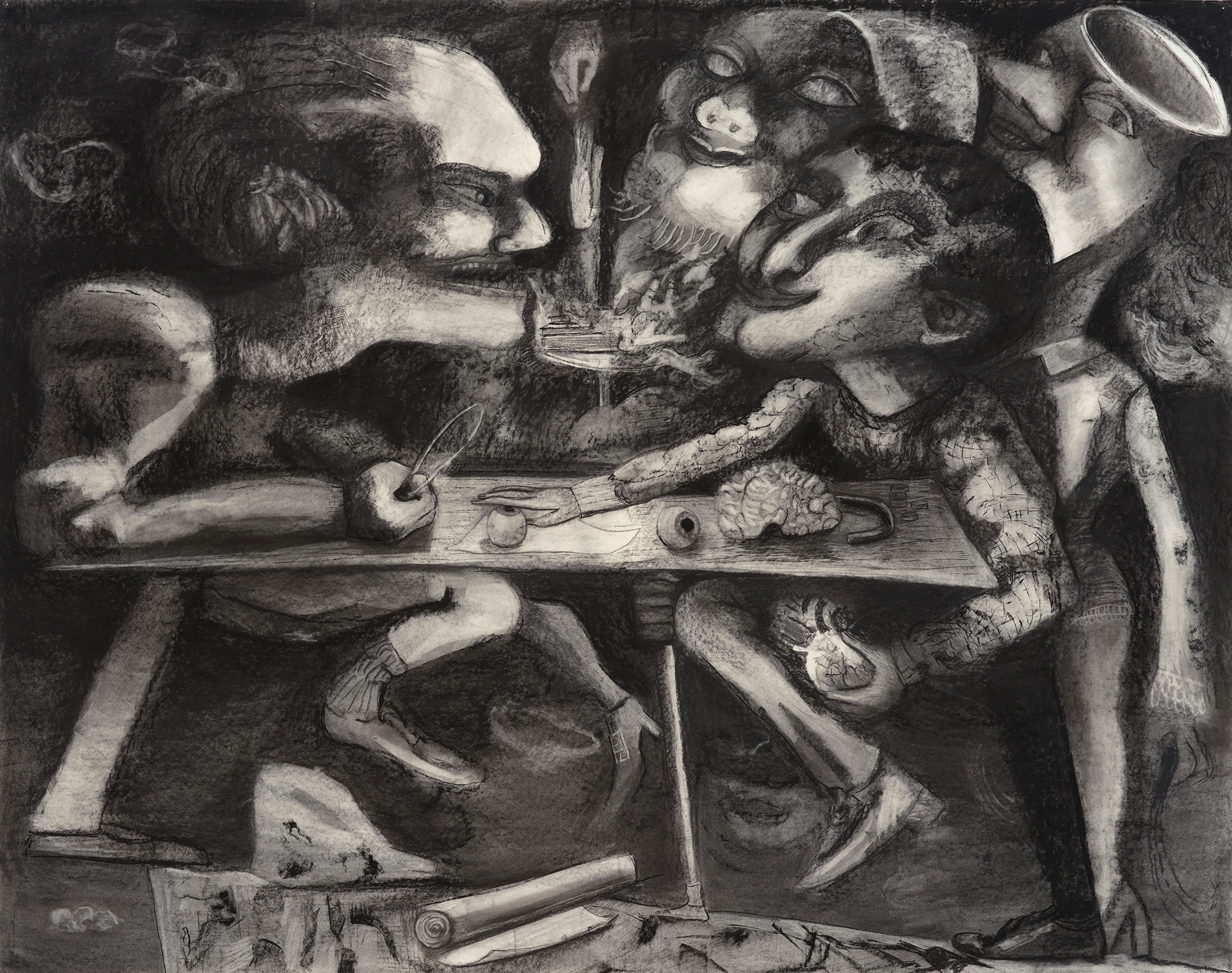
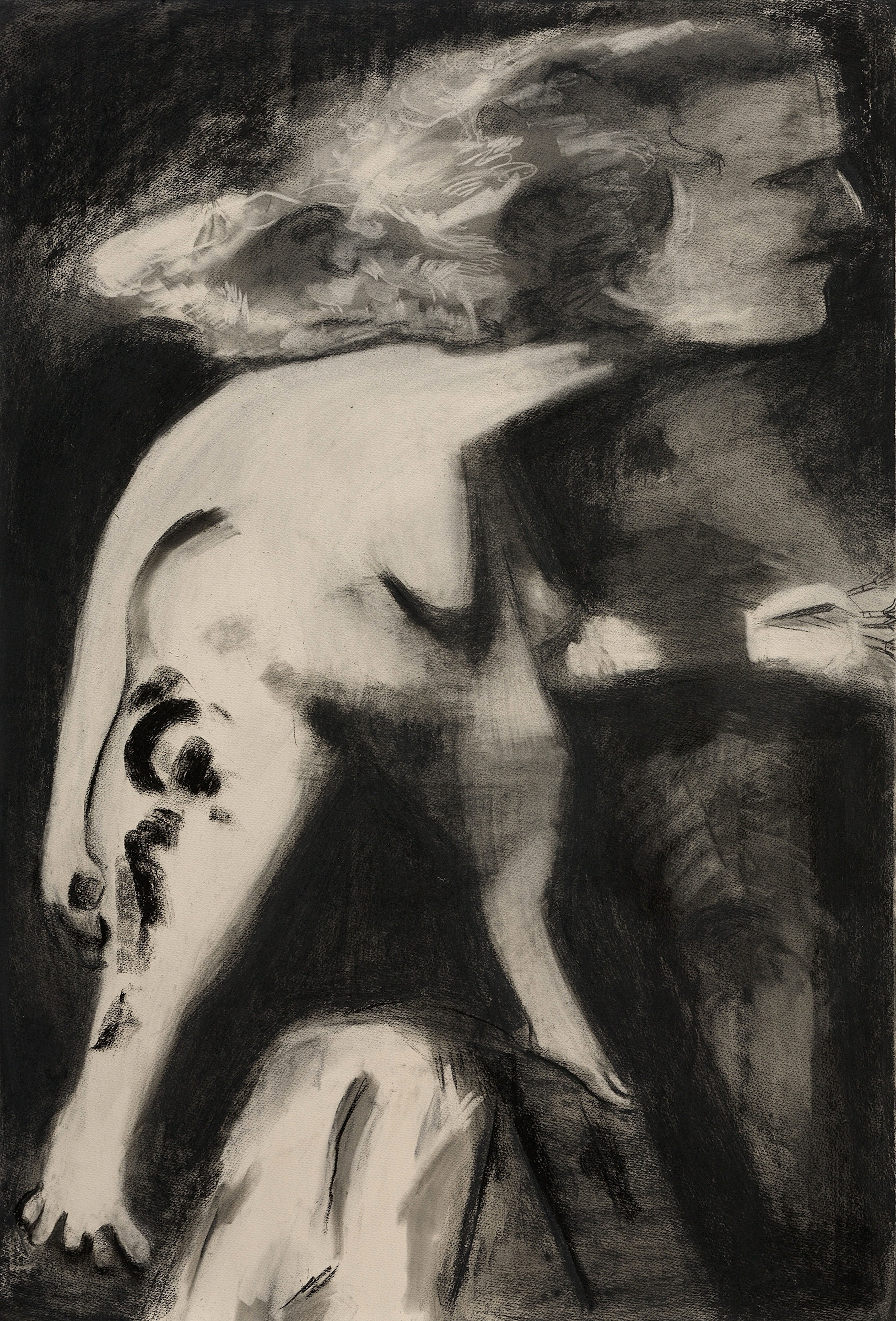
In The Department at CFA in Berlin, she is also showing a series of large-scale charcoal drawings. “Charcoal is totally different from paint. Even the process is completely different. I find it much slower than painting. You’re developing [the works] and it’s just dust. Charcoal is very fugitive, and you can easily lose the white of the paper, so there’s just this slower development of the image,” she reflects.
“With painting, I’ll get into my painting outfit, and it’s wet, and it’s sticky, and there’s a time element. You paint in these sessions, these bursts. With drawing, I would find that sometimes I would think it was done, but you can always tweak. You think you find the bottom of a lake and then you realise, oh, you’re not at the bottom.”
The artist’s works in charcoal have been a foundational principle of her practice alongside the vividly coloured oil paintings for which she is best known. Comparing the receptions of the two approaches, she explains: “Black and white has its own mood and starkness. Black and white is not garish. It’s funny, sometimes there’ll be subjects that people can like more if it’s in black and white, because I think colour is irritating to people.”
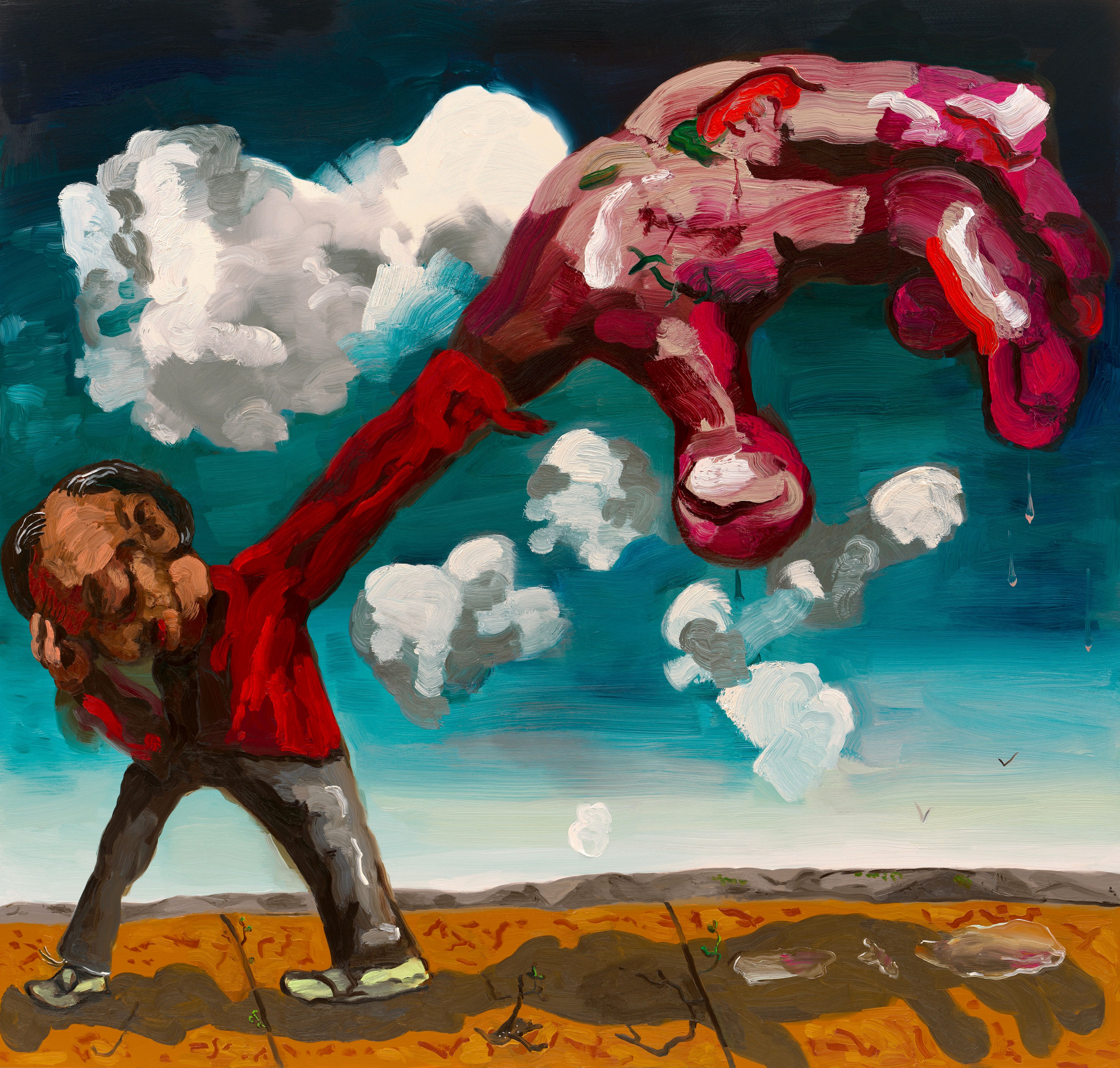
One painting in Schutz’s latest exhibition, The Hurt Hand (2026), exemplifies the associations that colour can allude to and trigger. A man stands alone with his arm outstretched towards the viewer, his hand enlarged and layered with thick brushstrokes of hot pink, bright red and smears of white and rose. “It’s meant to look painful or like this abused hand,” Schutz says. “And I just thought that it should look kind of like its own painterly element in the painting and that cold pink felt kind of painful.” As she adds: “It was meant to be garish.”
Schutz’s own art historical references slide easily from Philip Guston to Otto Dix, jumping centuries from the Old Masters to the American Expressionists. Melded with nods to the contemporary banalities and atrocities of modern life, she conjures a quiet hum of horror just beneath the ordinary and the everyday. In her compositions of scenes that blur the line between fantasy and reality, she brings into sharper focus the ultimate fallibility of humans throughout time. As the artist puts it: “It’s a beautiful thing that art is always changing depending on the viewer or the place or the time. It’s one of the powers of art.” —[O]




A respected voice in contemporary art discourse.
Focusing on ambitious storytelling and insightful art-world commentary. Ocula Magazine publishes in-depth interviews, critical essays and timely analysis on the artists, exhibitions and ideas driving the global art world.
Learn more about Ocula Magazine
Showcasing the best of the art world.
Ocula partners with galleries from around the world to highlight their artists, artworks and exhibitions. Gallery membership is by application and invitation, with each member vetted by an independent panel.
Learn more about Ocula Membership
Specialises in the sale of major artworks.
Led by a team with deep ties to the world’s leading auction houses, galleries and collectors. Ocula’s advisory team offers bespoke services to high-net-worth clients from around the world who are looking to acquire the best of contemporary and modern art.
Learn more about our team and services