


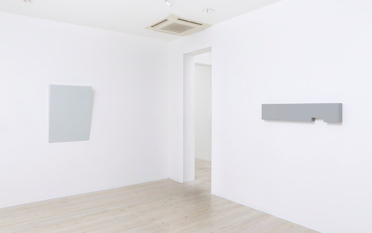
Born in the United Kingdom, Suzie Idiens studied art and design at the Royal College of Art, London. Since emigrating to Sydney in 2006 she has exhibited in Berlin, Sydney and London, as well as at the Melbourne Art Fair and Art Stage, Singapore. In her latest exhibition, Neutral Ground at Gallery 9, Sydney, Idiens contests the boundaries between painting and object, while challenging the concept of neutrality in the most minimal of surfaces.
Prior to moving to Sydney you studied furniture and industrial design at the Royal College of Art in London. Tell us about how you came to practice as an artist?
Making art in some form or other has been a thread throughout my life. I studied design because I like design, I appreciate it, and for some reason I thought I would have a better chance at making a living out of design rather than art. Furniture design requires a certain level of engineering. A chair should support your body weight, for example. There is something seductive in this reassuring logic, and at the same time I was drawn to the conceptual aspect of art. So while undertaking my BA in furniture design some very understanding tutors enabled me to swap woodwork modules for fine art modules. Later, at the RCA, I was interested in the idea of 'furniture equals art' and exploring the link between the two subjects. As life had it, through various circumstances, I ended up in sales instead and continued to dabble with making art on the side. I consciously moved to Sydney because of the quality of light, and within a year established a studio to make work in. By 2010 I realised there was little option but to start taking this obsession seriously and pursue a professional art practice.
You have said that the experience of viewing art (or anything) is for you three dimensional, that you are occupied with trying to capture a sense of mass or volume of colour. What are your principal concerns as an artist?
Form. Line. Edge. Surface finish. Spatial composition. Shadows. Light. How I can reduce something complex to a simple, singular geometric form? How will it occupy space within its surroundings and in relation to the viewer? How will the viewer perceive and experience the viewing of the piece? Questions go through my mind in that order; though strictly speaking light always come first and influences every aspect thereafter. Colour is the binder, the filler—it makes the form visible. When I started, colour seemed to be my heavy-handed approach of expressing form. Form needs a colour (or material finish), and colour—if wanting to show it as a solid mass—needs a form.
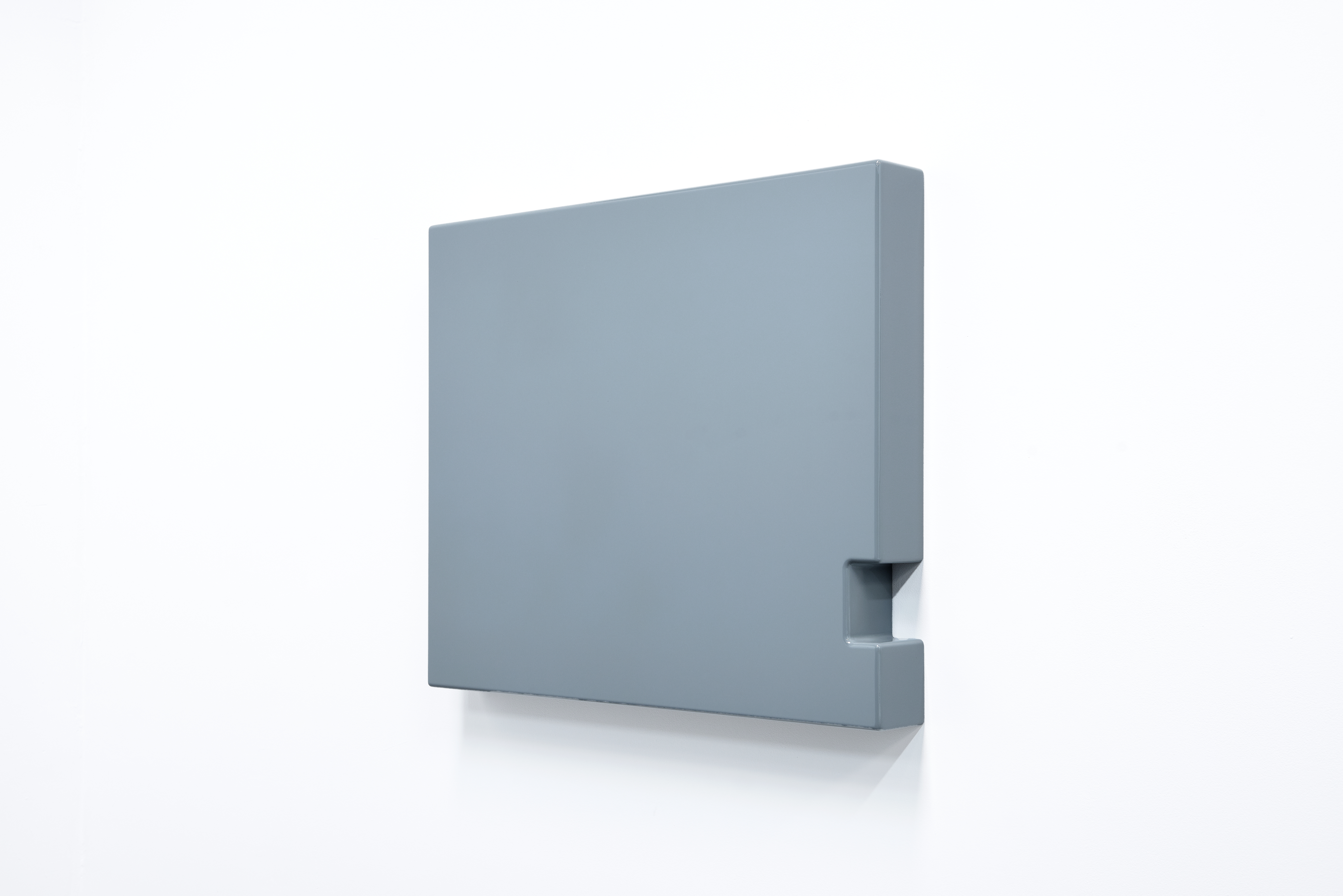
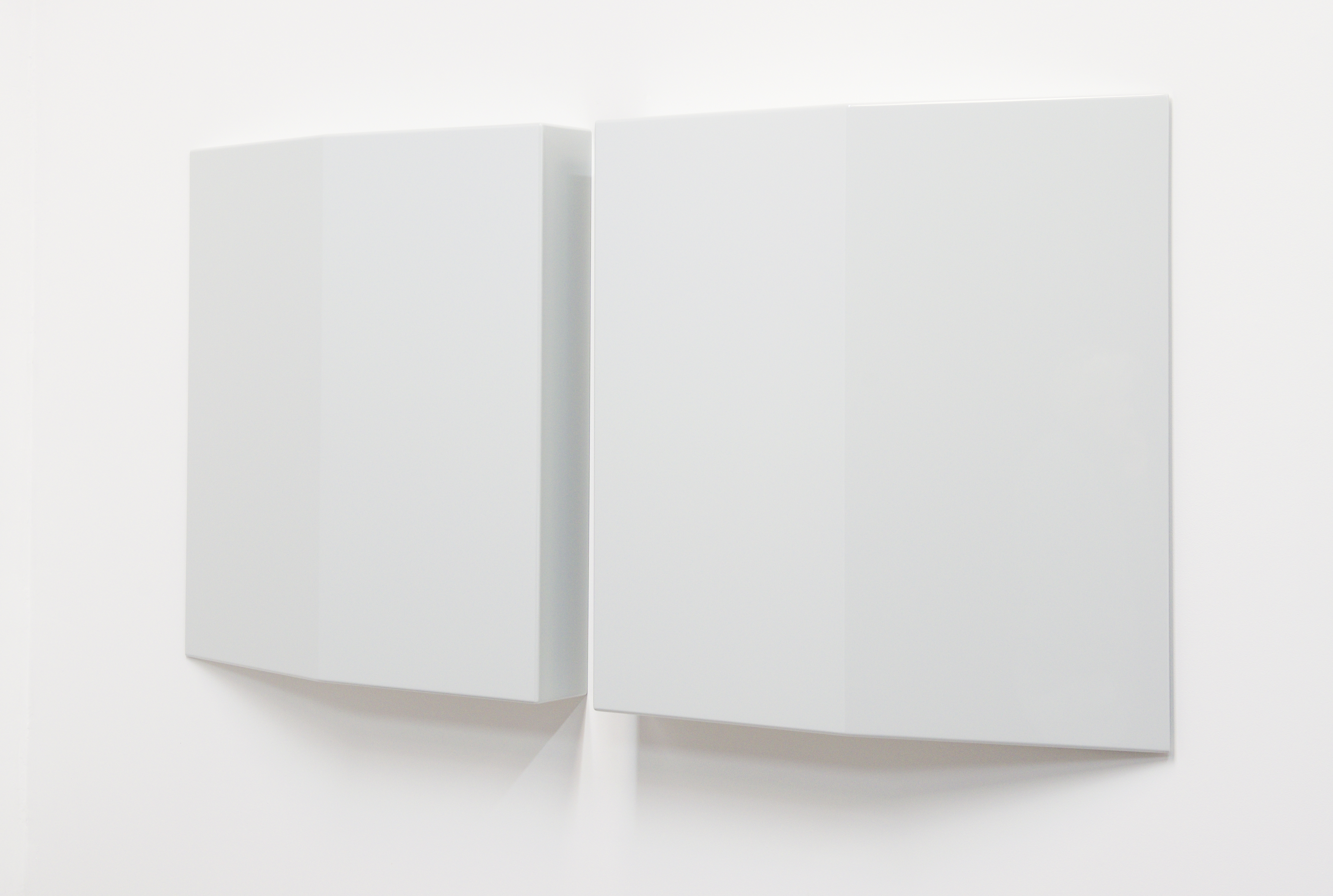
Of course the experience of your work reveals a lot about our perceptive capabilities. At first glance they are simple, reduced solid forms but closer inspection reveals shadows, depth, rounded corners, grooves and reflections. So they are a lot about seeing?
They are very much about seeing and perceived seeing ... slowing down, the experience of seeing. These pieces rely on a physical audience moving around them, observing from different angles. The glossy surfaces and rounded edges allow the eye to glide over the form easily—the idea is not to be interrupted, there is no 'sticking' point that disrupts the viewing. I like the German term 'sich sattsehen'—looking at something for so long one feels 'full'. It comes from “sich satt essen”; eating until you are full. You know when an artwork is good, because there is no way you will be able to look at it long enough. But it feels good trying!
Your simple, seamless forms call to mind American minimalism. Tell us about your influences and inspirations?
I am heavily influenced by American minimalism and the artists grouped under that umbrella term. I used to sometimes wonder if it is possible to improve on or add to the conversation of what was created by the American minimalists ... but judging by the current amount of post-minimalist work being created worldwide the conversation is very much alive and kicking. There is incredible post-minimalist, non-objective, reductive art out there—it gets me so excited seeing it. I hope I am adding something relevant to this conversation.
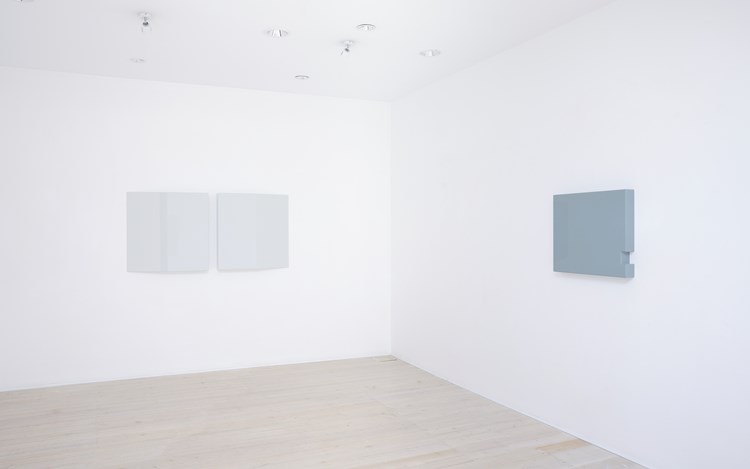
Turning to your use of colour, the works in Neutral Ground are all in shades of neutral grey. In the past you have worked in a range of colours from bright reds and pinks to white, yellow and blue. What is the role of colour in your work and what dictates the choice of colour you use?
Mood—in a word. Technically there are no neutral greys in Neutral Ground. None of the greys in the show are taken from the spectrum between white and black—they are all 'contaminated', they all include some tint of colour, hence the grey shades constantly shift, depending on the light. The title is more a play on words—how we perceive neutrality and the ambiguity surrounding it. Watching the world today, I don't see much neutral ground, if any.
Colour is a very powerful tool in conveying or evoking an emotive response. And colour, in all its myriad of options, is so beautiful. Understandably people tend to gravitate towards the coloured works, though personally I find the black works from my previous All Things Being Equal show rewarding and revealing; the same goes for the subtleties of grey tone used in Neutral Ground.
I understand you always work in series and that each series is started with sketches for which you have many in play at a time. Can you describe your process?
Over the years a backlog of sketches have accumulated which I work from and continuously add to. These are often drawn as a series as I work out different possibilities available to the same idea. I see them in groups and imagine them exhibited together as a collective conversation. Sometimes this concept doesn't always fully materialise for an exhibition, so a few pieces are made later or left out of a show. They are the loners ... I try to incorporate them in other shows if possible. And often I revisit a shape, re-make it in another colour, as colour has the ability to change the piece considerably. Plus I just want to see the options, see how the piece works differently.
I start with a hand drawn sketch, which is converted to a working drawing, and then possibly a cardboard mock up. Once satisfied with the proportions, I start making the work. From that point on it is a rather methodical process until the piece is ready for the topcoat—then I deliberate over the colour for a while. Then the topcoat is applied and the piece is finished.
One is struck by the seamless, perfection of your work, they have a manufactured appearance. Are you working with commercial producers to achieve these results?
I work with commercial producers at the very beginning (getting the MDF cut to size) and in the final stages—the undercoat and topcoat are applied by commercial spray painters. Everything else, the assembly of the pieces, trimming, sanding, filling, shaping, more sanding, I do myself. Like any commercial painter will tell you—it's all in the preparation. The underlying reasons why I do most of the work myself is due to budget, the need to be physically involved with the shaping of the work and 'quality control'. And again, playing into the hands of perception, there is something subversive in making something so labour intensive look manufactured.
Do you have a particular favourite work in the show?
Each work interests me for different reasons, and I enjoy the experience of seeing them collectively on show. Each has it's own characteristics, some are obvious and others appear over time. That said, the one piece that caught me by surprise is Untitled #7, aka The Big Wedge. It sort of bamboozles me—I still haven't got to grips with it yet, it's the wolf in sheep's clothing for sure.
What else are you working on now?
I am very fortunate to be undertaking a residency at SNO (Sydney Non Objective) Contemporary Art Projects for the next two months. During this time I am preparing for the SNO 129 exhibition in November/December, which will involve collaborative work with Paul Leadbetter, Skye Wagner and Melissah Chalker. There are a few smaller panel works and cardboard studies I am looking to complete in the upcoming months, and start working on the next series. —[O]
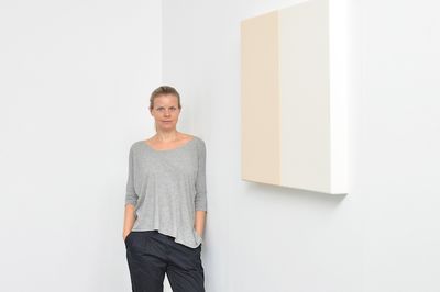
Main image: Image: Suzie Idiens. Courtesy the artist.

A respected voice in contemporary art discourse.
Focusing on ambitious storytelling and insightful art-world commentary. Ocula Magazine publishes in-depth interviews, critical essays and timely analysis on the artists, exhibitions and ideas driving the global art world.
Learn more about Ocula Magazine
Showcasing the best of the art world.
Ocula partners with galleries from around the world to highlight their artists, artworks and exhibitions. Gallery membership is by application and invitation, with each member vetted by an independent panel.
Learn more about Ocula Membership
Specialises in the sale of major artworks.
Led by a team with deep ties to the world’s leading auction houses, galleries and collectors. Ocula’s advisory team offers bespoke services to high-net-worth clients from around the world who are looking to acquire the best of contemporary and modern art.
Learn more about our team and services