


SARAH MORRIS
b. 1967, United KingdomSarah Morris’s abstract paintings and films dissect the architecture and psychology of global cities. Characterised by geometric patterns, precise lines, bold colour and an adjacence to cinema, Morris’s works have been commissioned for public sites as well as gallery exhibitions.
Early Years
Sarah Morris was born in the United Kingdom, in 1967, but raised in America. She studied at Brown University between 1987–1988 and then crossed the Atlantic to study at Jesus College, Cambridge (1990–1990). Morris’s father was an endocrinologist and her mother a doctor who also painted—her grandmother and other family members were also artists. Morris’s geographical and sociocultural background influenced her practice: a scientific approach to believing “what you can disprove” as well as living through American politics and culture during the late 1970s and early 1980s.
Sarah Morris: Artworks
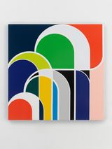
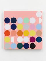
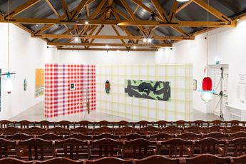
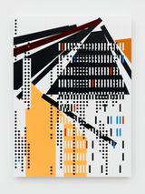
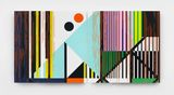
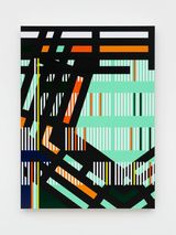
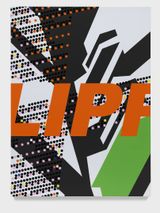
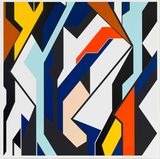
Sarah Morris’s art practice spans painting, film, and site-specific commissions, each medium informing the other. She began her career with graphic paintings inspired by the language of advertising and the press although she is perhaps best known for large-scale geometric abstractions, made with household gloss paint, that draw from the colours, forms and rhythms of cityscapes. Her grids reference local views or architectural ideas and often accompany films that deploy varying forms of cinematography.
Morris converts local themes—architecture, design, language, audio, systems—into grids and patterns, so cities and spaces are given their own colour schemes and patterns.
- The Midtown series (1998–2001) look back at the period Morris spent in the early 1990s working in a New York City studio, examining the relationship between people and architecture. The gloss-painted grids reference landmark buildings including Madison Square Garden and the Crowne Plaza Hotel. The accompanying film, Midtown (1998), shot in a single day, shows how the buildings frame the city’s everyday movements.
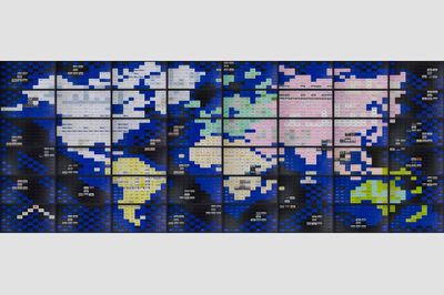
- The Capital series (2001) was inspired by the political architecture of Washington DC.
- Both the Clips and Knots series (2009) examine structures of control and power networks through paintings inspired by intertwined paper clips, or knotted ropes.
- 2018’s Sakura, the last film Morris shot before the Covid-19 pandemic and commissioned by the Nakanoshima Museum of Art, focuses on the Japanese city of Osaka and coincides with the blossoming of the Sakura tree. Combining documentary and fiction, the film is sometimes in real time but at others uses a fabricated timeline.
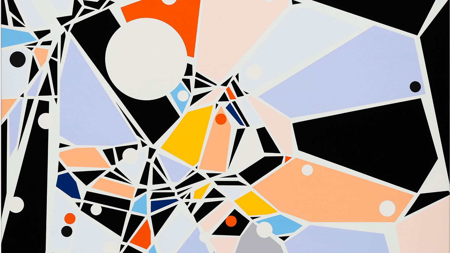
- During the Covid-19 lockdowns, Morris exiled herself to Massachusetts, where she refocused her artistic eye to her immediate environment, which led to her Spiderweb series of the early 2020s. Fascinated by spiders’ webs, she experienced a realisation that cities were also organic entities.
Sarah Morris: Select Public Commissions
- Total Lunar Eclipse, Don Valley Station, Toronto (2020): a geometric porcelain tile mural
- Hellion Equilibrium, 39th Avenue MTA Station, Long Island City, New York (2019): a two-dimensional transparent colourful platform panel
- Endeavour, Palais de Tokyo, Paris (2005): a 6.7 x 37.2m fresco related to Morris’ 2004 film Los Angeles
- Jardim Botânico [Rio]: a panoramic mural combining vibrant colours and rectangular and curved forms, Kunsthalle Bremen, Germany (2013)
- Robert Towne: a 1,840 square-metre geometric mural on the ground-level ceiling of the 1950s block Lever House in New York City (2006)
Select Awards and Accolades
- Joan Mitchell Foundation Painting Award (2001)
- Berlin Prize Fellow, American Academy in Berlin (1999–2000)
Sarah Morris: Exhibitions
Select Solo Exhibitions
- Transactional Authority, Nakanoshima Museum of Art, Osaka (2026)
- Snow Leopards and Skyscrapers, White Cube, London (2026)
- All Systems Fail, Kunstmuseum Stuttgart and Zentrum Paul Klee, Berne (2024)
- Who is Who, Tai Kwun Contemporary (2024)
- As Slow As Possibles, Espace Louis Vuitton, Munich (2023)
- Pinecones and Corporations, Gallery Hyundai, Seoul (2023)
- Means of Escape, White Cube Bermondsey, London (2021)
- The Odysseus Factor, UCCA, Beijing (2018)
- Finite and Infinite Games, Petzel, New York City (2017)
- Points on a Line, Wexner Center for the Arts, Columbus, Ohio (2012)
- Black Beetle, Fondation Beyeler, Basel (2008)
Select Group Exhibitions
- Frame in Frame, Consulate General of Switzerland, New York City (2026)
- Animalia. Of Animals and Humans, Heidi Horten Collection, Vienna (2026)
- The Kaleidoscopic: Writing Histories Through the Collection, The Bass, Miami (2025)
- Endeavours and Masterpieces, Frac Sud—Cité de l’Art Contemporain, Marseille (2024)
- The Milton and Sheila Fine Collection, Carnegie Museum of Art, Pittsburgh (2023)
- 50 Paintings, Milwaukee Art Museum, Wisconsin (2023)
- I Could Eat You, Casa da Cultura de Comporta (2022)
- Desde el Salón (From the Living Room) Sol Calero selects from the Hiscox Collection, Whitechapel Gallery (2021)
- A Possible Horizon, de la Cruz Collection, Miami (2020)
- The Vitalist Economy of Painting, Galerie Neu, Berlin (2018)
- Art and China after 1989: Theater of the World, Solomon R Guggenheim Museum, New York City (2017)
- Days like These: The Tate Triennial Exhibition of Contemporary British Art, Tate Britain, London (2003)
- Iconografias Metropolitanas, 25th Bienal de São Paulo (2002)
Further reading
- Sarah Morris’ Instagram
- Sarah Morris’ website
- Artist page at White Cube
- 2016 interview with Alain Elkan
- 2024 studio visit from Curator
Sarah Morris FAQs
What are Sarah Morris’s influences?
Urban architecture is an influence on Sarah Morris’s work, as are Modernism, Conceptualism, Pop Art and film. She has said that she is drawn to Modernism’s “clean lines”, how Modernism “interacts with contemporary life” and how her creative process is informed by the movement’s spirit of abstraction. Morris is of course a filmmaker, and the creation of her artwork also references the parameters of film—framing, creating narrative and space.
What is Sarah Morris’s colour palette?
Sarah Morris’s colour palette features bold hues and huge contrasts, often including neons. She has said that her use of colour is part of her storytelling process and that she selects colours according to the way they convey narratives or themes, or how they might spark particular emotions. She has said that colour is a key part of an artwork’s meaning: bright blues and reds might conjure ideas of conflict or intensity while softer pastel colours might prompt feelings of calm.
How does Sarah Morris connect her art pieces and films?
Although different mediums, Morris has said that her films and paintings are “part of the same conversation” because both types of work are about creating a dialogue with the viewer. She identifies linguistic connections between the titles of works as well as links in terms of composition and colour.
Ocula

Works at Fortes D'Aloia & Gabriel


Recently Exhibited


Works Elsewhere


Explore and Follow Artists Shaping Contemporary Art
A respected voice in contemporary art discourse.
Focusing on ambitious storytelling and insightful art-world commentary. Ocula Magazine publishes in-depth interviews, critical essays and timely analysis on the artists, exhibitions and ideas driving the global art world.
Learn more about Ocula Magazine
Showcasing the best of the art world.
Ocula partners with galleries from around the world to highlight their artists, artworks and exhibitions. Gallery membership is by application and invitation, with each member vetted by an independent panel.
Learn more about Ocula Membership
Specialises in the sale of major artworks.
Led by a team with deep ties to the world’s leading auction houses, galleries and collectors. Ocula’s advisory team offers bespoke services to high-net-worth clients from around the world who are looking to acquire the best of contemporary and modern art.
Learn more about our team and services