


The art world in focus
Subscribe to our newsletter for news and insights on artists, galleries and exhibitions.

Years ago, Ben Sakoguchi took leave of the art world’s pageantries. No openings, no banquets, no studio visits. Yet, far from the monkish, laconic recluse I imagined him to be, the 87-year-old cuts an affable figure in a rare video interview accompanying his exhibition at Gasworks in London. The footage shows the artist offering up aspects of the personal history that inform his work with great candour and equanimity, while taking care not to foreclose the many associations and readings his riotous painterly mash-ups invite. ‘I want people to look at history with a bit of skepticism,’ Sakoguchi says of his approach. ‘I’m trying to create a sense of ambivalence.’
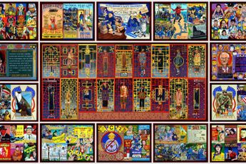
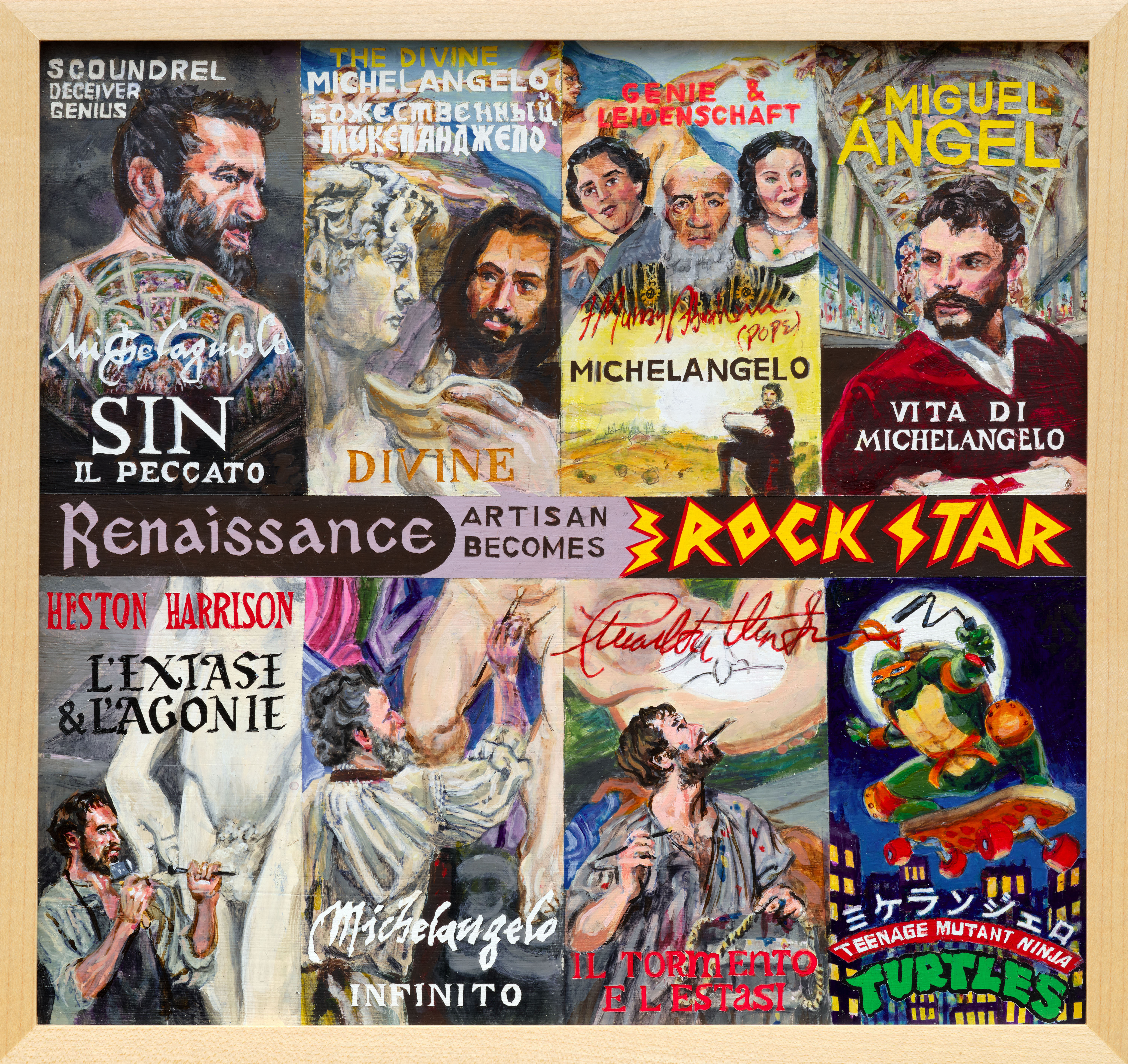
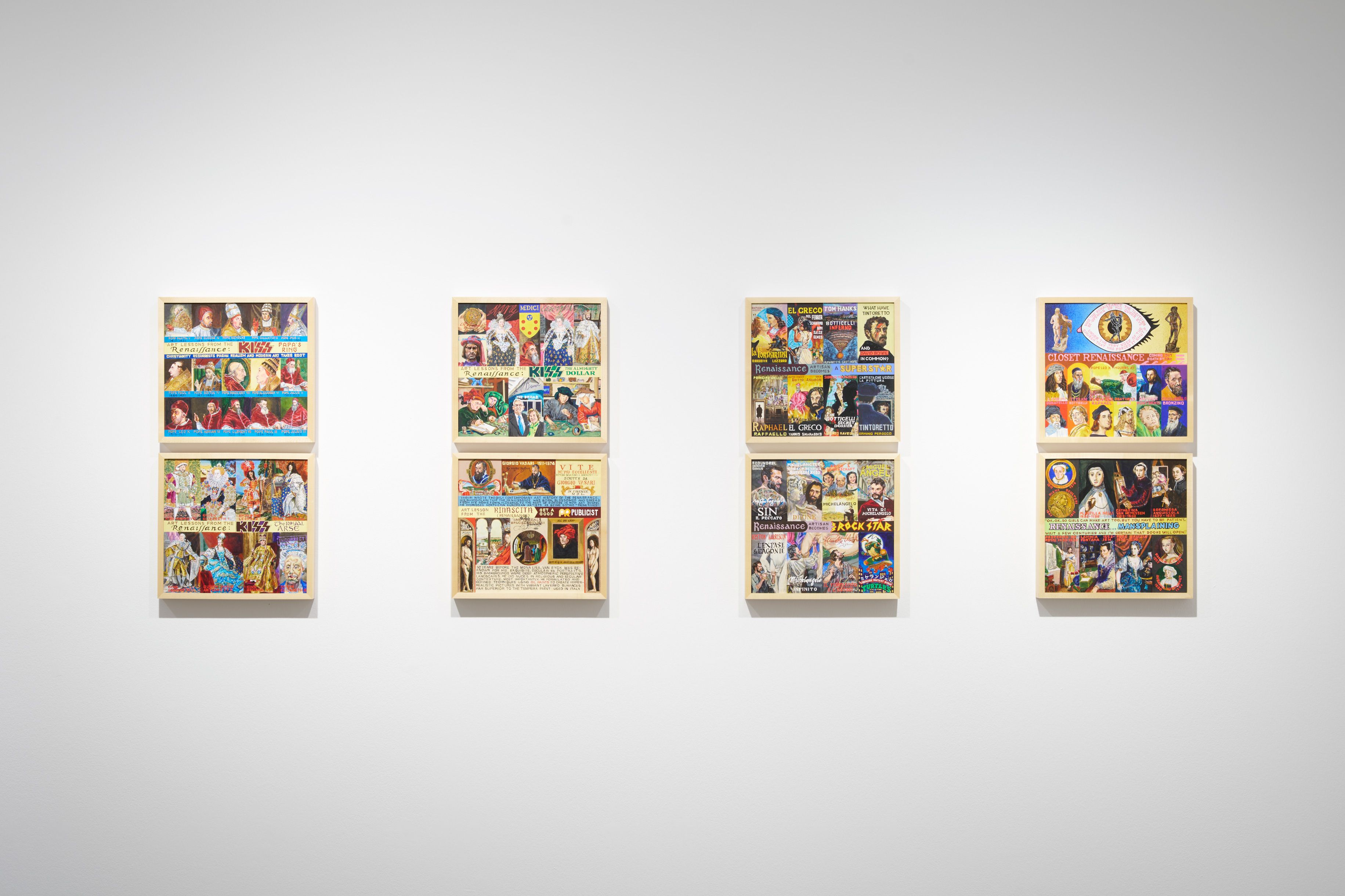
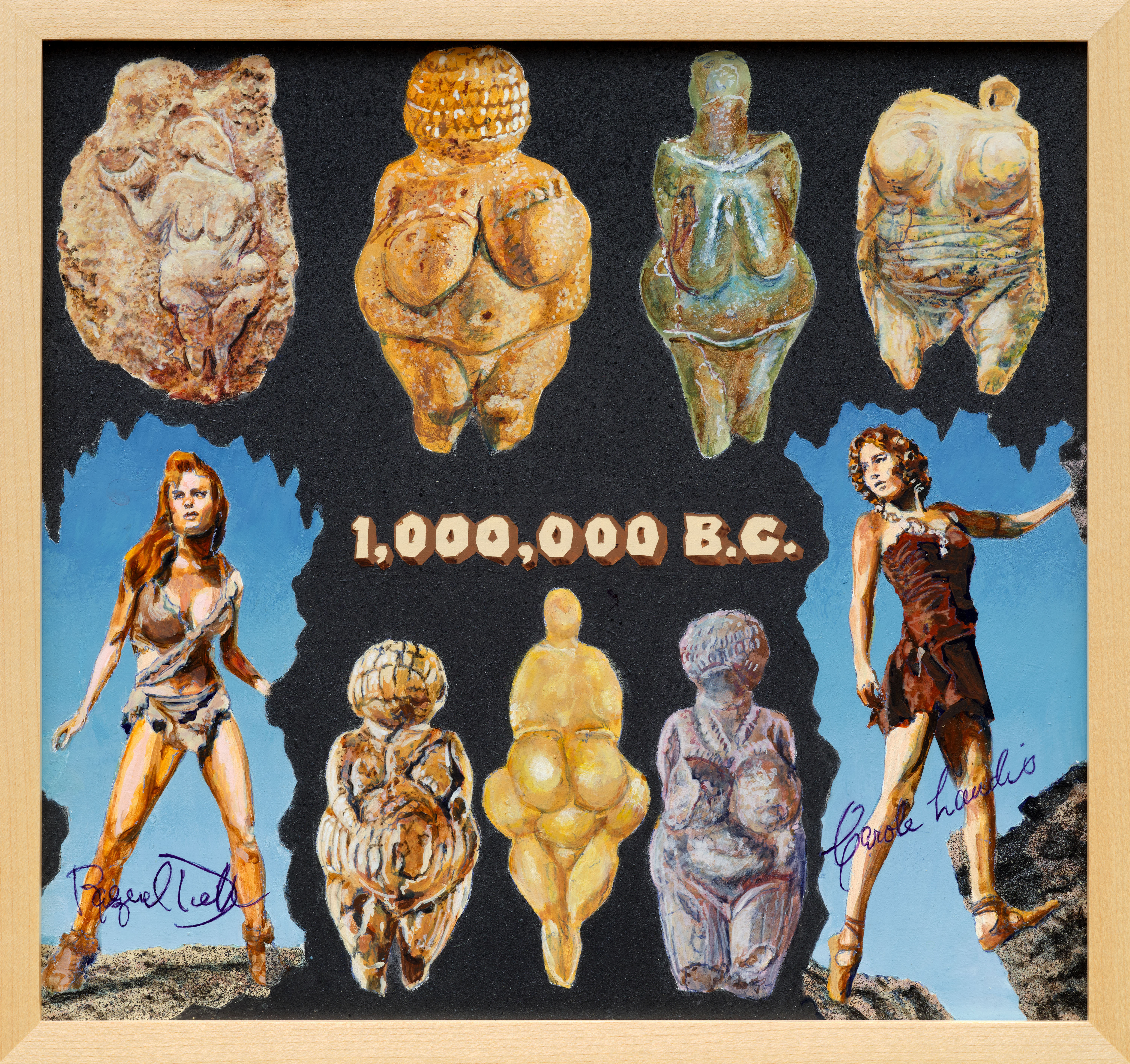
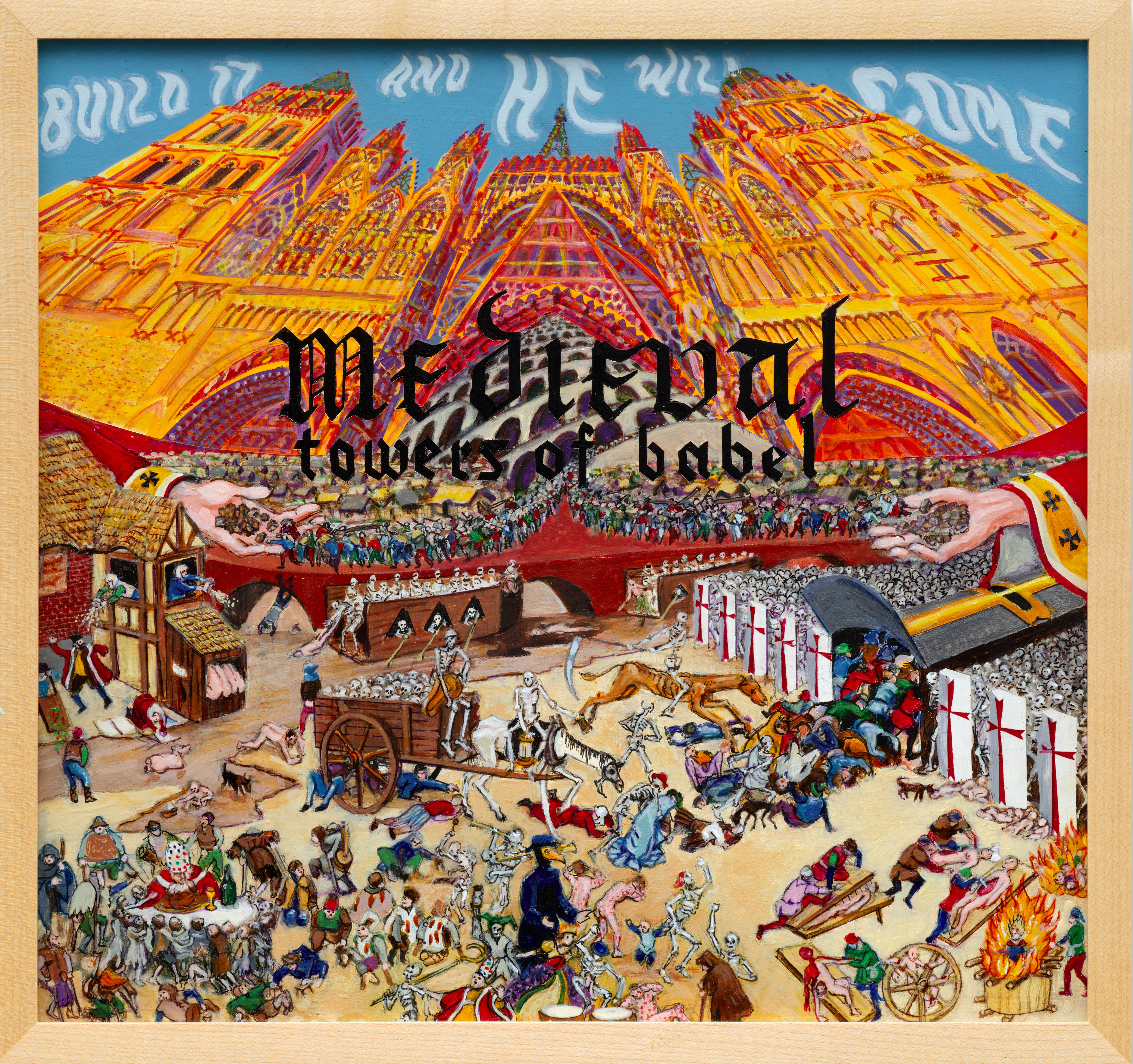
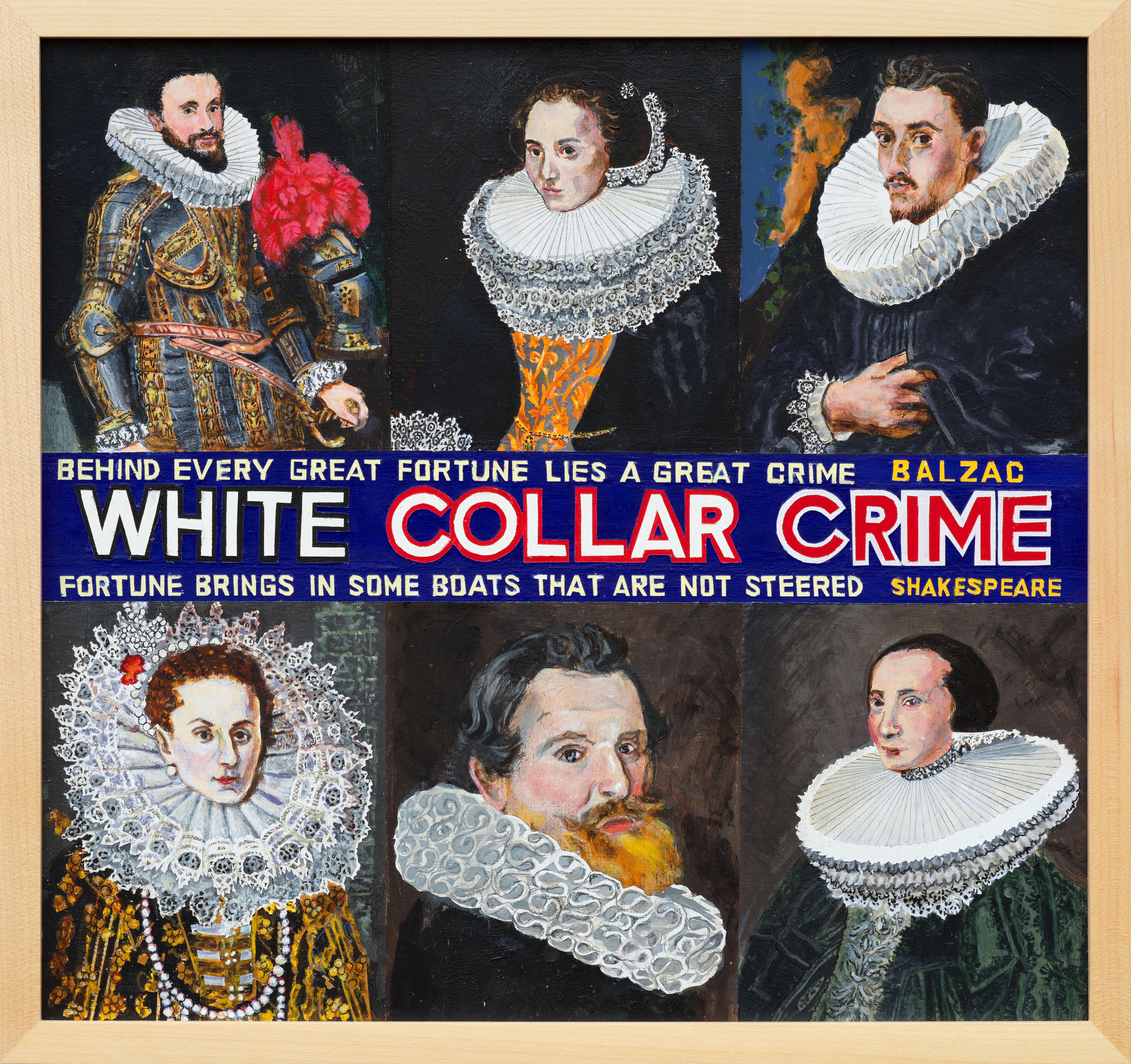
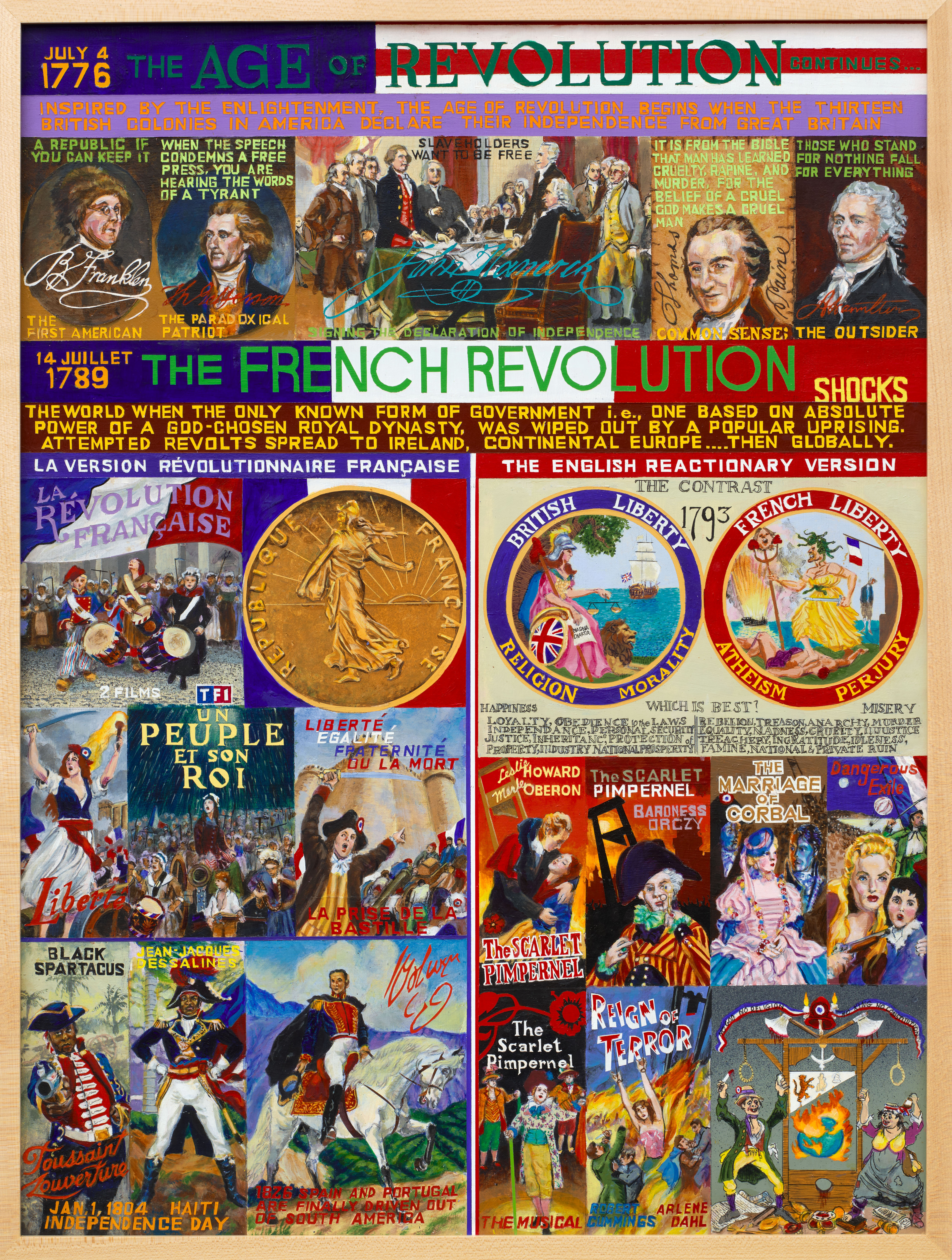
Titled Critical Art Theory, the exhibition is best described as gonzo art history: Atlas-like in its ambitions, with Sakoguchi deftly compressing the canon’s longue durée into 67 biting and meme-like fragments.
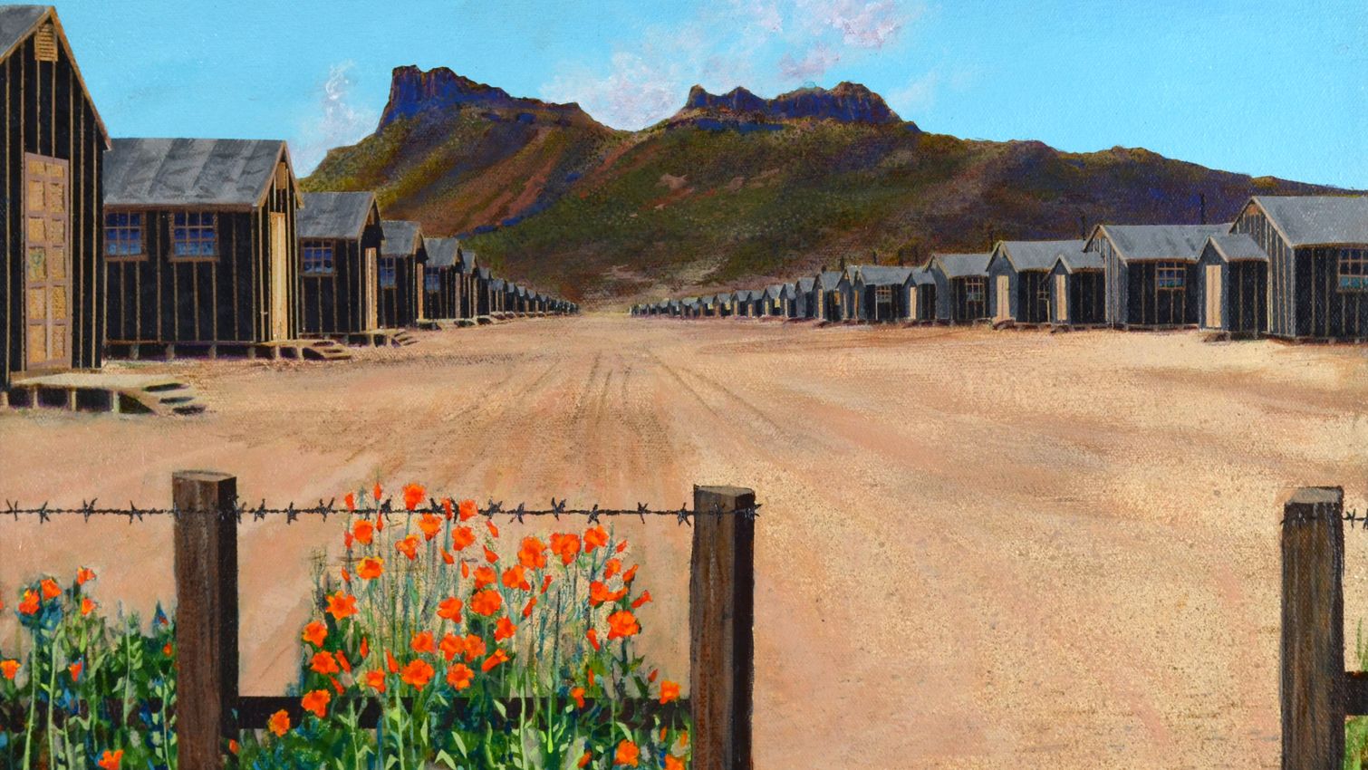
Born in San Bernardino in 1938, Sakoguchi spent part of his childhood in a Japanese American internment camp in Arizona—an experience that would shape recurring themes of xenophobia, state violence, and U.S. imperialism in his work. Yet many of his paintings venture out beyond his own experience, addressing themes like antiblackness, antisemitism, and misogyny, among others. Despite a chorus of criticism—including censorship by the Orange County Museum of Art in 2022 of paintings depicting a swastika—Sakoguchi remains undeterred in his mission to lay bare cruel, violent ideologies and their attendant iconographies.
Beyond these contested semiotics, the Pop-inflected style of Sakoguchi’s painting—bright, bold, text-driven—is derived from the orange-crate labels once sold in his parents’ grocery store. The form has proved a flexible container for almost anything: personal memory, political critique, art-historical send-ups.

In the ‘Orange Crate Label’ series, begun in the 1970s and ongoing, each work carries the same ‘ingredients’: an orange, the word ‘Brand’, and a place name with the subject matter ranging wildly, from Renaissance art to Cold War politics. Throw into the mix newspapers, movie posters, Japanese woodblock prints, Goya, and a heady maelstrom of high and low culture treated with the same wryness and irreverence. Sakoguchi is peerless in his capacity to make history’s tragic and absurd turns glow in lurid technicolour.
Few people know the scope of Sakoguchi’s work better than Jackie Tarquinio Kennedy, director of New York’s Reena Spaulings Fine Art and Gaga in Los Angeles, and previously director of The Box L.A., who has acted as Sakoguchi’s intermediary for almost a decade—managing his communication with curators, gallerists, and collectors, and helping organise his exhibitions. We spoke about her first encounters with Sakoguchi’s work, the evolution of his style, and the principles that have kept him both deeply connected to and resolutely apart from the art world.
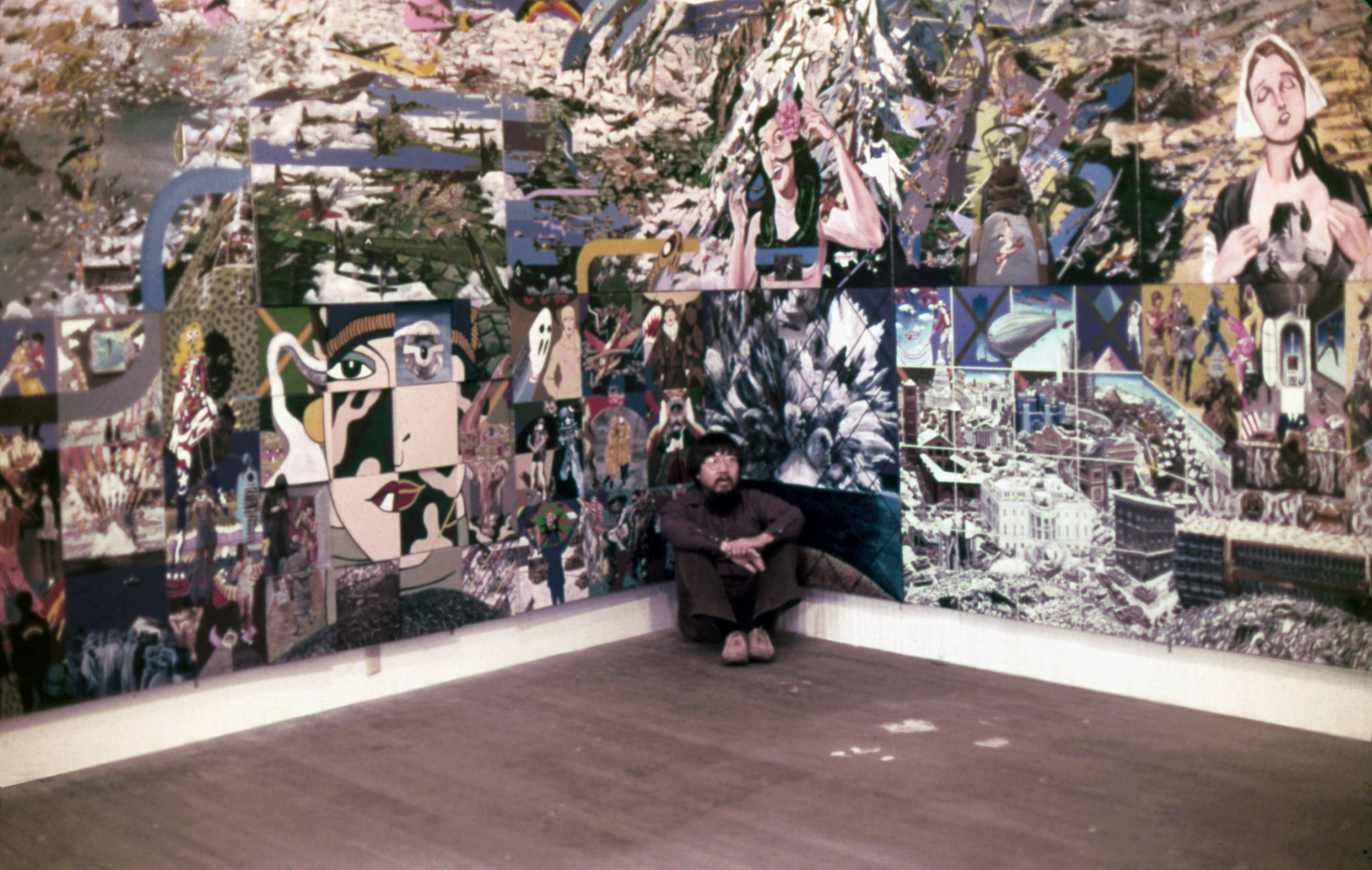
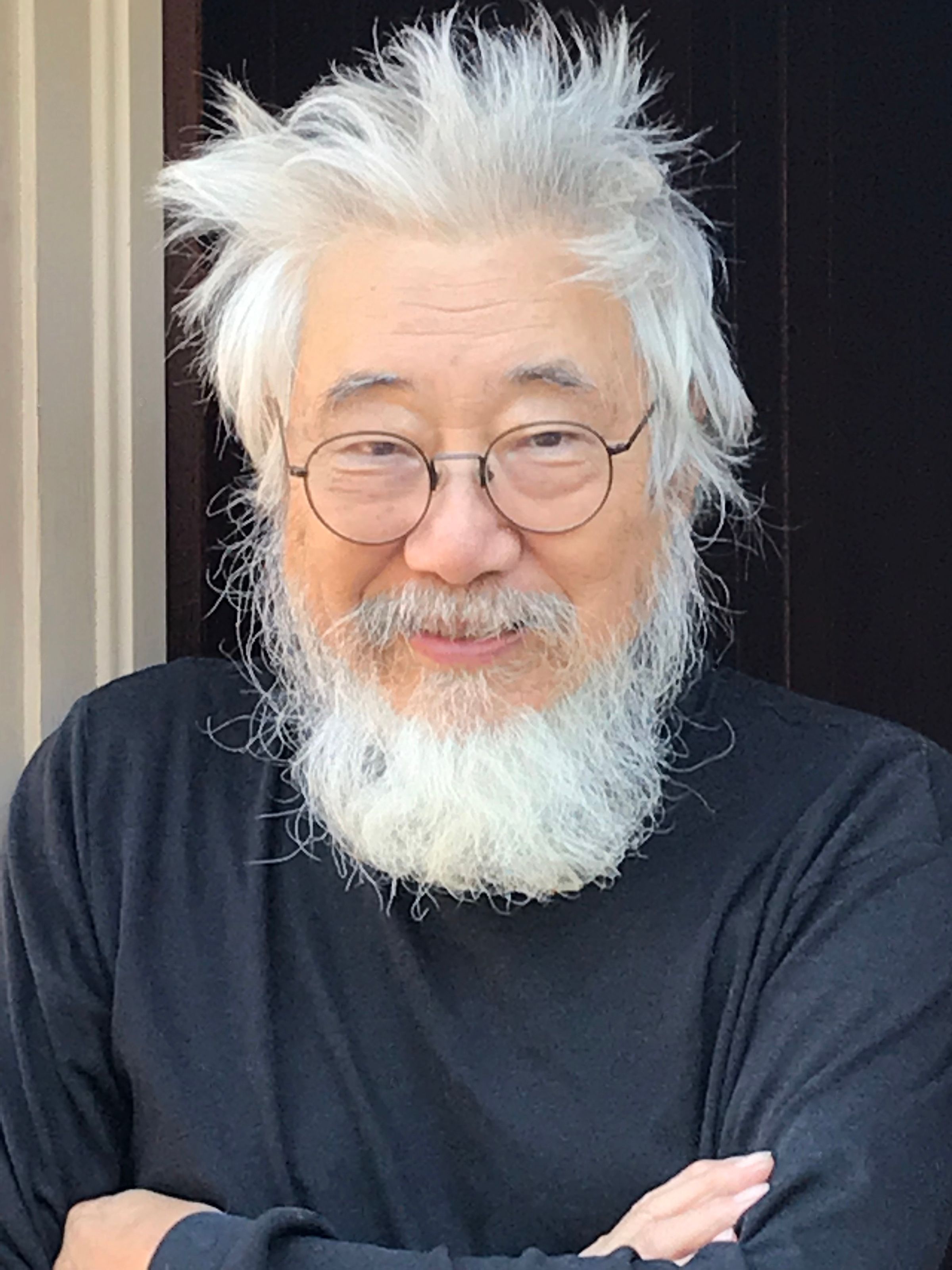
JTK: I first saw Ben’s work in 2011 in a group show called Sub Pop at a gallery in Culver City called Cardwell Jimmerson, which focused on Southern California art history. I worked at a gallery down the street, and on a lunch break I went to see the show. I walked in and saw these crazy paintings by Ben.
They were from a multi-panel work he made in the late 1960s and early 1970s called Big Painting—26 four-by-four-foot panels joined together to form a single work eight feet high by 52 feet wide. In Sub Pop, there were four panels from Big Painting, and the composition and content stuck with me. They were wild—playful but also politically sharp—and unlike anything else in the show.
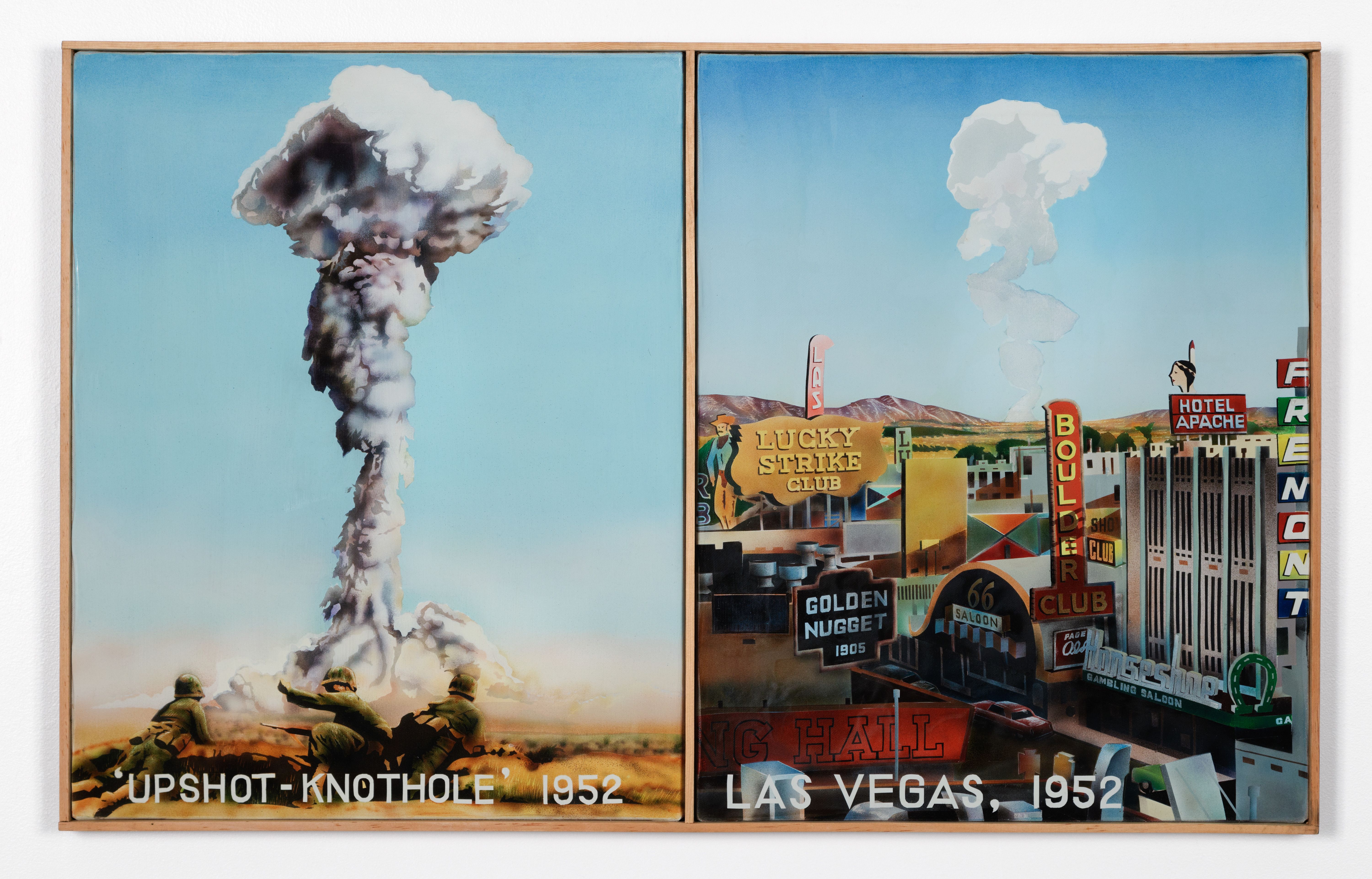
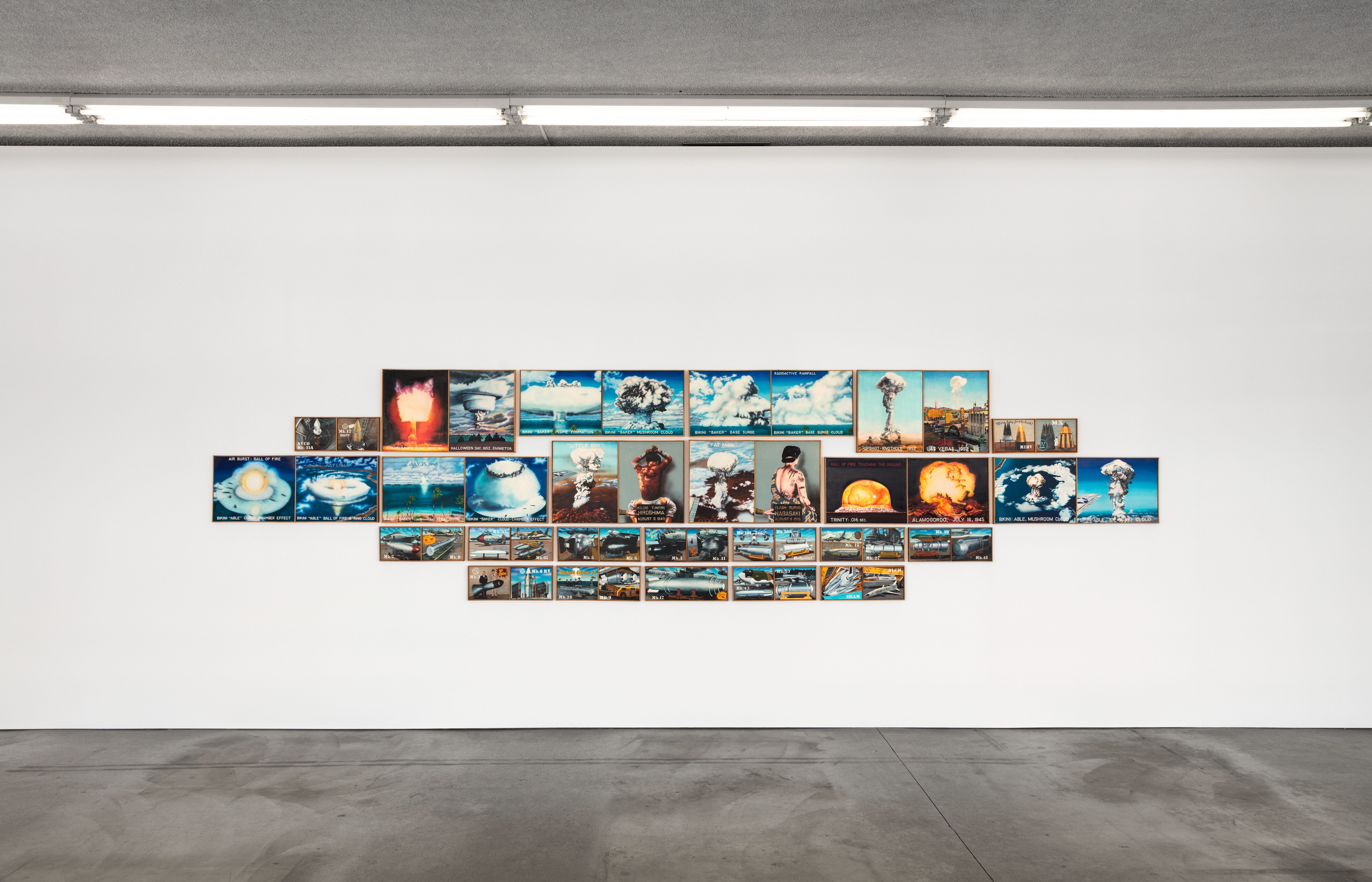
Years later, when we opened POTTS—basically an artist-run space, more of a project space—in L.A., we showed a work from the early 1980s titled Bombs, which is the piece Rosa Tyhurst, the curator of the Gasworks exhibition, saw. That showing was the beginning of my working relationship with Ben. We didn’t represent artists in the traditional sense, but I became very close to Ben’s wife, Jan. She had been doing much of the communication for him over the past decades and eventually asked me to step in and help with that.
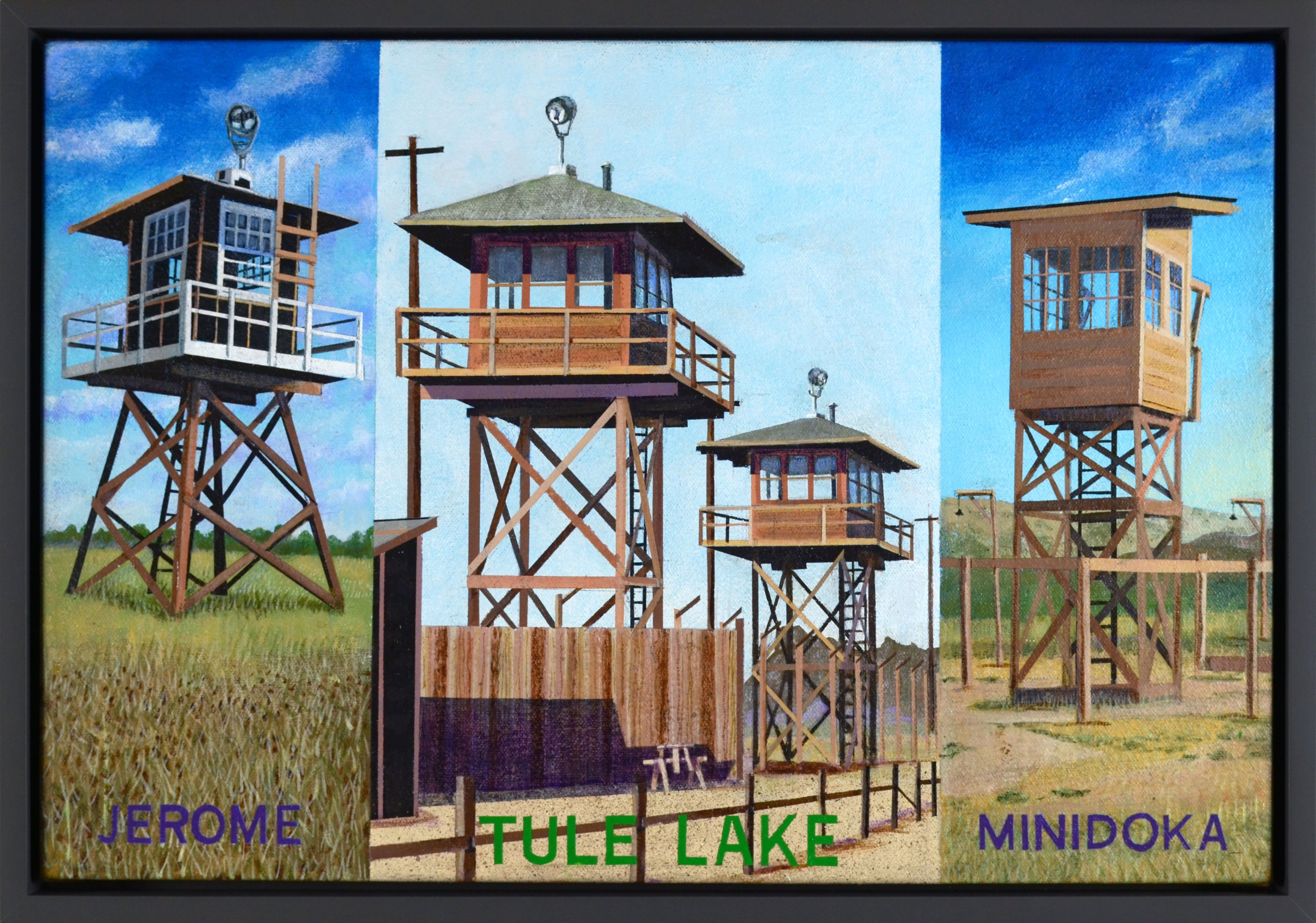

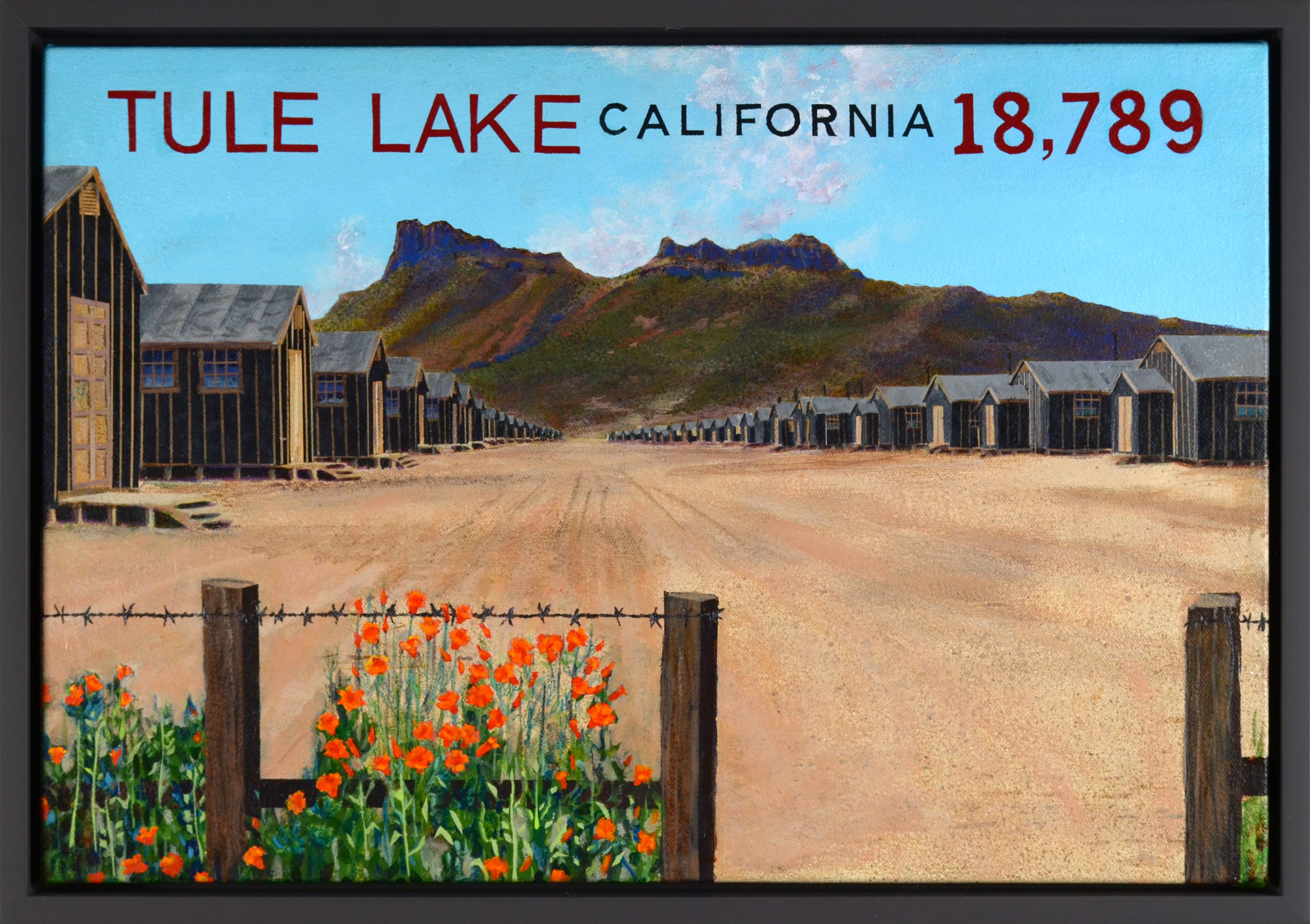
JTK: Sometimes it can happen quickly—say, with the ‘Orange Crate Label’ paintings. He’ll have the idea, he’ll have the moment in time, because a lot of it is tied to current events, and he’ll make the paintings fairly fast.
And then there are series like Critical Art Theory, which he’s been tackling in his mind for decades but hasn’t had the time to fully dedicate to until recently. For this particular work, he’s already been working for about four years, and we still don’t know when it’s going to be done. He often starts and then sees where things end up.
As far as source material, Ben has always been a collector of images and books. He sources from newspapers, magazines, posters, and—of course now—the internet. His archive is vast, and you can feel that density of reference in the work.
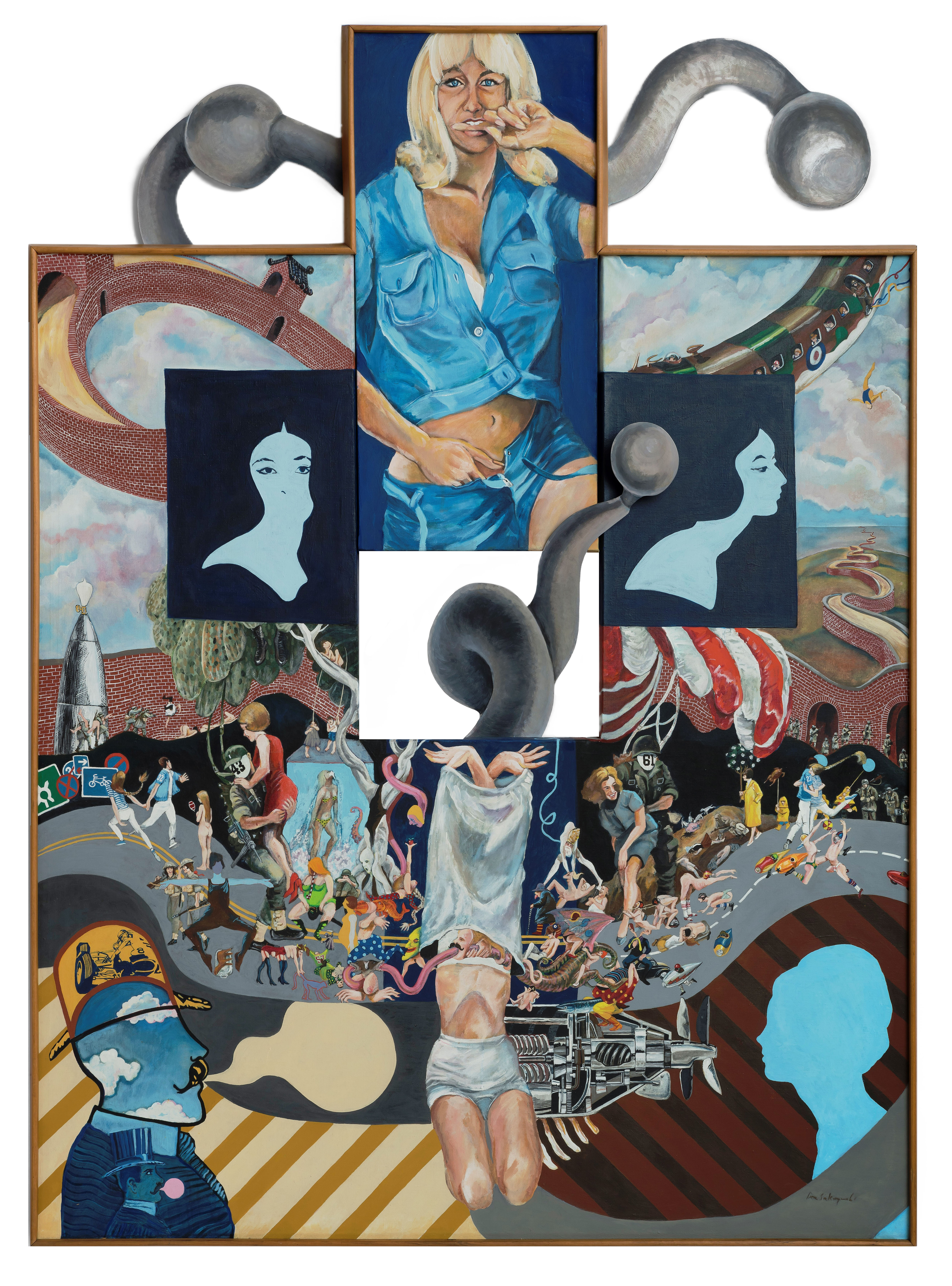
JTK: Ben started out as a printmaker. His early intaglios are compositionally so complex. He was truly a master printer, and when he started adding colour with silkscreening, he often had to run the press numerous times for different colours. Eventually, that became too complicated and time-consuming to achieve what he wanted, so he started to paint.
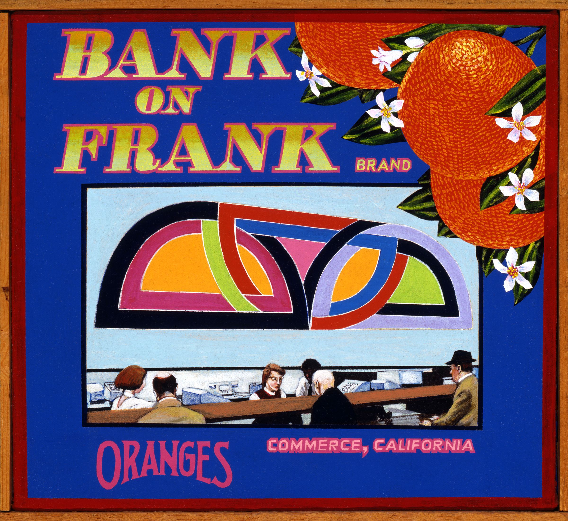
The early paintings were often bigger and more surreal, with references to artists like Hieronymus Bosch in Dawn: She Would Never Pose (1966). There were still nods to historical events, American values, and pop culture, but the content and style shifted in the 1970s with the ‘Orange Crate Label’ paintings. These works are all the same size, ten by eleven inches, and have what Ben calls the same ‘ingredients’: an orange, the word ‘Brand’ in the title, a real place, and the word ‘orange’. Using this format, he can address any subject matter—personal, political, funny—and he continues making them to this day.
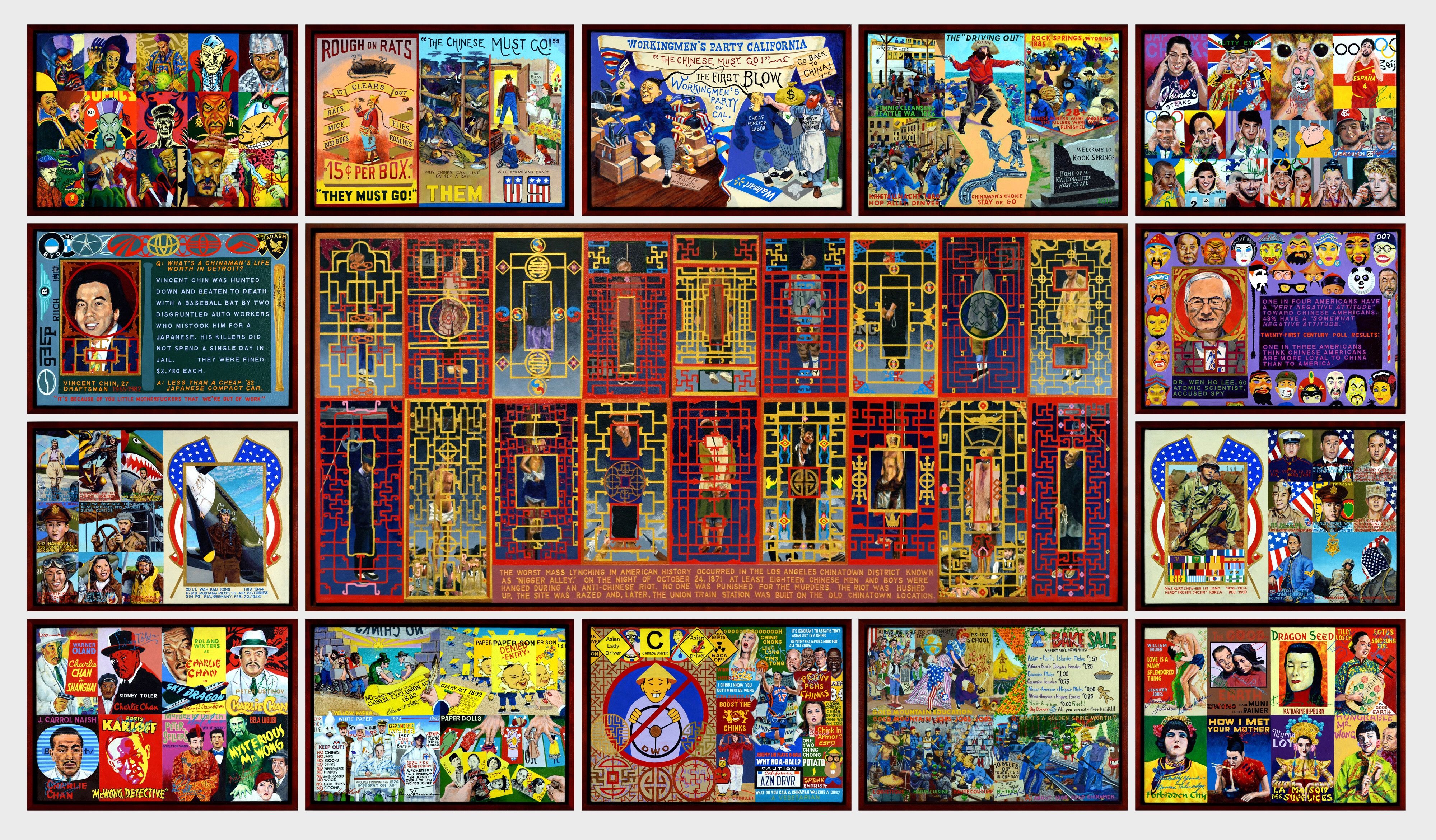
He also developed a system for several multi-panel works, such as Towers (2014), Comparative Religions (2014/2019), and Chinatown (2014). These typically have a larger central panel surrounded by 15 to 17 smaller panels and focus on specific histories, like his time in an internment camp or the 1871 Los Angeles Chinese massacre.
JTK: When he studied at UCLA, he had a very influential teacher named John Paul Jones. Vija Celmins was also studying there and was a friend. He remembers seeing the 1963 Duchamp retrospective at Pasadena Art Museum (now Norton Simon Museum) with her and being blown away—not just by certain works but by the anti-art establishment sentiment that ran through the show.
Most of his influences reach further back. He’s particularly excited by the prints of Japanese artists like Hokusai and Hiroshige. Probably his favourite artist is Goya; Ben’s series ‘The Caprices’ is his update of Goya’s Los Caprichos (1799), and he’s also made his own version of Disasters of War (1810–1820).
He’s obsessed with history and art. This is clear in Critical Art Theory, but also in the ‘art about art’ subset of the ‘Orange Crate Label’ paintings, which include works like Bank on Frank Brand (a Frank Stella hung in a bank), Renoir Brand, Art Ear Rat Brand, and Looney Koons Brand.
JTK: Ben often talks about the art history department at UCLA and how rich it was at the time, with professors who stressed the importance of understanding history. For him, the key was finding subject matter he wanted to work with. Jan once told me about a studio visit with a New York artist who told him, ‘You’re not a New York artist—don’t try to be one. Do your own West Coast thing.’ That was important advice for him.
You can see this independence in Critical Art Theory, where he uses historical knowledge to question accepted narratives and highlight how capitalism, religion, and the state have shaped the art world.
JTK: Ben taught at Pasadena City College for over 30 years. He loved the range of students: older students, younger students, veterans returning from war, people changing careers. Even when he was offered positions at UC Irvine and UCLA, he said no. He didn’t think he’d get the same mix of students, and his life was already rooted in Pasadena. He may have also been uncomfortable with the master-apprentice model common in other art schools.
Pasadena has a fascinating art history. Walter Hopps worked there in the 1960s and 1970s and was a major influence in L.A. He curated the Duchamp retrospective and New Painting of Common Objects, an important Pop show that influenced the next generation of artists. Many artists have lived or had studios there, but Ben has always been slightly outside those circles—more of an observer than a participant.
JTK: I really appreciate the position he’s taken and how he sticks to it. What he wants to do is paint, and he paints all day and all night. It’s unusual working for someone like that—I’ve only met him face-to-face once. Most of my communication is with Jan. It’s not that he’s uninvolved—he is, but in a way that works for him.
I also think the work is amazing. I don’t know anybody making art like this right now. —[O]


A respected voice in contemporary art discourse.
Focusing on ambitious storytelling and insightful art-world commentary. Ocula Magazine publishes in-depth interviews, critical essays and timely analysis on the artists, exhibitions and ideas driving the global art world.
Learn more about Ocula Magazine
Showcasing the best of the art world.
Ocula partners with galleries from around the world to highlight their artists, artworks and exhibitions. Gallery membership is by application and invitation, with each member vetted by an independent panel.
Learn more about Ocula Membership
Specialises in the sale of major artworks.
Led by a team with deep ties to the world’s leading auction houses, galleries and collectors. Ocula’s advisory team offers bespoke services to high-net-worth clients from around the world who are looking to acquire the best of contemporary and modern art.
Learn more about our team and services