


ED RUSCHA
b. 1937, United StatesBest known for his word paintings, since the 1950s Ed Ruscha has been examining the iconography of popular culture and emblems of Americana through drawings, paintings, prints, photographs, and artist’s books often characterised by the use of bold typefaces and bright colours.
Associated with Pop art due to his use of commercial techniques and subject matter, Ruscha is often compared to artists such as Andy Warhol and Robert Indiana, while the examination of the American ethos in his works has also been compared to the works of Jasper Johns, one of his earliest influences.
Early life
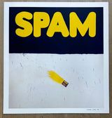
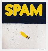
Ruscha was born in Omaha but raised in Oklahoma City. In 1956, he relocated to Los Angeles to attend the Chouinard Art Institute (now known as California Institute of the Arts) to study commercial art. While the ethos of Abstract Expressionism was dominant at the Institute, his early paintings depict household objects such as cigarettes (Cigarettes, 1956) and cans of Spam (Actual Size, 1962). While a student, the artist earned money by painting labels on signs by hand: early practice for the textual motifs he would come to be known for. His first word painting, E.Ruscha (1959), depicted the artist’s name in roughly applied black and red oil paint. Subsequent text-based works from the era typically bore one word such as ‘smash’ or ‘noise’ on a monochromatic background, and were mostly freehand drawings covered with oil paint.
Style and motifs
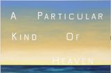
After graduating, Ruscha remained in California, a locale that would become a central influence on his art, seen in his use of bright, expressive colours and examinations of American consumerism. Such interests were compounded by the artist’s working at California commercial ad agencies, as was his penchant for scale and design. In one of his most iconic pieces, the 1966 screenprint Standard Station, he depicted a Standard Oil gas station in flat, bright colours with a bold gradient background. The gas station is an important motif for the artist, symbolising a mundane but classically American landscape. This motif would inspire his book Twentysix Gasoline Stations in 1963, which comprises photographs of gas stations taken across the south-western United States and is considered one of the first modern artist’s books.
‘Liquid words’
In the latter half of the 1960s, Ruscha began work on his ‘liquid word’ series, which bore single words printed in trompe l’oeil lettering that mimicked the appearance of spilled fluid. For the backgrounds of these works, the artist often utilised the ‘split fountain’ technique, which entails combining two or more colours of ink before applying them to the paper, creating a smooth gradient effect. While visually evoking by-then clichéd, sunny imaginings of 20th-century California, this practice also spoke to the artist’s background in advertising, as at the time the method was more commonly used in commercial art than fine art.
Use of humour
Humour and the absurd has long played an important role in Ruscha’s artwork. A distinctly Surrealist influence can be seen in works from the 1960s, such as Angry Because it’s Plaster, Not Milk (1965), which depicts an oversized bird next to a much smaller cup of plaster.
Non-traditional materials
Extending this playfulness into material form, in the late 1960s he began to incorporate non-traditional substances into his two-dimensional works. In the 1969 portfolio of prints Stains, the artist utilised egg yolk, beer, salad dressing, and his own blood to create the works on paper. Similarly, for the canvas Dance? (1973) he used coffee, egg white, chili sauce, cheese, and several other foodstuffs to write ‘Dance?’ on a white background. In the late 1960s, his accidental discovery of gunpowder’s potential for artistic use resulted in a series of delicate trompe l’oeil drawings made by applying the dust with cotton balls and swabs.
Text and typefaces
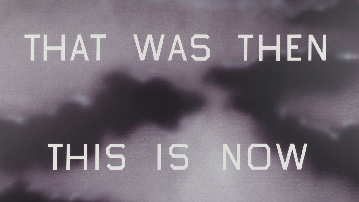
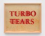
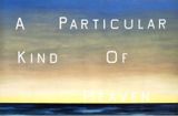
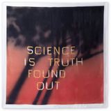
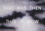
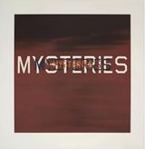
By the mid-1970s, Ruscha began to incorporate entire phrases—such as ARTISTS WHO MAKE “PIECES” (1976) and HOLLYWOOD TANTRUM (1979)—in bold sans-serif white lettering onto colourful backgrounds. Font choice has always been important to his work; in the 1980s, the artist developed his own typeface, entitled Boy Scout Utility Modern and inspired by the letters of the Hollywood sign.
Today, Ruscha continues to examine the role of text in art, placing his signature font over photorealistic painted landscapes, as seen in works such as the large-scale acrylic painting Tulsa Slut (2016).
Notable exhibitions
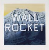
In 2009, he published an artist’s book version of Jack Kerouac’s On the Road. He later mounted an exhibition at The Hammer Museum of works featuring his characteristic backgrounds of snow-capped mountains overlaid with key phrases from On the Road. In 2016, the de Young museum in San Francisco mounted a significant show of his works entitled Ed Ruscha and the Great American West.
Other significant solo exhibitions include:
- ED RUSCHA / NOW THEN, Museum of Modern Art, New York (2023)
- Ed Ruscha, Course of Empire, National Gallery, London (2018)
- Ed Ruscha, Museum of Contemporary Art Australia, Sydney; MAXXI, Rome; The Neue Nationalgalerie, Berlin (2004)
Group exhibitions include:
- Desire, Knowledge, and Hope (with Smog), The Broad, Los Angeles (2023)
- On the Edge, Los Angeles Art, 1970s–1990s, from the Joan and Jack Quinn Family Collection, Bakersfield Museum of Art, California (2021)
- Los Angeles, A Fiction, Musée d’Art Contemporain de Lyon (2017)
His artworks also appear in the collections of The Museum of Modern Art in New York, Tate in London, and the Los Angeles County Museum of Art.
Ruscha currently lives and works in Culver City, California.
Who is Ed Ruscha?
Ed Ruscha is an American artist known for his pivotal role in the development of West Coast Pop Art and Conceptual Art. His practice spans painting, drawing, photography, and printmaking, often combining language and landscape to explore themes of American identity, consumer culture, and urban sprawl.
What is Ed Ruscha’s most famous work?
Among Ruscha’s most recognised works is the photobook Twentysix Gasoline Stations (1963), a minimalist document of American roadside culture. His word paintings—such as OOF (1962) and Hollywood (1968)—are also iconic, marrying graphic typography with enigmatic or ironic content.
What influenced Ed Ruscha’s art?
Ruscha’s work has been shaped by American pop culture, commercial design, and the visual vernacular of Los Angeles, where he has lived since the 1950s. Influences include Jasper Johns, Marcel Duchamp, and the signage and billboard aesthetics of mid-century America.
Where has Ed Ruscha exhibited his work?
Ruscha has exhibited widely, with solo presentations at major institutions including the Museum of Modern Art in New York, the Hayward Gallery in London, and the Centre Pompidou in Paris. In 2005, he represented the United States at the 51st Venice Biennale.
What themes does Ed Ruscha explore in his art?
Ruscha explores themes such as language and its visual form, the banality of the American West, the passage of time, and the interplay between image and text. His restrained compositions often draw attention to typography as subject matter, prompting reflection on cultural symbols and communication.
Ocula | 2025

Explore Ed Ruscha's Exhibitions On Now

View Ed Ruscha's Artworks


Ed Ruscha in Ocula Magazine


Explore and Follow Artists Shaping Contemporary Art
A respected voice in contemporary art discourse.
Focusing on ambitious storytelling and insightful art-world commentary. Ocula Magazine publishes in-depth interviews, critical essays and timely analysis on the artists, exhibitions and ideas driving the global art world.
Learn more about Ocula Magazine
Showcasing the best of the art world.
Ocula partners with galleries from around the world to highlight their artists, artworks and exhibitions. Gallery membership is by application and invitation, with each member vetted by an independent panel.
Learn more about Ocula Membership
Specialises in the sale of major artworks.
Led by a team with deep ties to the world’s leading auction houses, galleries and collectors. Ocula’s advisory team offers bespoke services to high-net-worth clients from around the world who are looking to acquire the best of contemporary and modern art.
Learn more about our team and services