

The art world in focus
Subscribe to our newsletter for news and insights on artists, galleries and exhibitions.

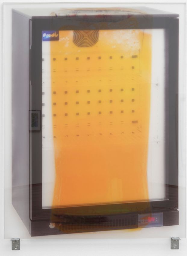
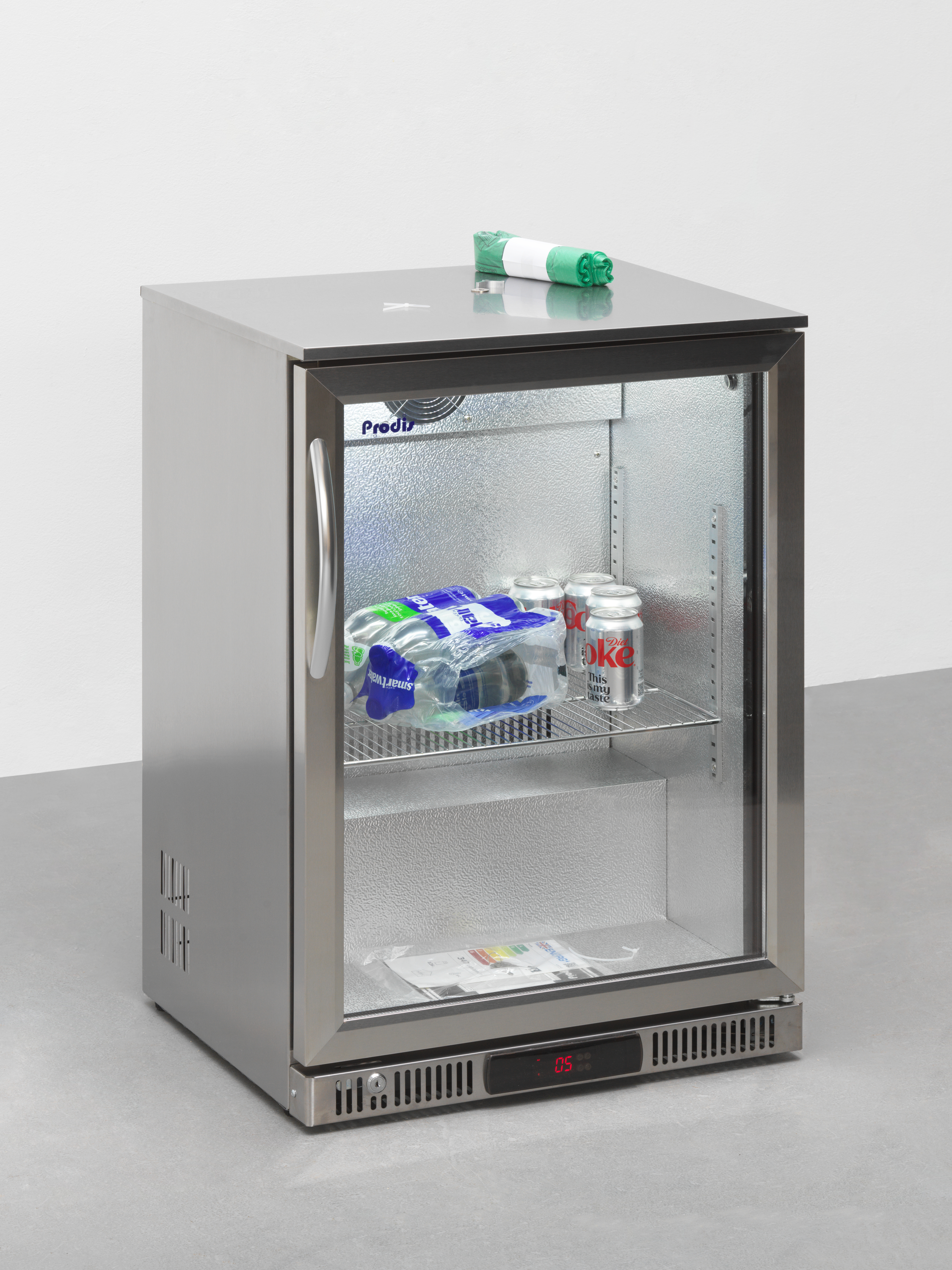
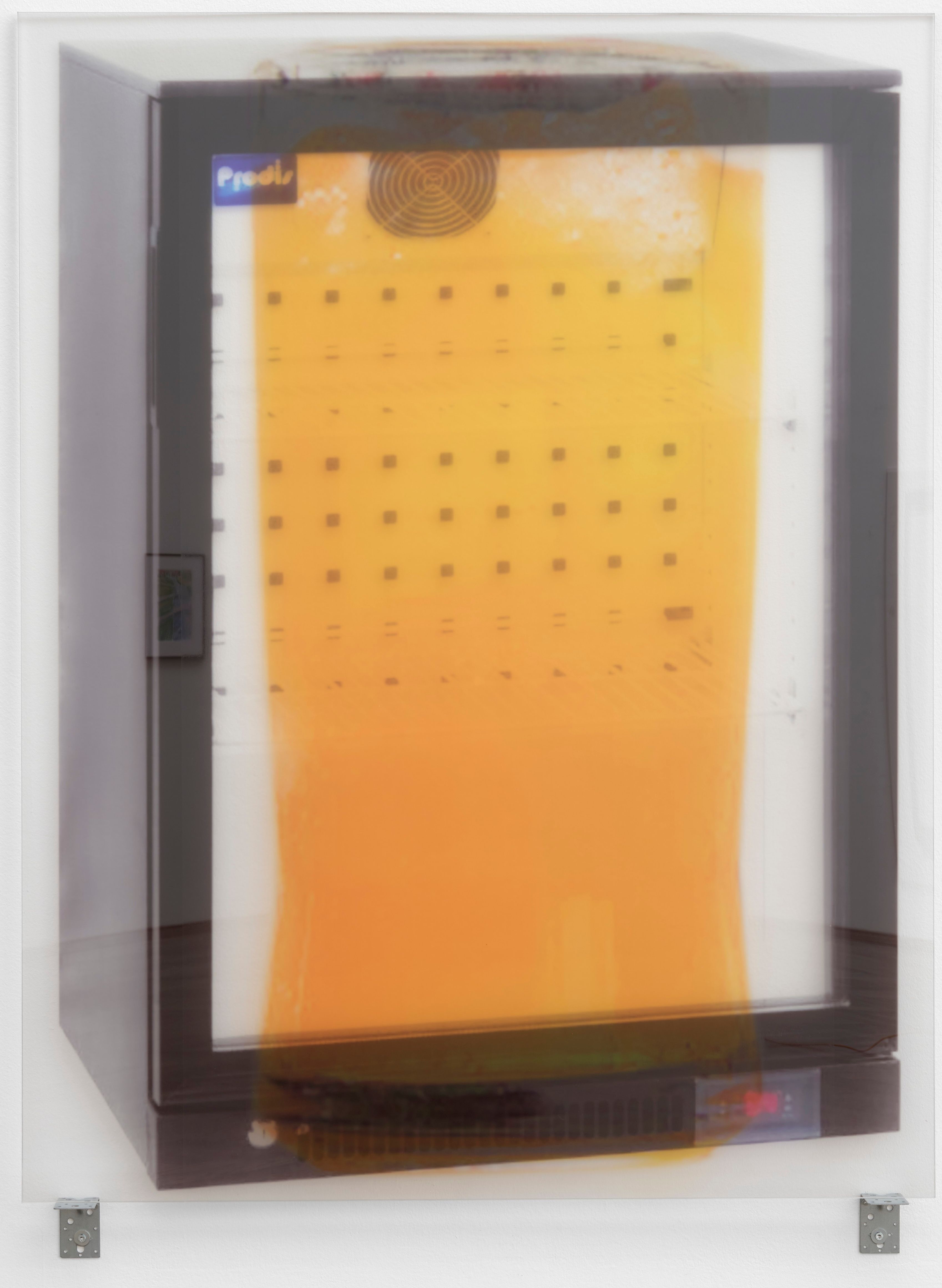
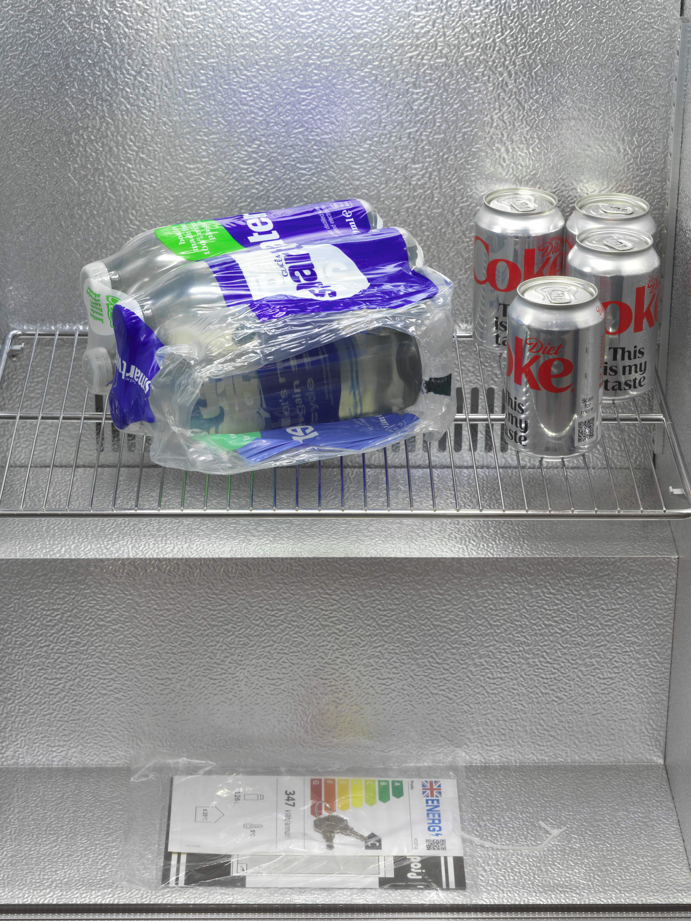
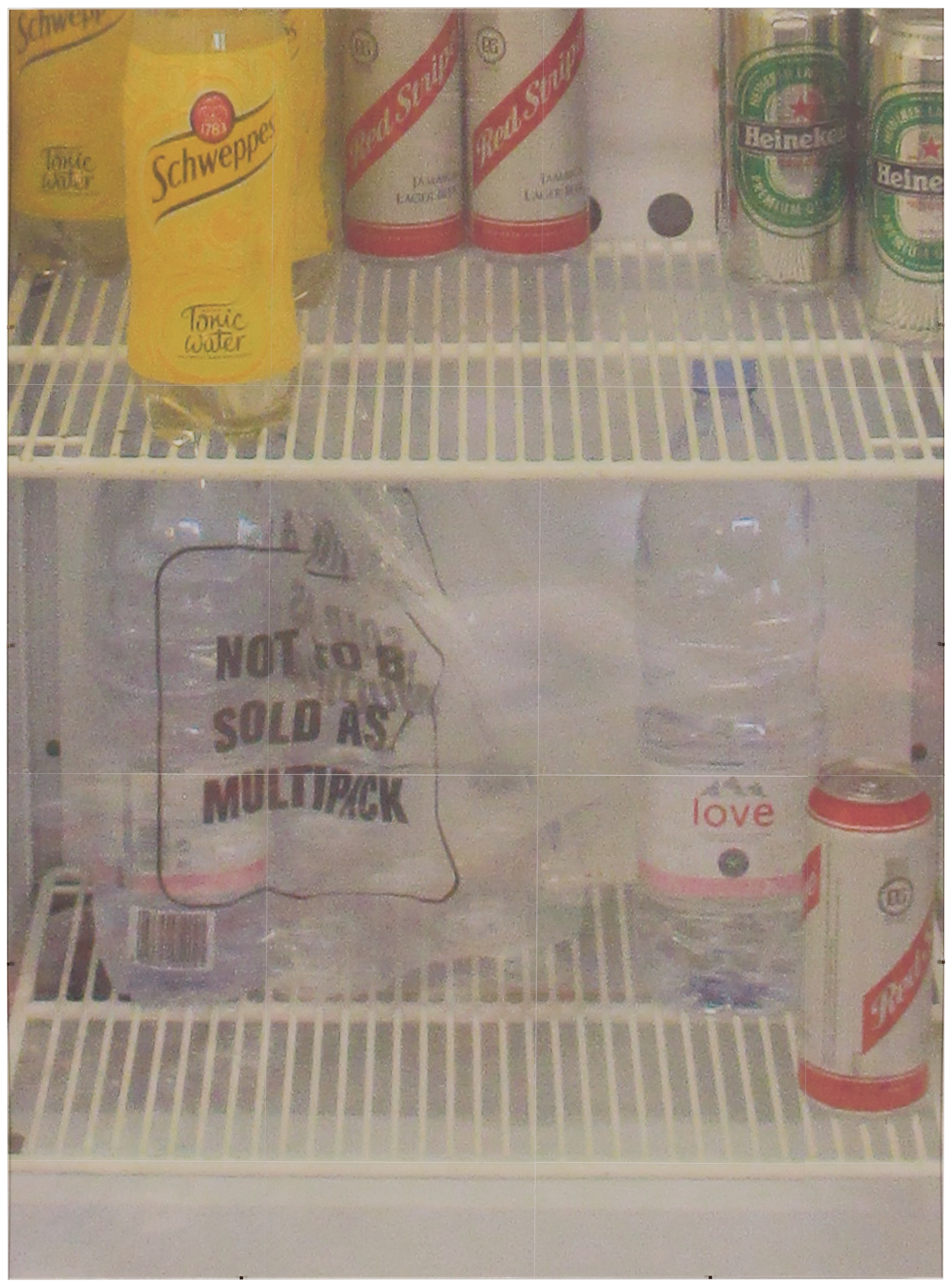
Light and Airy, London-based artist Gili Tal’s largest solo exhibition to date, opened at Kunsthalle Basel this week. At the centre of the show is an object with which Tal has a longstanding fascination: a huge refrigerator, the kind seen in British corner shops and cafés. Where Tal has previously shown physical fridges, in Light and Airy the refrigerator is no longer a sculpture but a JPEG photograph that has been carefully applied on to Perspex, before being displayed on a set of metal brackets, as if the photograph has become a commodity itself.
In some cases, there is another object inside the fridge: a Spider-Man lunch bag, a teddy bear, a layer of grass taken from an architectural rendering of a London development. All of these “images” come from time Tal has spent flâneuring through London.
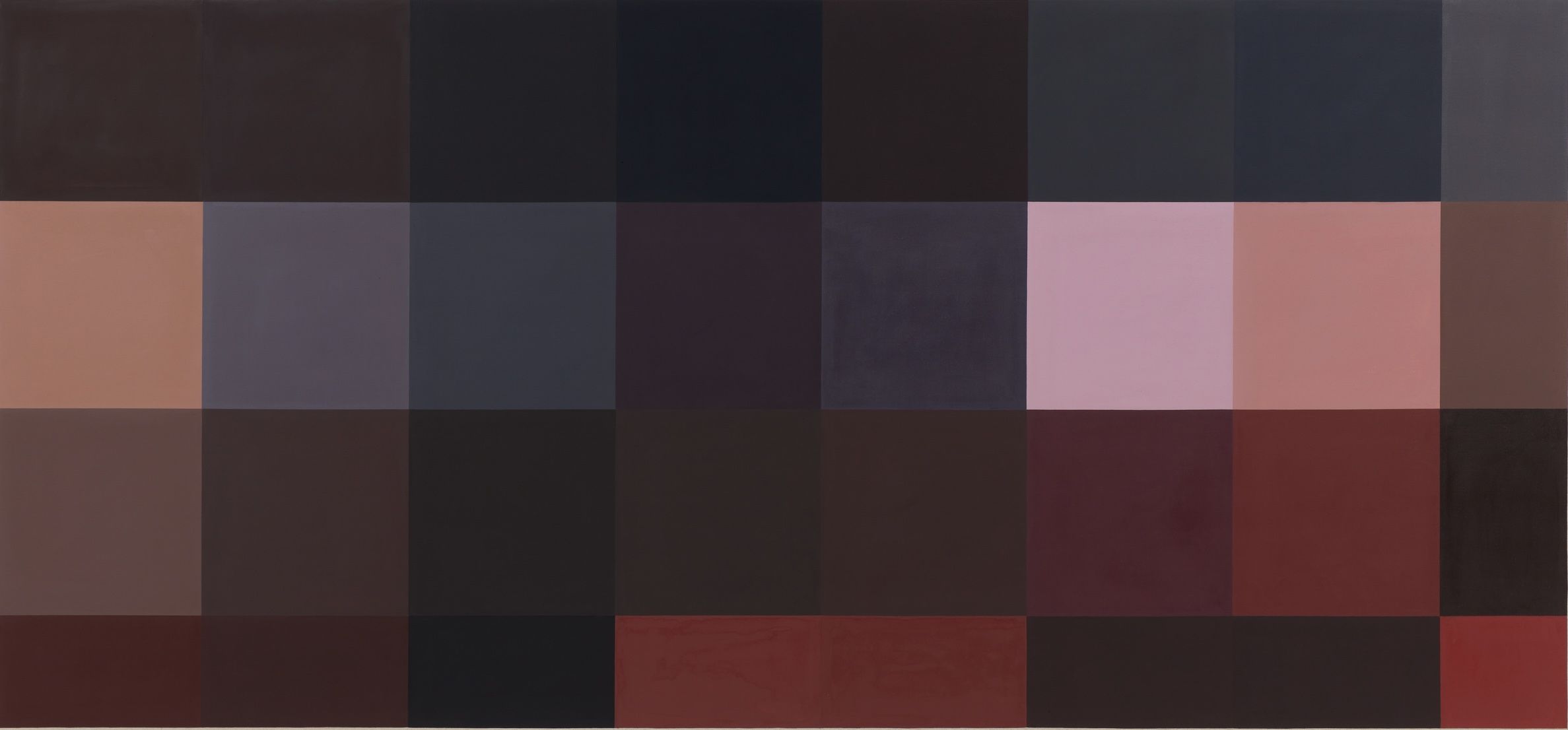
Tal has always been interested in the photographs of cities that are used in marketing, whether stock photos, building-site hoardings, or architectural renderings of new housing developments. Her 2022 solo show at Cabinet Gallery in London, You May See Butterflies, presented a series of heavily pixelated oil paintings of red double-decker buses, their advertisements made unreadable to the viewer. Reduced to a blurry outline, the faded red hues dissolved, as if into polluted city air.
The Impressionists played with light to capture fleeting beauty in a fast-industrialising city, as in Claude Monet’s Le Pont de l’Europe, Gare Saint-Lazare (1877). Tal uses commercial, abstract language to capture her own city.
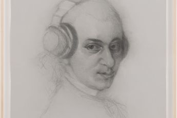
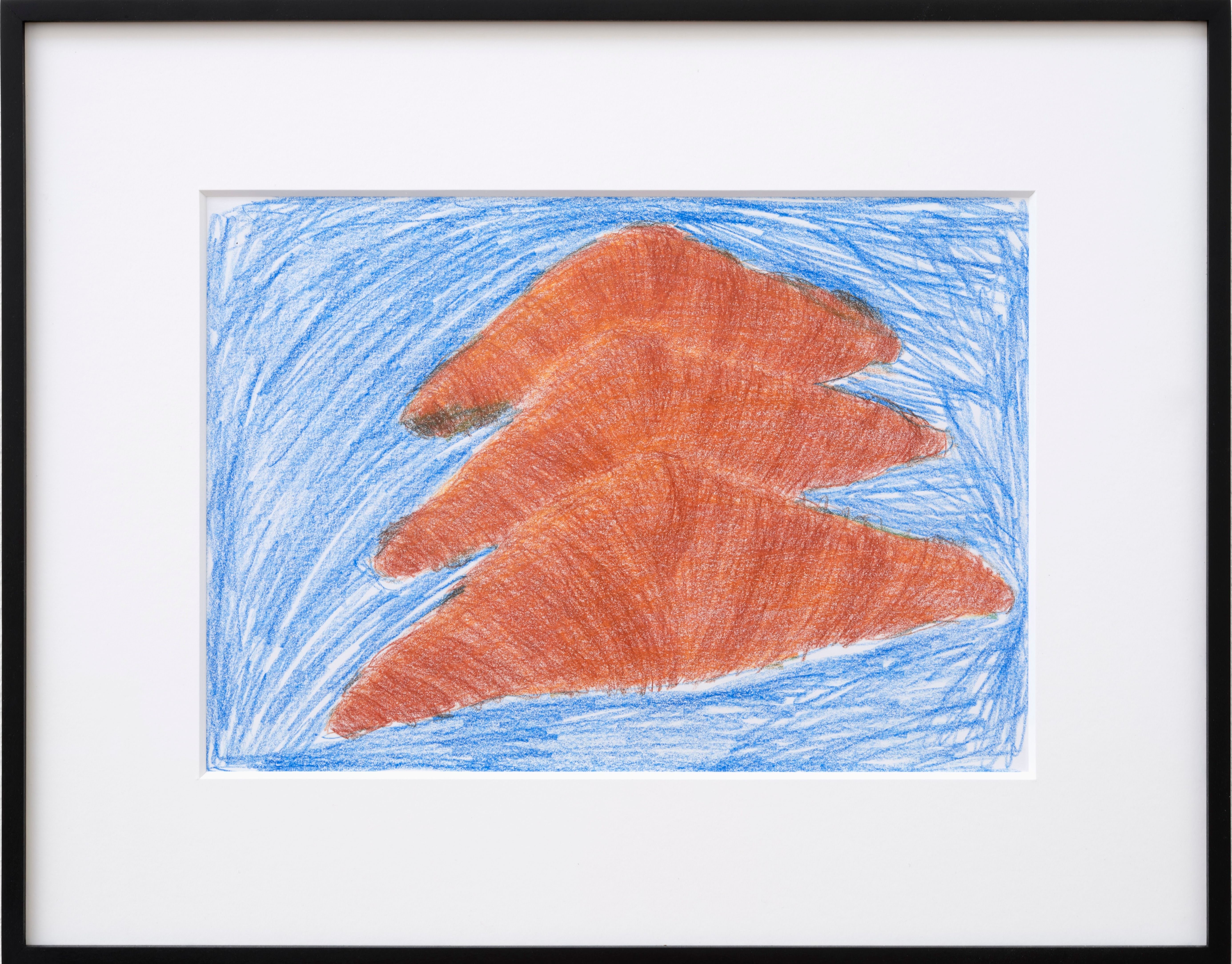
Gili Tal: Both have qualities of the weather in how they’re rendered. The fridge has a very light, misty or foggy feel, whereas the mark-making in the drawings is maybe far more tumultuous with the rapid pencil marks.
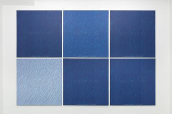
GT: Snowdome was made with one-way perforated window film, which is a kind of mesh, so it’s a series of holes leading your eye through to the gallery wall again. All the fridge works in this show, which have gold motifs, are printed from a commercial printer on to Perspex, which is then applied to the Dibond.
The fridges have always been about playing with different degrees of emptiness. When I was using real fridges with real drinks, I was working in bars at the time. If a fridge was emptying, you’d be asked to bring the cans to the front and turn the labels forward to make it look fuller. I got interested in those strategies for masking the void behind.
GT: Wandering the city played into these new works, which are commercial window stickers I made, like those you see on the fronts of shop windows. I also go to new-build areas: homogeneous environments which present these green open spaces in an attempt to be bucolic amongst the new housing developments.
GT: I like the way the surfaces of these new-build green spaces look, the bricks against the pavements, the greenery and the blue; it sort of shimmers. For me, the link to Impressionism was the way the surfaces interacted: the bricks, the water against the pavement; they become dream spaces that produce an unreal quality.
I work from a combination of photos I’ve taken and renderings you find on property development websites. There’s one called Riverside Life, a space in Woolwich, that’s drawn from a prospective render. The work I made was a chance to make this connection with new-build landscapes, and my fridge works, more explicit.
“The fridges have always been about playing with different degrees of emptiness”
GT: I’m not quite sure what “modern Gothic” means. People have used it in relation to my work, but that’s not my aim at all. There’s definitely an aspect of alienation, a discomfort with the world. But it’s not about banality. Alienation is a factor, with the materials becoming so thin, the transparency, the flatness.
The phrase that kept coming into my head when I was making the new works—for example, in the Kunsthalle show there’s a constellation with a pink slider and a teddy bear—was “just as unreal”. I was thinking about how the systems we inhabit have been constructed around us—they link to the pixelated bus paintings; they had this edge of dissolution feeling, like you could touch them and the pixels would just fall.
GT: I was reading a lot of [Michel] Houellebecq. I think he uses that word “limpid” a lot in the book he wrote about Schopenhauer. For me, the phrase worked in relation to these crystal-clear fridges that now function as frames. I enjoyed Houellebecq’s descriptions of supermarkets in one of his essay collections. It was a big influence; he describes the spaces tourists walk through, the way the flows are organised by transparent signs and metal surfaces. That stayed in the back of my mind with these works, all the clear Perspex and the metal brackets, everything very smooth.
GT: A lot of Nicolas Ceccaldi’s work. There’s quite a lot of pathos in his work. And Josephine Pryde’s photographic series Cubicles—where she went into changing rooms in clothes shops, posing dead sea creatures in them.—[O]



A respected voice in contemporary art discourse.
Focusing on ambitious storytelling and insightful art-world commentary. Ocula Magazine publishes in-depth interviews, critical essays and timely analysis on the artists, exhibitions and ideas driving the global art world.
Learn more about Ocula Magazine
Showcasing the best of the art world.
Ocula partners with galleries from around the world to highlight their artists, artworks and exhibitions. Gallery membership is by application and invitation, with each member vetted by an independent panel.
Learn more about Ocula Membership
Specialises in the sale of major artworks.
Led by a team with deep ties to the world’s leading auction houses, galleries and collectors. Ocula’s advisory team offers bespoke services to high-net-worth clients from around the world who are looking to acquire the best of contemporary and modern art.
Learn more about our team and services